
Our entire repository of COVID charts HERE.
There is a ton of data about Omicron and it is time consuming and difficult to go through it all. We have seen approximately one million charts on Twitter, usually saying different things. There is both garbage in, garbage out AND data manipulation to fit narratives. Today we’re going to highlight some of the practices we’re wary of. And if you see a chart on Twitter and want us to check it, please just ask. We are happy to help.
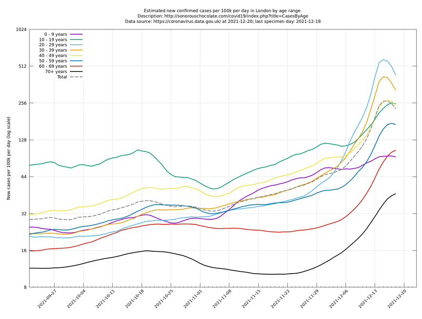
For example, we saw a chart of case growth rates by age in London, which indicated rates were rolling over for almost every age demographic (first chart). The chart claims its data is from the UK’s official COVID data website. Seems legit, but the data from the UK doesn’t match up (second chart). The data from the UK ends at 12/15, unlike the first chart, which ends at 12/18. At the very bottom of the first chart’s website, they admit “Note that, as a consequence of the last few days’ information being incomplete, the case number estimate for these days can sometimes be retrospectively updated over the next day or two.” The fine print and asterisks are hard to spot, especially when the source looks legitimate. This is not to imply what will happen to rates in London, but rather to note how difficult it can be to spot bad charts.

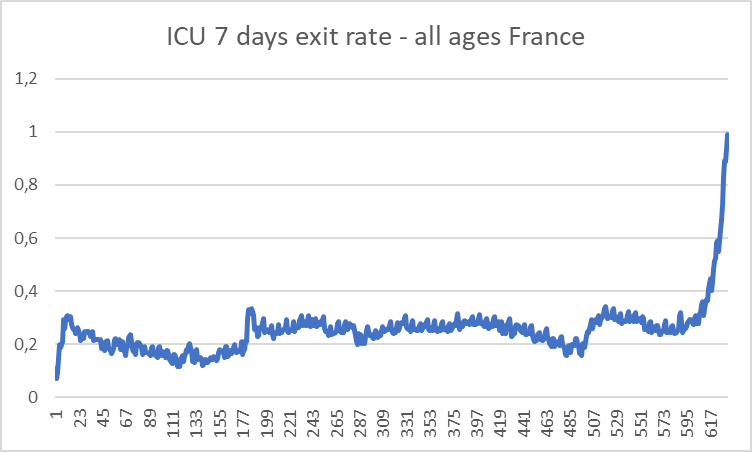
We hope our report has helped. We are far from infallible, so thank you to all who have given feedback. For example, we should not have used the France ICU chart referenced yesterday. The ICU exit rate referenced was when the incidence of Omicron was extremely low. So, it does not provide insight into Omicron’s severity.
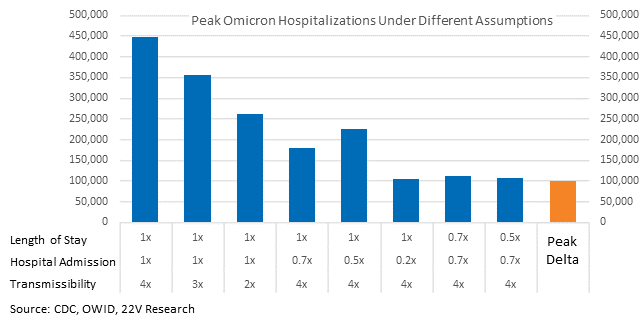
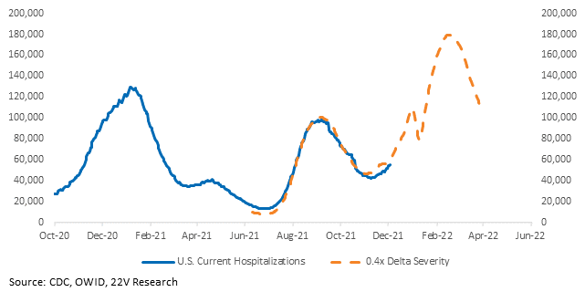
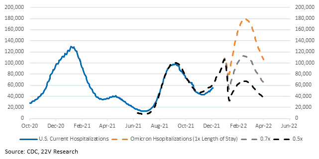
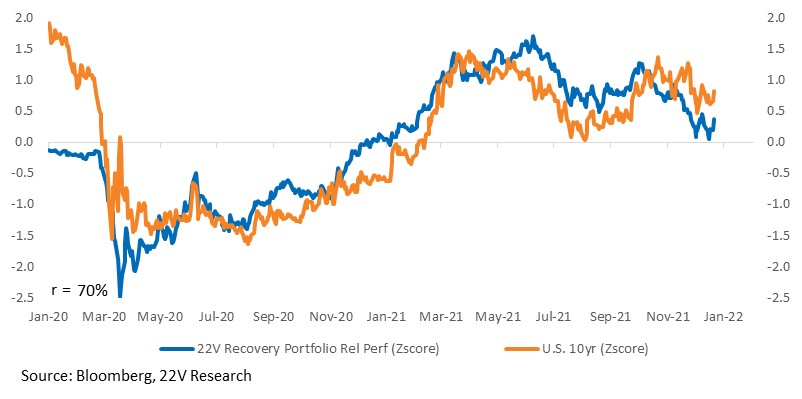
Fortunately, our analysis doesn’t rely on that particular data point. The range of hospitalizations is wide, introducing uncertainty into markets. That’s suppressed the 10yr and weighed on Recovery Portfolio performance. However, better data from Denmark, indicating the Omicron hospitalization rate is ~60% less than Delta, has helped reduce tail risk (second chart). Any reduction in the length of stay is still extremely important, as highlighted in the third chart.
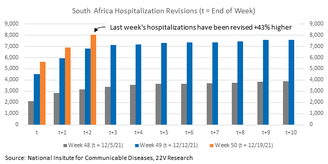
Now on to some practices to keep in mind. South Africa’s hospitalization data is not timely. It is revised significantly higher upwards of a week after the fact. Case growth is not, so initial estimates of severity are wrong. This is one of the reasons we are laser-focused on the UK, which keeps timelier data.
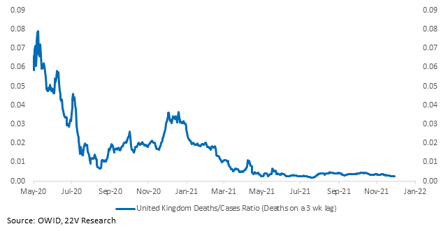
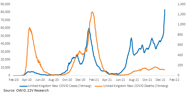
Don’t be early on deaths. If deaths didn’t meaningfully increase during Delta, that doesn’t mean they can’t increase during Omicron. And deaths lag case growth by 2-3 weeks. The UK case to death ratio we use is now as of 11/29, when Delta was 99% of case growth. Hospitalizations should lead death data, which will help. But they still lag case growth. If UK case growth starts to taper off and deaths stay at low levels, it will signal that worst case scenarios are off the table. Low volatility and Defensives, which have had outlier relative performance over the past month, will come under relative pressure as that happens. Unfortunately, we likely need to wait until January to figure that out.
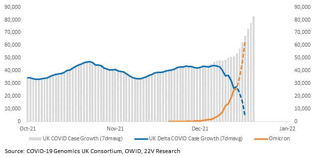
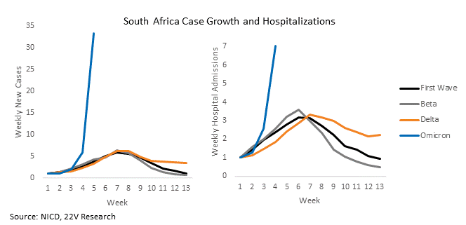
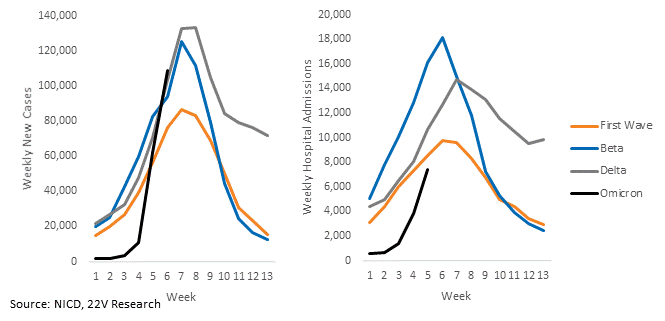
Extrapolating early trends is rarely useful. We saw analysis of roughly one week of Omicron data go both ways; Omicron is a non-issue and Omicron is as severe as Delta. We saw a study on South African hospitalizations that concluded most of the hospitalizations were incidental, therefore severity is actually much lower. But the sample size was 42 people and it was the first week of the Omicron wave. Here’s a recreation of a chart we saw at the very beginning of the Omicron wave in South Africa, portending the end of the world. Since Omicron’s rates were calculated off a much lower base of case growth than the prior waves, the rates looked devastating, but the absolute numbers were more comparable. The absolute numbers, as of the same time, are pasted below.
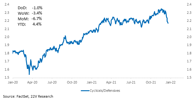
It’s worth noting we think Paxlovid is underappreciated. Paxlovid is nearly 90% protective against hospitalization and deaths. The FDA may authorize the drug this week. Even if vaccines are less effective, new therapeutics like Paxlovid can help keep severity low. The only sticking point may be supply; Pfizer can treat 180k people this year, but 21 million or more by the end of June 2022. Meanwhile, Cyclicals, 10yr yields, and our Recovery Portfolio have all been weighed down by Omicron. Uncertainty has overwhelmed positive news and we are still a few weeks away from clean data.
Charts for every state and country we have data for are HERE. And, again, if you see a chart and want it checked, just let us know.

