
Our entire repository of COVID charts is HERE.
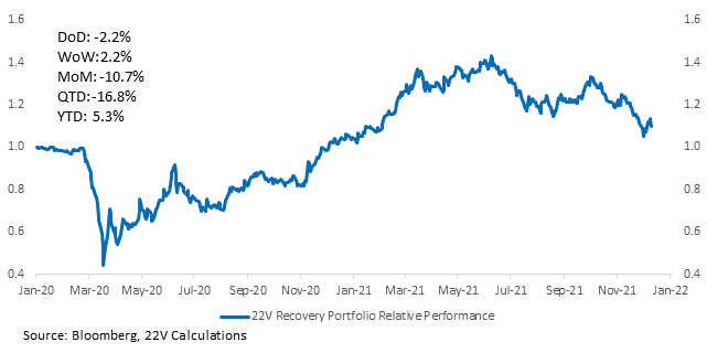
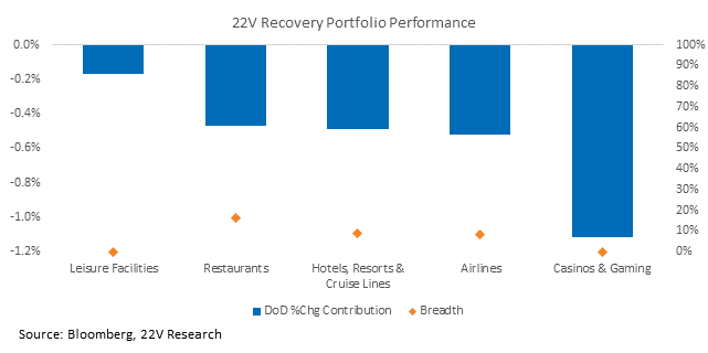
Data on Omicron severity is driving market action today. Our recovery portfolio is down -2.7% and the 10yr is down -7bps. Omicron data is noisy, which will continue to contribute to volatility (more on that below). A week ago, South Africa hospitalization data looked like Omicron was significantly less severe than Delta. But weeks-old admissions have been revised up significantly (check out the chart below, which tracks how hospitalizations two weeks ago have been revised +80% higher). Case growth is not revised in the same fashion. So, estimates of severity are increasing. The net result is investors are extrapolating worse hospitalizations elsewhere, explaining the hedging and extreme underperformance of recovery stocks. The practical implication is not to place too much emphasis on last week’s hospitalization numbers yet – they probably won’t be close to their final tally until late this week.


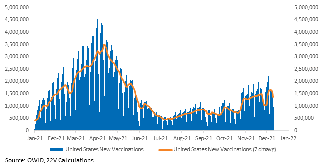
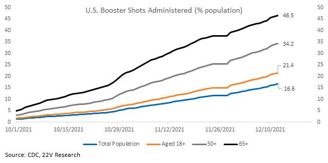
That also makes tracking which hospitalization scenario may unfold in the US based on South African severity a hazardous endeavor. Not only is the data noisy, but South Africa’s healthcare system is also much different than the United States. Simply put, the situation is different. In addition to underlying differences in quality of care, boosters are being rolled out in the US while the campaign has only just started in South Africa. Researchers found two doses of AstraZeneca and Pfizer vaccines were not as effective or ineffective neutralizing Omicron. However, there is currently no evidence of increased potential to cause severe disease. And a small study of vaccine efficacy in the UK found a booster dose provides ~70-75% protection against symptomatic infection. Boosters are important; rollout in the U.S. is progressing. 47% of those 65+ have received a booster.
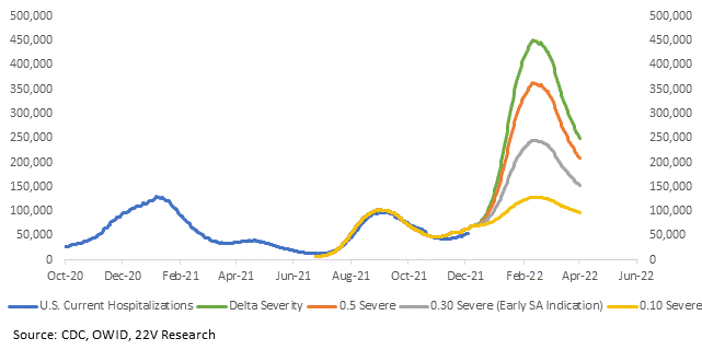
The below simulation illustrates that the range of hospital outcomes is wide. Which path is the most likely is unknown. Small changes to estimates of severity have large effects on the number of possible hospitalizations given how much more transmissible Omicron is. Fyi, details on how we arrived at the below simulation are here.
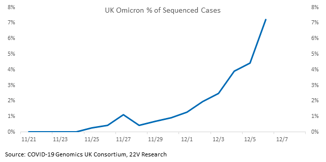
The UK is a better comparison than South Africa. It collects better data and has a more similar standard of living. It’s not as far along, so it won’t yet make the headlines that South Africa will. But, the incidence of Omicron is accelerating and case growth is increasing. So, the data that it produces over the coming weeks will be more valuable.
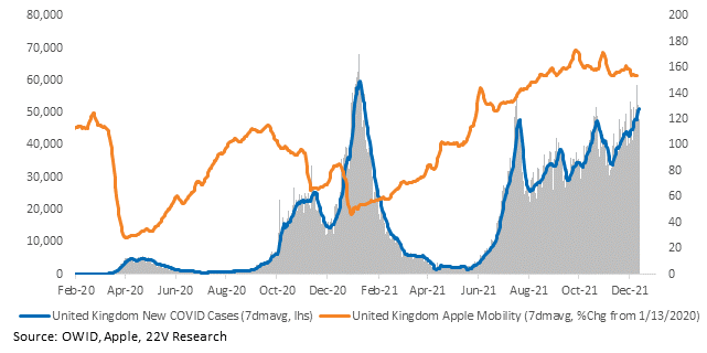
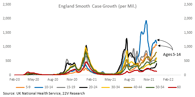
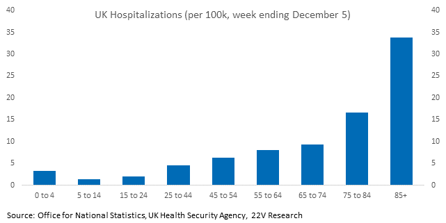
Case growth rates in the UK are highest in children and hospitalization rates are the lowest. Tracking severity is important; tracking severity in children is even more important. We will be monitoring this data as Omicron case growth increases. We will have a better idea of what the US is facing after we assess data from the UK.
Headlines and messy data affect internals, volatility, and 10yr yields (which are used as a hedge).
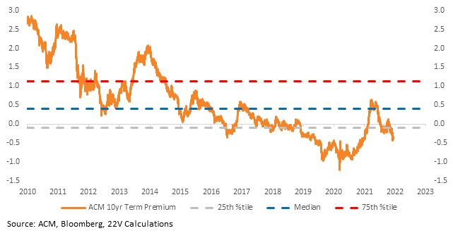
The term premium is at its lowest level since early 2020, when vaccines and treatments didn’t exist. Hospitalizations matter for the markets insofar as they lead to lockdowns and the economic consequences thereof. There are two points to keep in mind (in addition to how little is known when estimating hospitalizations): 1) we have new and better treatments, including therapeutics that are expected to work against omicron, and 2) political appetite for lockdowns is significantly less than 2020.
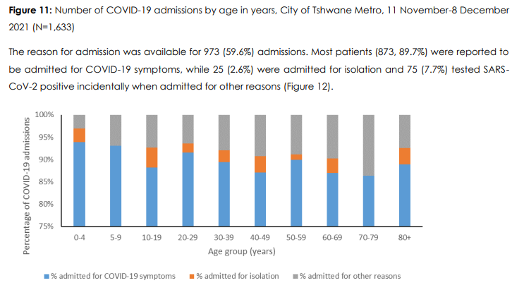
And here’s a final note on Twitter threads and headlines. Legitimate (or seemingly legitimate) sources are saying Omicron is relatively benign while others are claiming it’ll be the worst yet. One thread celebrated that 30% of women in labor are asymptomatic but testing positive, meaning they are counted as hospitalized but aren’t in the hospital for covid. Another thread refuted that, noting 90% of hospitalizations were admitted for covid symptoms. Incidental hospitalizations are understandably part of the picture of severity, but it’s particularly opaque. They both use similar data sources, which serves to highlight the trouble in relying on small data sets from one hospital in one city in one province in South Africa.
Charts for every state and country we have data for are HERE.

