
Our entire repository of COVID charts is HERE.
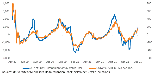
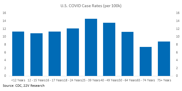
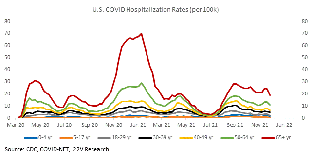
To start, there isn’t anything alarming in the data for case growth rates or hospitalization rates in children (see charts below). But, net hospitalizations and ICU admissions have both been increasing. Yesterday, New York temporarily halted elective surgeries at hospitals in areas with the worst growth rates (~30 hospitals, all upstate). Sentiment toward case growth has collapsed, which is consistent with rising global case growth. But sentiment toward severity, in this case deaths, has been improving.
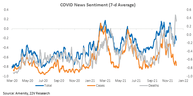
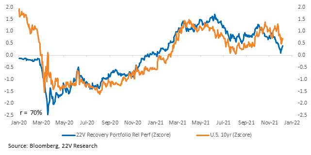
Investors we talk to expect vaccine efficacy against omicron to be very low (~50-65%). Higher than that is a tailwind for reopening stocks and even more so for 10yr yields, which are used as a left-tail hedge. If efficacy is much higher than 60%, big omicron case growth numbers will have less of an impact on risk assets. That noted, if case growth numbers remain large, there is still political and hospitalization risk (out of sheer volume) that will have an impact on risk assets shorter-term.
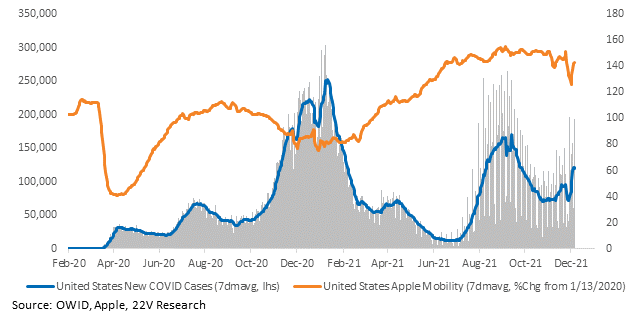
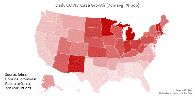
Case growth in the U.S. is increasing again, following a Thanksgiving reporting lag. Mobility recovered as well though. We don’t have data for the incidence of omicron in the U.S. so we cannot tell what strain is driving the current increases. New cases are spread across the Northeast, Midwest, and Southwest.
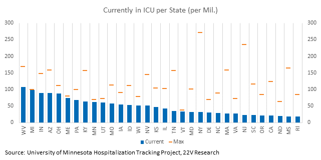
Yesterday we mentioned that case levels matter. The U.S. is heading into a possible omicron wave with more people currently hospitalized and in the ICU than in previous waves. And net hospitalizations and ICU admissions have both been increasing. Yesterday, New York temporarily halted elective surgeries at hospitals in areas with the worst growth rates (~30 hospitals, all upstate). That noted, most states are well below peak ICU usage hit during prior waves. Michigan is the lone state at its peak now. We include all the states we have data for in the third chart.

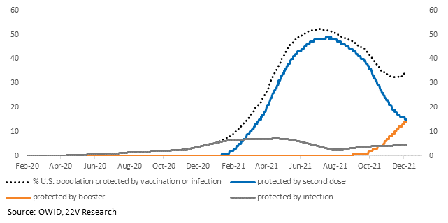
More people in the U.S. are vulnerable to infection now than before the Delta wave. Only 15% of the population have had their second dose in the past 6 months (after which efficacy wanes). 14% have had a booster. 5% have been infected in the past 6 months. That’s a total “protected” of 34%, much lower than 52% in July. This exercise (charted below) is NOT meant to reflect an exact number of those vulnerable to COVID. That would be false precision. This assumes no vaccine efficacy after 6 months, 100% efficacy before 6 months is up, and no reinfection risk within 6 months. We know these are unrealistic assumptions; the point is instead to compare this rough estimate to earlier in the pandemic to show susceptibility to infection is higher now, which we can conclude without getting too precise. This is not a great sign for case growth, which reinforces the importance of tracking severity instead.
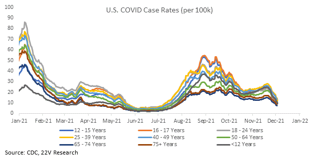
There isn’t anything alarming in the data for case growth rates or hospitalization rates in children. The latest week of data is the week including Thanksgiving, which made the data a little wonky, but there weren’t any concerning signs the prior week either.
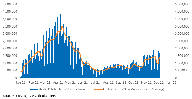
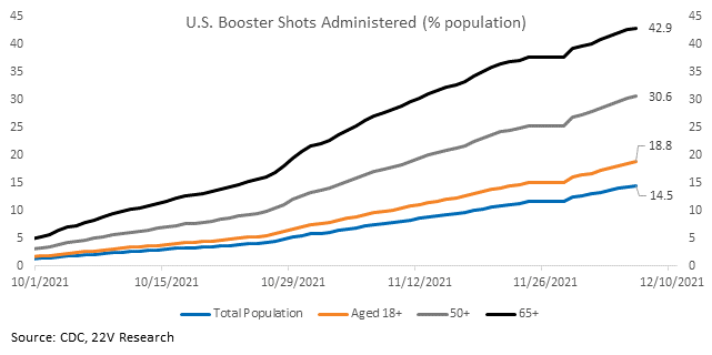
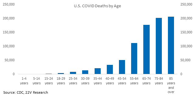
In a positive sign, vaccination rates are increasing. This is important as long as vaccines have some effect against omicron, particularly in preventing serious illness. 42% of those 65+ have received a booster. 75% of COVID deaths have been in those 65+.
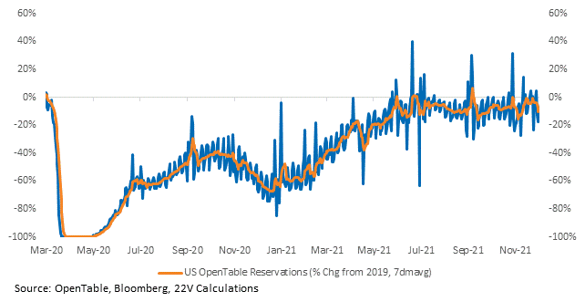
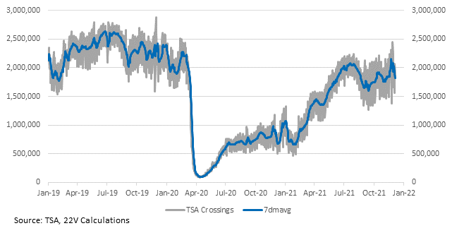
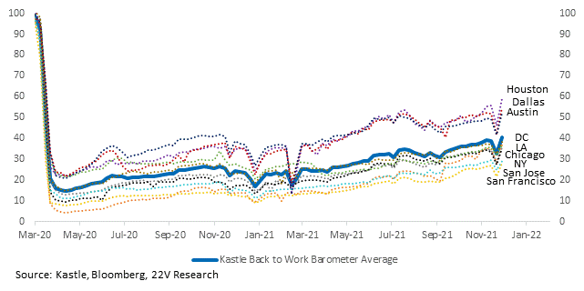
Apple mobility data is still high. OpenTable reservations have dropped a little. TSA crossings have fallen after reaching a post-pandemic high over Thanksgiving. Kastle’s back-to-work barometer shows more gradual progress towards normalcy, though levels remain well below pre-pandemic.
Charts for every state and country we have data for are HERE.

