High inflation and the Fed’s forceful pivot to fight upward pressure on prices have led to a rapid regime shift in risk assets. It is pretty well accepted that regime shifts happen and have a large impact on internals, but monitoring/defining periods tends to be a highly subjective, narrative-driven process. To systematize that process we built a Gaussian Mix Model (GMM) inspired by a Two Sigma paper (here) that assigns macro/market data into different Gaussian/Normal Distributions. With the mean and standard deviation of each distribution, it is easy to get the probability of current readings falling into each grouping.
The model classifies previous periods into four groups: Recession, Transition, Growth, and Normality. As inflation remains extremely high and the Fed is continuing to aggressively raise rates, the probability of a recession is also elevated. Our classification system currently puts the economy in “Transition”, a period that frequently ends in recession. Though only if unemployment starts moving meaningfully higher.

At the sector level, Materials, REITs, and Staples lead during Transitions sectors. In general, Defensives outperformed Cyclicals during Transitions, which is consistent with recent market trends. If a recession becomes the base case, which would happen if unemployment ratcheted higher, Defensives (especially Utilities and REITs) will face the greatest headwinds. That may be counter-intuitive, but is consistent with the market bottoming that tends to occur once a recession is clearly occurring.
At the factor level, Transitions have seen Low Volatility, Quality of Earnings, and Value factors outperform at the expense of Earnings Turbulence and Earnings Growth. Realized Value and Low Volatility have been the best performing factor this year, while Quality of Earnings was one of the worst performers. There should be some recovery of high quality names given how high recession risk is today. A catalyst for that rotation could be the upcoming reporting season, where misses and negative earnings revisions should increase.
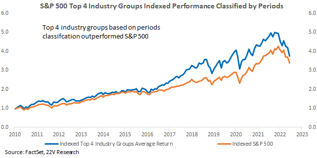
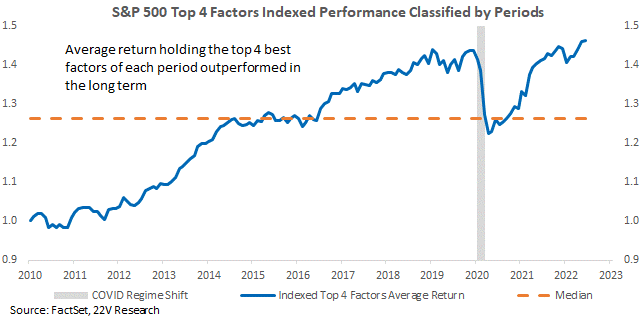
Factor and industry group return based on historical classification has been effective in return prediction. We back test the portfolios constructed by holding the top 4 factors or top 4 industry groups of each period based on the latest monthly classification at the end of each month, rebalancing monthly. Indexed factor portfolio gained for most periods, with only major decline happened around COVID. Index industry group portfolio outperformed the S&P, especially post 2016.
Objective Classification Methodology: High inflation and the Fed’s forceful pivot to fight upward pressure on prices has led to a rapid regime shift in risk assets. In a maker that is down ~-20%, Value has rallied 17% and Low Vol is up 12%, while Growth and Price Momentum are down -7%. It is pretty well accepted that regime shifts happen and have a large impact on internals, but monitoring/defining periods tends to be a highly subjective, narrative driven process. To systematize that process we built a Gaussian Mix Model (GMM) inspired by a Two Sigma paper (here) that assigns macro/market data into different Gaussian/Normal Distributions. With the mean and standard deviation of each distribution, it is easy to get the probability of current readings falling into each grouping. A chart illustrating the idea is below. The blue dots and red dots are classified into two clusters based on filtered GMM contour.
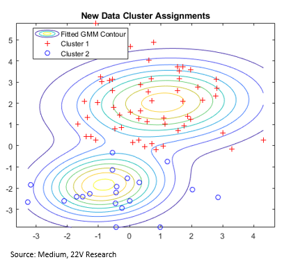
One potential problem for the model is that classifications can be influenced by the selection of the distribution center. An intuitive method that avoids the problem is to combine several GMM classification results together and define each dot with the majority model voting. Therefore, we apply ensemble based GMM methodology in “average”.
So, suppose M is a m*n data matrix, m is the number of months we try to classify, and n is the number of features selected for classification of each month. We first apply GMM method x times and generate x classification result, then compare the pairwise classification of all x classifications for each month and generate connectivity matrix for each pairwise comparison.
For x classification results, comparing them pairwise will result [x*(x-1)]/2 different results. An average connectivity matrix can be calculated by averaging all the matrix . Finally we use GMM on the matrix A for the ensembled result of classification.
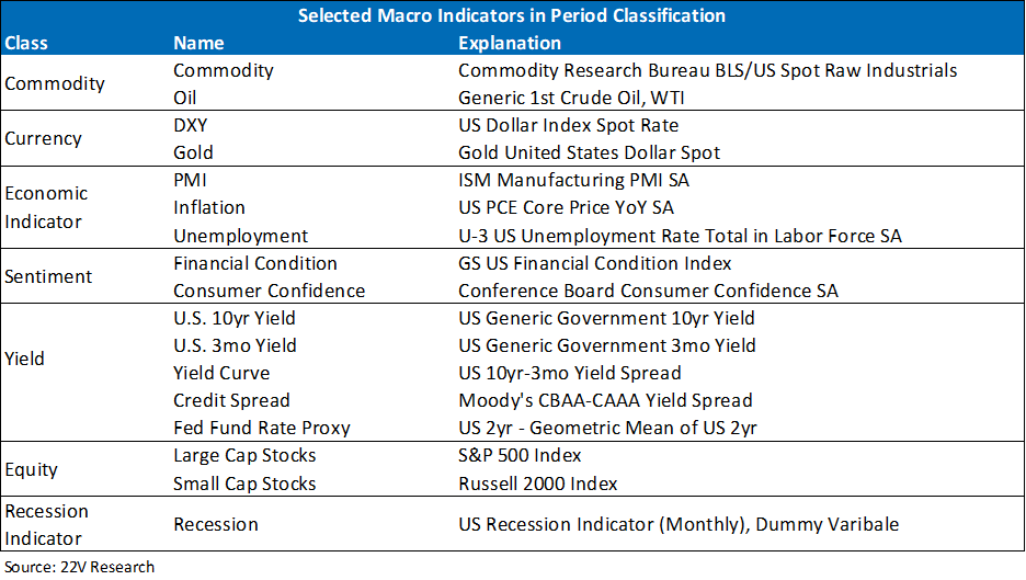
To feed to model, we selected the 17 most important macro indicators representing the status of the economy (the full list is listed below). The data starts in March of 1983 and are updated monthly. YoY changes are used as inputs to avoid volatility and influence from outliers.
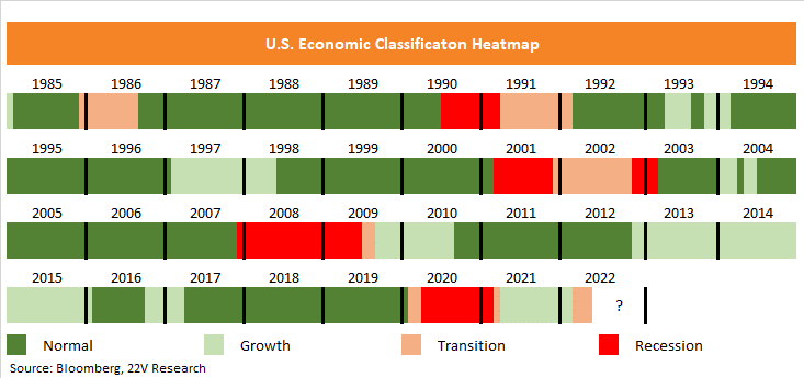
From Growth to Transition: A heatmap of the models classifications are listed below. There are four groups, which we named Normality, Growth, Transition, and Recession.
Recession: There were four periods labeled recession; 1990-1991, 2001-2003, 2008-2009, and 2020-2021, roughly in line with NBERs definitions. Recession periods are concentrated and happened periodically, accounting for 11% of all periods. During Recessions, consumer confidence dropped significantly, and yields declined as well.
Transition: There have been 6 Transition periods, making up 9% of all periods. Usually, transitions happen around Recessions, though there have been Transition events without recessions. That suggests short term volatility of macro backdrop can create periods where recession odds increase significantly WITHOUT triggering a large downturn. We are currently in a Transition period.
Growth: Growth periods account for 23% of total periods. Growth periods usually happen during Normality or after Transitions out of Recessions. The rotation also shows that the traditional economic cycle classification is dominated by shifts back and forth between Growth and Normality.
Normality: It is the most common classification, reflecting a relatively peaceful period without major macro changes. 57% of time, the economy falls into this period.
Looking at the S&P performance in NBER defined Recessions, we can see that our objective classification approach matches official recession well. The latest COVID recession was longer under our system compared to NBER’s methodology. Considering the volatility after the market selloff, it is reasonable to extend the Recession to reflect the uncertainty after that initial selloff. The recent elevated recession risk period is also reflected in the mode, classified as a shift from Growth to Transition (more detailed report here).
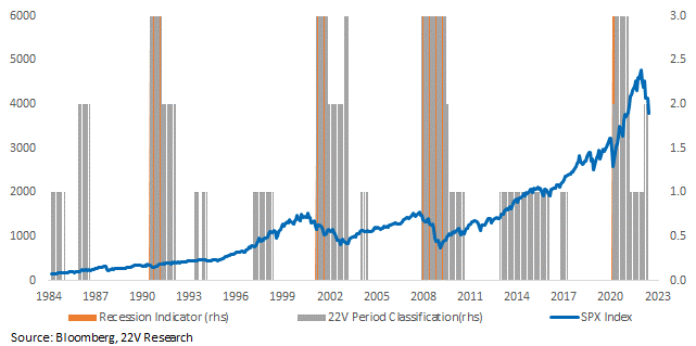
Characteristics for Different Periods: We care about market classification because market internals can be meaningfully different between regimes. Recession periods have a dramatically different macro backdrop with Consumer Confidence, yields, and inflation falling, and unemployment rising. During Transitions, yields and confidence fall, but employment remains steady. That result roughly maps to single-factor models like the Sahm Indicator.
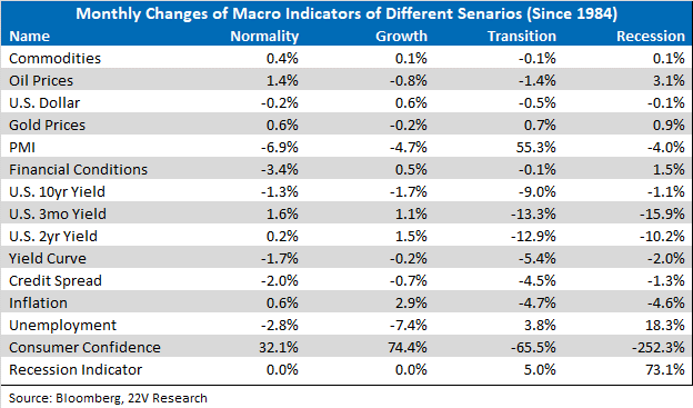
At the sector level, Materials, REITs, and Staples lead during Transitions sectors. In general, Defensives outperformed Cyclicals during Transitions, which is consistent with recent market trends. If a Recession becomes the base case, which would happen if unemployment ratcheted higher, Defensives (especially Utilities and REITs) will face the greatest headwinds. That may be counter-intuitive, but is consistent with the market bottoming that tends to occur once a recession is clearly occurring.
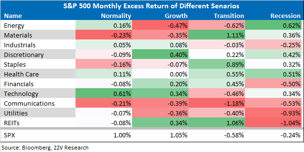
At the factor level, Transitions have seen Low Volatility, Quality of Earnings, and Value factors outperformed at the expense of Earnings Turbulence and Earnings Growth. Realized Value and Low Volatility have been the best performing factor this year, while Quality of Earnings was one of the worst performers. There should be some recovery of high quality names given how high recession risk is today. A catalyst for that rotation could be the upcoming reporting season, where misses and negative earnings revisions should increase.
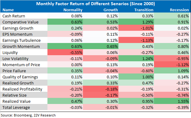
To apply period rotation and classification to portfolio construction, we back test a portfolio constructed by holding the top 4 factors of each period based on the latest monthly classification at the end of each month. The portfolio posted positive returns for most of periods. The only major decline happened around COVID, during which a major unpredictable regime shift happened.
Applying similar portfolio construction method on the S&P industry groups by holding the top 4 industry groups of similar classification periods based on current classification and rebalancing monthly. The portfolio outperformed the S&P 500, especially since 2016.