

I have noticed that both Bloomberg and the Wall Street Journal have — during the past two days — used the expression “powering through” to describe the behavior of the U.S. economy (or aggregate demand growth more specifically) in the wake of recent headwinds that could not possibly yet have shown up in the data. I will offer some criticism of the economics involved there in this note briefly below. But before I get to that, I just want to invoke yet again Amos Tversky’s warning about the lazy use of metaphors. Spending growth does not actually “power through” anything. And to speak of them doing so is just to signal that you have not bothered to ask what is driving the flow of data that you are observing – and whether it might be sustainable. That’s the tell that such comments should be taken only contrarily.
Tversky is best known for having collaborated with Daniel Kahneman who won the Nobel Prize for pioneering work in behavioral finance. And Tversky would probably have been tagged with him had he been alive when the Prize was awarded. Kahneman wrote a very popular book summarizing his main findings, some of which ended up not being replicable in fairness, called Thinking Fast and Slow. People too often apply fast thinking, which is basically a reliance on intuition or heuristics to cases where that is inappropriate. A baseball hitter needs to think fast after having put in his requisite 10,000 hours of training, although that number comes from another psychologist, not Kahneman or Tversky. But when assessing how the economy might respond to this or that headwind, it is better to think slow. (Kahneman’s grammatical slip there is intentional, I would guess. Thinking Quickly and Slowly does not roll off the tongue.)
One way to slow down is to rely on quantitative indicators or models that predate the question in hand – and therefore cannot sneak in fast thinking. And that brings me to the Fed’s measure of financial conditions, which is meant to assess the effect of changing asset prices on prospective aggregate demand growth. I have highlighted this metric often before, not always profitably, in fairness. And just to refresh, the index involves both a reporting lag and an implicit measurement lag. But we can easily get around this by observing where the metric would settle over the next three months if asset prices on the screens right now were to hold. A running history of that simulation is shown in the right panel of the chart below. And in the left panel, I show the official measure through August and then pencil into September the current simulated value. I think that is a fair depiction of the implications of today’s prices within the context of the Fed staffers’ approach. There remains a debate about whether we should look at the absolute value of the index or how it has changed recently. I would say the larger the influence of variables outside the index influencing growth, the more we should look at the recent change. But that is a discussion for another day, and one in which I would not be inclined to pound the table. I have my perspective.
The “shock” does not seem huge, but it is quite recent
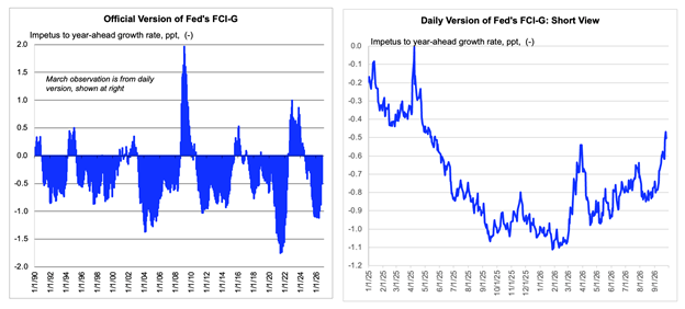
Data in the right panel are based on asset prices to the Friday close. The official version is monthly actual to August and simulated to September, by penciling the last value in the daily simulation, as discussed in the text.
Anyhow, what you might want here more than my opinion are the data. Since early in the year (roughly, given the smoothing involved in the official measure), the financial conditions index has tightened by about 60 basis points, from -1.1 (implying 1.1 ppts of impetus to year ahead growth) to -0.5, based on the prices on the screens at the close on Friday. And just over half that tightening has happened during the past month, as hinted at by the right panel in the chart. So, the idea that we know if the economy is “powering through” this headwind — or the one associated with higher petroleum product prices – should be taken contrarily, obviously. So, on the call Friday, I tried to be clear that I was putting my rates hawkish take into one of its many temporary retirements.
As mentioned, I tend to think that it is the change of financial conditions index that would in principle be the more informative. (An alternative take, which might be linked to the Laubach Williams I/S curve, might be that the current value of the index tells us whether growth would run above or below potential.) We know the change of the index recently, and then we can think of that as acting as a shock to what the recent data flow imply. I think the data flow imply that GDP growth has been running at a trend rate of around 2%. Final sales to private domestic purchasers, not shown, would imply a growth rate closer to 2 ½%. But keep in mind that this measure of “core” demand nets out the trend effect of the drag from net exports as well as the quarterly noise there. As a result, it systematically overcounts the effects of the hardware component of the AI boom, whose demand effects are almost entirely vented overseas.
I am not saying we should be long fixed income here. For me, that would be a heavy lift. But I am trying to hit singles here and not into double plays, (metaphor!), so I oscillate between emphasizing hawkish themes, without making a strong rates call, and then saying, yeah but maybe cool it for a bit here, partly out of respect for the admittedly fast idea that some of this repricing and sentiment change reflects an arbitrarily-timed toughening of Fed rhetoric. The Fed chairman might be wondering if folks are playing the ref, rather than the ball. Which reminds me: I am also inclined to take my own schadenfreude contrarily.
Maybe the shock is acting on a 2% demand growth baseline?
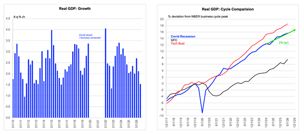
Data are actual to 2026 Q2 and FH estimate for Q3. The four quarter growth rate might be slightly depressed. The green line is the fit through the level over seven quarters ending in estimated 2026 Q3.

