

Main point: It is probably a bit misleading to observe that the ratio of business capital spending to GDP is almost as high now as it was during the 1990s tech boom. The capital stock growth rate and the flow of capital services are much more muted. This fits my thesis that the AI boom may eventually become dangerously overextended but that we do not appear to be quite there yet.
I suppose there may be good reason to fear that the AI buildout will morph into a bubble, followed by a crash in both related assets and economic activity. For example, we seem to have passed through the first two of the five phases of a bubble that Charles Kindleberger identified in Manias, Panics and Crashes. We have had the “displacement,” which is meant to radically change expectations, in this case in the form of a new General Purpose Technology (GPT). And now we are in the midst of the “expansion” phase, driven by aggressive capex among the hyperscalers and AI developers. And some might say we are now pushing into the “euphoria” phase, to be followed inevitably by “crisis” and “contagion.”[1]
The fact that the political system is now pushing capital market and banking system deregulation would seem also to fit the template. And that one of the supposed rationalizations for this is to allow the Fed to shrink its balance sheet, to reduce its “imprimatur” on the economy, is truly chef’s kiss. We can argue whether the MBS holdings have depressed mortgage yields by 20 or 40 basis points, but the idea that this represents a “distortion” that would rank even among the top 50 would not bear serious inspection. One of Kevin Warsh’s presumed objectives, according to a piece by Nick Timiraos in today’s WSJ is to pare back the Fed’s lender of last resort function. For a certain type of Wall Street “libertarian” that idea will appear attractive right up to the point it is relevant, and then we will all have to be practical. They may even pull Larry Summers out of ignominy to remind us that now is not the right time for morality tales, etc. etc. etc., as he did during the SVB shock.
It is not hard to be jaded about how this stuff works. But timing is important. And on the question of timing, I have been keen to emphasize a key distinction. There is a very good chance that the capital spending plans of the major players involve implausibly large outlays that would be very dangerous if implemented. But that is not to say that the current pace of activity involves a major overshoot, especially when taken at the macroeconomic level, as opposed to at the level of specific players involved. For example, the overall corporate sector as well as the hyperscalers remain in financial surplus (although much reduced in the case of the hyperscalers), which contrasts sharply with the corporate excess of the 90s bubble and the household excess of the housing / credit bubble. We are due for data through the first quarter, with the release of the Fed’s Financial Accounts later this month. But given the massive blowout of the fiscal deficit during Q1, it seems implausible that the financial position of either the household or corporate sectors has deteriorated.
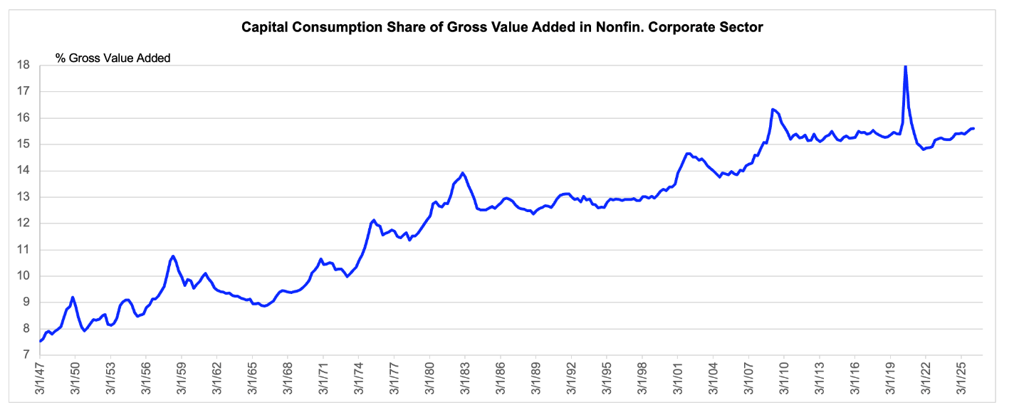
The wedge between gross and net capex has had a trend
Data are actual to 2026 Q1.
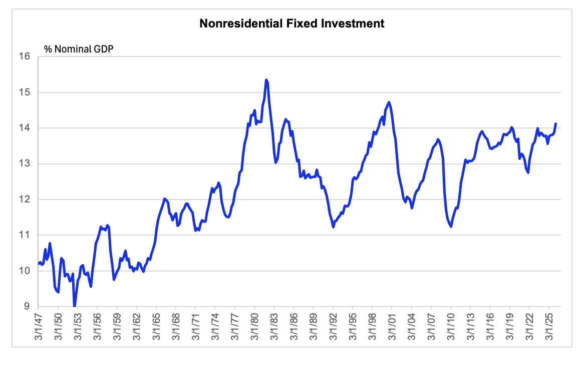
The best lens into the AI buildout is probably the company level data. But I watch the macro data as a cross check and to put the company level data, when I am aware of them, into historical context. And one point I have made is that the recent rise in the ratio of overall business investment to national income (measured by GDP) has not been dramatic in this episode. Along the way, I have mentioned breezily that it is probably the change rather than the level of the capital spending ratio that is relevant in this context, mainly because higher tech capital goods have relatively short lives, i.e., depreciate more quickly. For example, the depreciation share of gross value added in the nonfinancial corporate sector is twice what it was after the Second World War, although it is actually a sign of restraint (in aggregate) that it has not recently been surging. The working man’s way to deal with this is to watch the cyclical swing in the capital spending share rather than the absolute level. Accordingly, note in the chart below, the capital spending share today rivals that at the peak of the 1990s tech bubble (not relevant), but its inflection higher over the past few years is much smaller (more relevant).
The recent swing matters much more than the level here
Data are actual to 2026 Q1.
But this morning I noticed one of the columnists on Bloomberg invoking the level to suggest that we are in a period similar to that of 1990s (HERE). So, I figured it might be useful to be a bit less breezy about this and to actually run through the data, such as they are. Before doing this, I must be clear that the capital spending data can be a bit abstract and that we must recognize that the thing the statisticians are trying to measure here can in some cases be fuzzy. We know what a pound of potatoes or a pair of jeans are, but the stock of intellectual capital is a different beast. So, rather than pounding the table with the one top metric, it is probably more prudent to follow the balance of evidence or the “mosaic” approach, as the hedge funders call it.
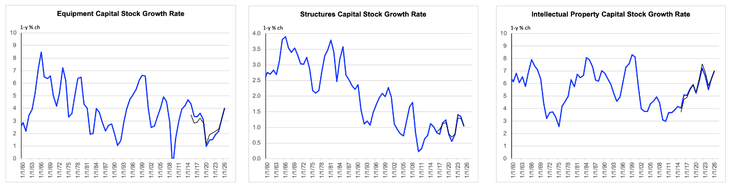
Three capital stock growth rates
Data are actual to 2024 and simulated to 2026 as described in the text.
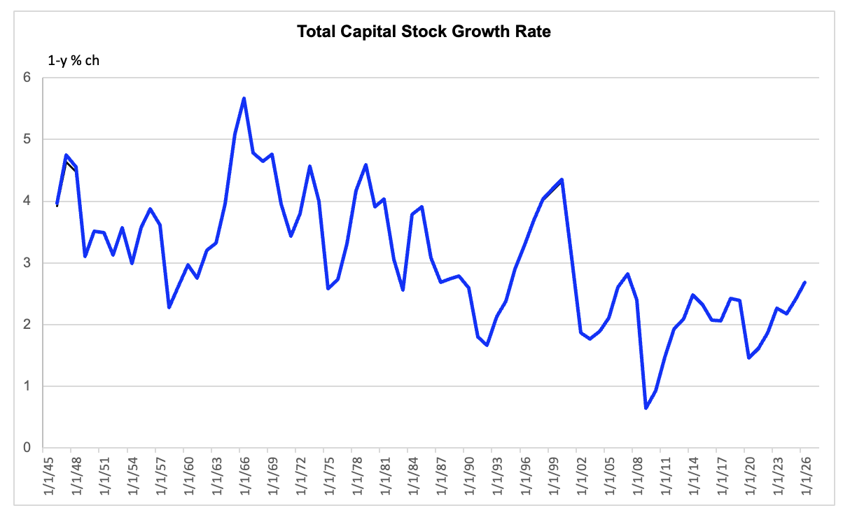
With that in mind, the chart above shows estimates of capital stock growth rates in equipment, structures and intellectual property through 2026. The charts incorporate formal data from the BEA through 2024. And I project them through 2026 based on gross capital spending through 2026 Q1, an extrapolation of the recent growth rate there through Q4, depreciation data through 2025 and an estimate for 2026. The thin black lines just show the correlation between my proxy of the capital stock growth rate and the official data, where both are available, i.e., up to 2024. Long story short, I should be pretty close to what the official government data will ultimately show through 2026, although we can argue about the merits of these data. Remember the mosaic! As you can see, the rate of growth of the equipment capital stock is no longer depressed – as it was at the last time I did this update a couple years ago. But nor does it compare with that of the 1990s boom. The structures capital stock is growing at a depressed rate, which I assume is known. And the intellectual property capital stock, dominated by software and the output of corporate R&D, is at the top of the historical range, although not well above it. The sum of these three times, shown in the chart below, is growing at a moderately slow pace, although it is no longer fair to say it is depressed.
A proxy of the aggregate nonresidential capital stock growth rate
Data are actual to 2024 and simulated to 2026 as described in the text.
The capital stock data certainly beat nominal investment (as a ratio to GDP) as a measure of whether capital spending is in aggregate dangerously overextended. But a major weakness with these aggregates is that they sum up apples and oranges, certainly at the level of the overall capital stock, but also at the first level of disaggregation, across equipment, structures and intellectual property. The conventional way to get around this issue is to measure the flow of capital services, which weights each specific capital item by its rental cost, which is meant to be a measure of its marginal productivity. The rental price is a function of depreciation, the opportunity cost of financial capital, and tax effects. Here be dangerous abstraction, admittedly. And I am particularly nervous about how the opportunity cost figures may have fallen in recent quarters – and may eventually need to look into that. But for whatever these data are worth, they show no dangerous acceleration of what we might call investment effort over this current cyclical episode. Certainly, there is no comparison with the 1990s boom. Incidentally, these data are from the CBO which in February updated its estimates through 2025 and projections through 2036. But I show the projection only 2026 because I want to allow an obvious comparison with the capital stock data themselves. Unsurprisingly, these two metrics are correlated.
If capex growth ends up slightly stronger than the CBO has assumed, then the capital flow estimate for 2026 might be slightly too low. But the sensitivity of the aggregate capital services flow to misses in capital spending growth is initially very low – because it is the integral or area under the curve that matters most in this context. It does not matter, then, that these CBO estimates are slightly stale. The bigger issue is that they do in fact measure an abstraction, in fairness.
The flow of real capital services has no comparison with the 90s
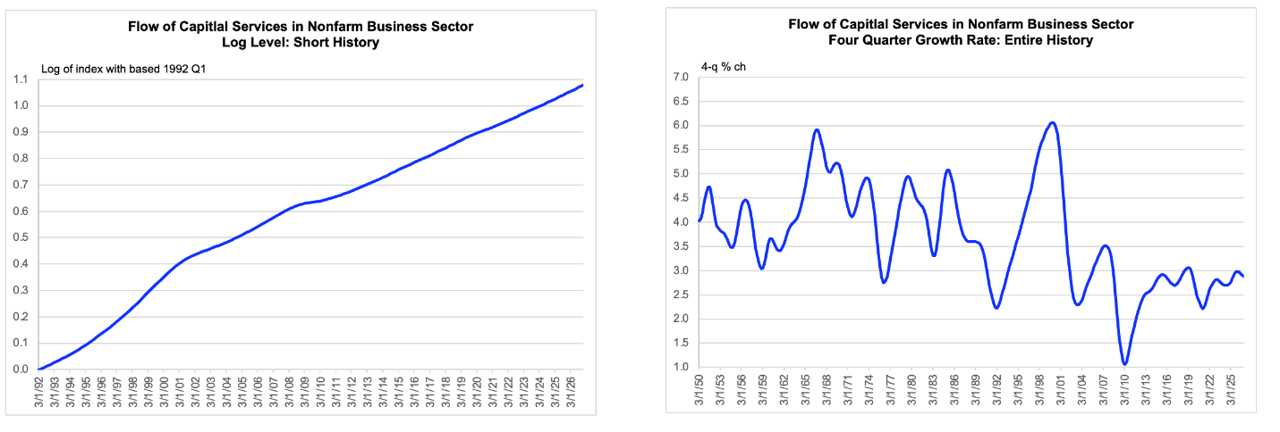
Data are actual to 2024, CBO estimate for 2025 and projection for 2026.
[1] The displacement need not be a General Purpose Technology, although that was the case during the 1990s, with the laser / integrated circuit buildout, and it is arguably the case now with the AI buildout. A fun (unless you were there) counterexample was the displacement behind the housing and housing credit bubble, which I would say was the surge of surplus global savings into US capital markets during the mid-2000s. That reduced real interest rate relative to income growth prospects and generated fundamental upward pressure on long-duration asset prices, such as housing, and was ultimately extrapolated into euphoria and crisis, to use the language of MP&C.

