

After the release of the first look at GDP for the third quarter, I mentioned that its implication for productivity growth was even stronger than I imagined might be the case based on the consensus ahead of the release. The reason is that GDP beat the screen consensus. And nonfarm business output, the denominator in the productivity calculation, was up a stunning 5.4% (ar), even though the most recent employment report suggested there was no increase in private nonfarm aggregate hours worked during the quarter. (Labor input looks stronger in Q4.)
The productivity guess is a bit more complicated than my simple analysis implies. But I figured it might be better to be early than precise, and I mentioned that I would return to this issue once analysts had produced more careful analysis. Today, I notice that the Bloomberg consensus has populated and that the median guess is a rise of 4.8%, which is close enough. Moreover, the top guesser, Mike Feroli at JPM, has penciled in a gain of 6.1% (ar). So, yes, productivity appeared to have soared during the third quarter, after an-almost-as-strong showing during Q2. And a reasonable guess for unit labor costs is that they were down about 1% (ar) during Q3, although the screen consensus has them up marginally.
These numbers may sound familiar to you and much of this note repeats points I have made earlier. But now that I see there are unlikely to have been special factors distorting Q3, I want to spend a bit of time on the implications. The first practical point to make about this is that we ought not rely on strong productivity growth to set our minds at ease when the employment data look weak. The employment data are typically released well ahead of the GDP bean counts converging on a particular pace for the quarter. And it would be ignoring useful information about the state of the cycle to dismiss weakness on the employment side as not a worry because it will be reflected in strong productivity. Separately, the propensity to spend out of labor income is probably higher than that out of profits. On the other hand, we can now take it as a fact – so far as facts exist in macro – that the employment weakness of recent months has not been reflected in slowing output growth. Those who insist that productivity is just the residual at short horizons would seem to be right. But the residual ended up being friendly during the third quarter, just as a matter of backward-looking fact.
Hard data on ULCs (and prices) just for the record, although they cannot tell us much about the trend
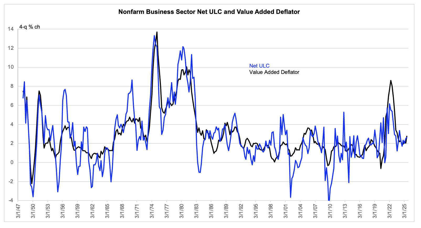
The value added deflator is actual to Q3. ULCs are actual — although adjusted to Q2 — and estimated for Q3.
We cannot rely on the reported trend in unit labor costs (ULCs) as a measure of underlying labor cost pressure, because ULC growth is very noisy, even when taken as a 4-quarter rate, as in the chart above. But if the core ECI suggests that underlying Average Hourly Compensation (AHC) growth is running at about 4%, and if we believe that the trend in productivity is running in a range of 1 ½ to 2%, then we might say that underlying ULC growth is running in a range of 2 to 2 ½%.
Separate from that debate about what the trend in labor cost growth might be, we can assign some significance to the ratio of unit labor costs to output prices taken in level terms. That ratio is an index of the labor share, as you can see by multiplying both the numerator and denominator by real output. And when the ratio is low, we know that at least in level terms labor costs are not putting upward pressure on prices – unless tech or market structure change implies an abrupt decline of the structural labor share, which is unlikely if not impossible. And separately, just a matter of accounting, we know that a low labor share favors higher profit margins. These are two sides of the same coin, and which side we choose to emphasize depends on which question we are trying to answer.
Labor share at or near record low during Q3
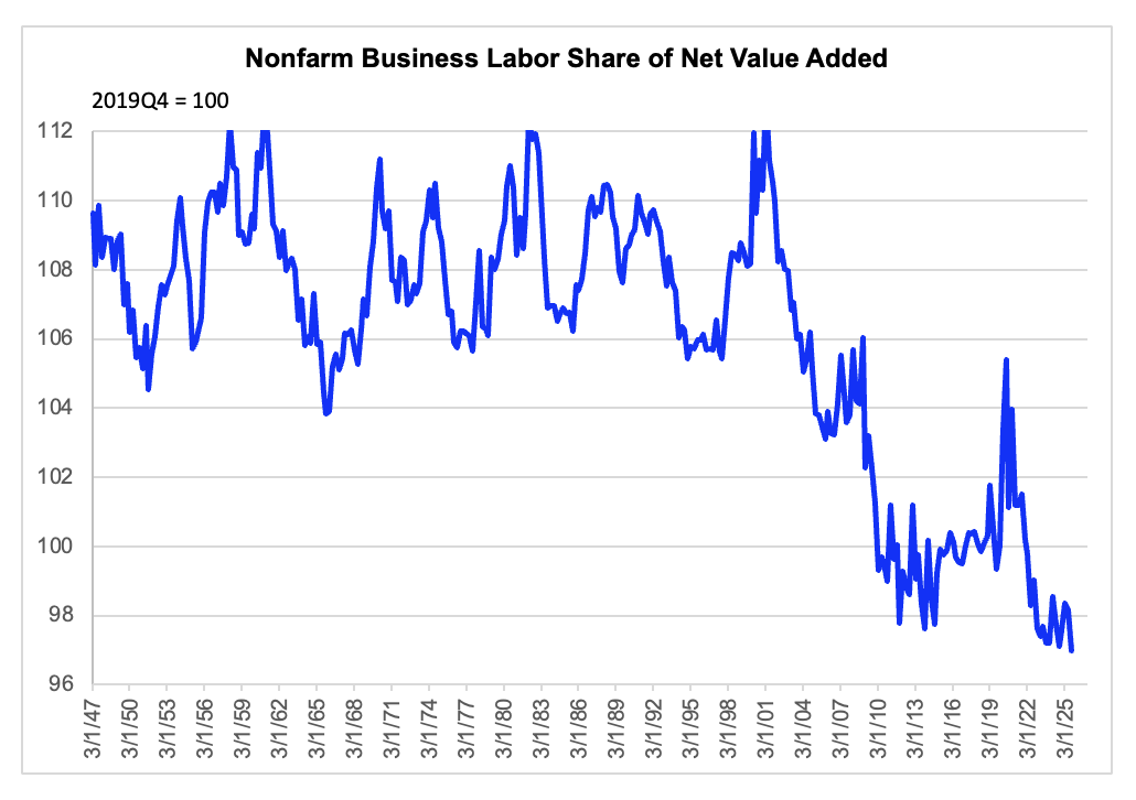
Data are actual to Q2, although adjusted for expected revision, and estimated to Q3.
The ratio of ULC to value added deflator is an index of the labor share.
The question of what the underlying trend in productivity growth might be is again a largely separate one. In the chart below, I show what I take to be a fair depiction of how the fully revised productivity data will ultimately print, once the employment revisions flagged by the QCEW are officially mapped into the productivity figures – in a few months. I also pencil in flat productivity during the fourth quarter, based on the consensus view that the GDP will be up only 1%, although that is probably conservative. I have been eyeballing a 2% productivity growth trend since the Covid shock. And the trend over the 13 quarters since the second quarter of 2022, shown with the red splash is about 30 bps stronger still. But I have been hesitant to incorporate that trend as the structural one, because I have suspected that part of the productivity pulse has been related to one-off gains following the Covid shock. Pressured business might in a pinch move closer to best practice or the production possibility frontier, as the jargon might put it. That would be different from the frontier itself accelerating its move outward.
But in fairness, who knows? Productivity is really hard to forecast and a lot of us probably compensate for that with a conservatism bias, anchoring on the longer-term trend. What we can say is that the data recently have tended to strengthen the hands of the optimists. Maybe the economy can grow at a decent pace without much labor input growth, although – to repeat – that does not mean we should just abandon watching the labor indicators as measure of the state of the business cycle.
Eyeballing, which is admittedly not reliable, suggests 2% +
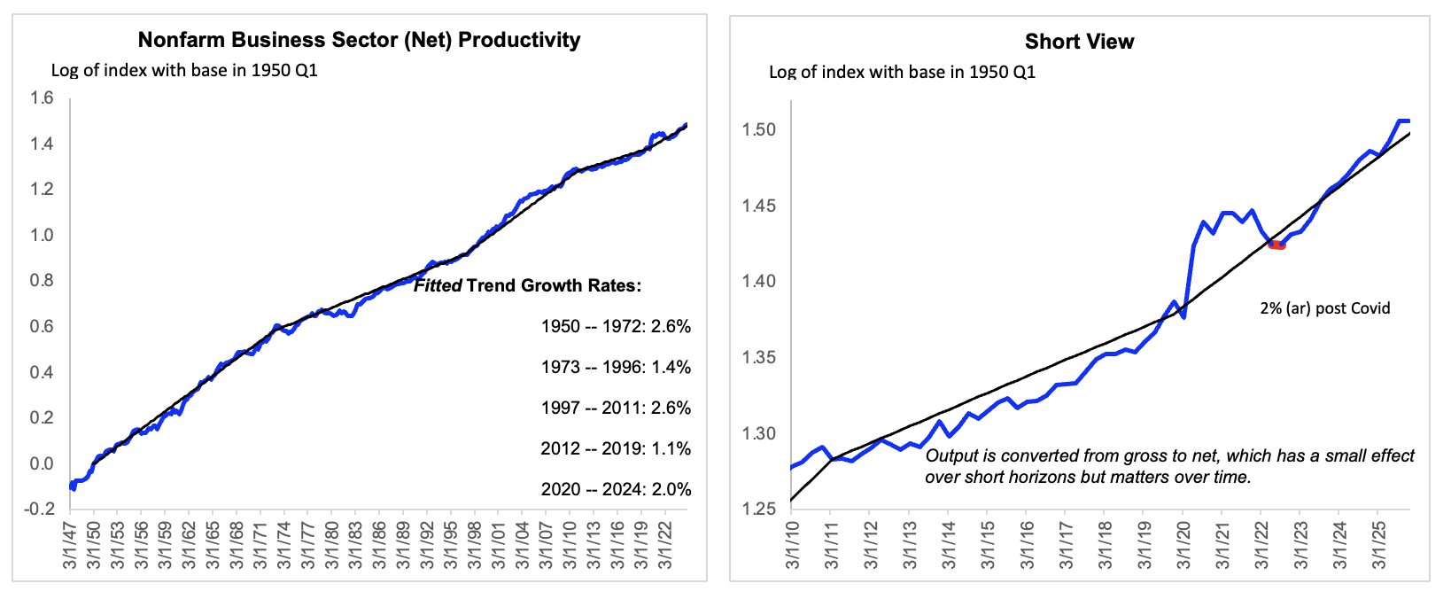
Data are actual to Q2, although adjusted for likely revisions to labor input and estimated to Q3 and Q4. The red splash in the right panel indicates 2022 Q2, thirteen quarters ago.

