

The main theme from last week’s FOMC meeting was that the Fed’s perception of the risks had shifted from roughly symmetrical to a heightened concern over employment relative to inflation. That was made obvious in the Press Release in a few different ways. And in the Press Conference Chair Powell mentioned that the shift reflected movements on both sides of the mandate. The outlook for employment had become more worrisome and the risks around inflation seemed to have dissipated somewhat. His comments on the inflation risk struck me as important because he had earlier seemed to read the very recent inflation data too hawkishly. To his credit, that mistake did not have any practical implication.
Focusing exclusively on the employment side, I viewed Powell as coming to Jesus on a factual matter. He had for a while been characterizing the risks around employment as tilted to the downside, which was obviously a judgment call, although a plausible one. But what was new for him was his recognition (as I would put it) that actual employment growth had slowed below the pace of even the sharply reduced breakeven employment growth. I repeat below what I take to be the money chart on this point. I get my estimate of breakeven employment growth from Wendy Edelberg’s work, the results of which Powell explicitly endorsed during the Press Conference, although without identifying her by name. (Edelberg is not the only one with these figures.)
And my trailing employment growth figure is corrected for the likely 800k downward revision of employment from April 2024 to March 2025, and then my estimate that monthly employment growth since March has been overstated by 40k a month. I apply that adjustment to August, even though there is an hypothesis circulating that August in particular might get revised up. My adjustments here are not rocket science but I suspect they will strike you as unbiased at least.
I revised the estimated revision through March 2025 to be slightly more extreme
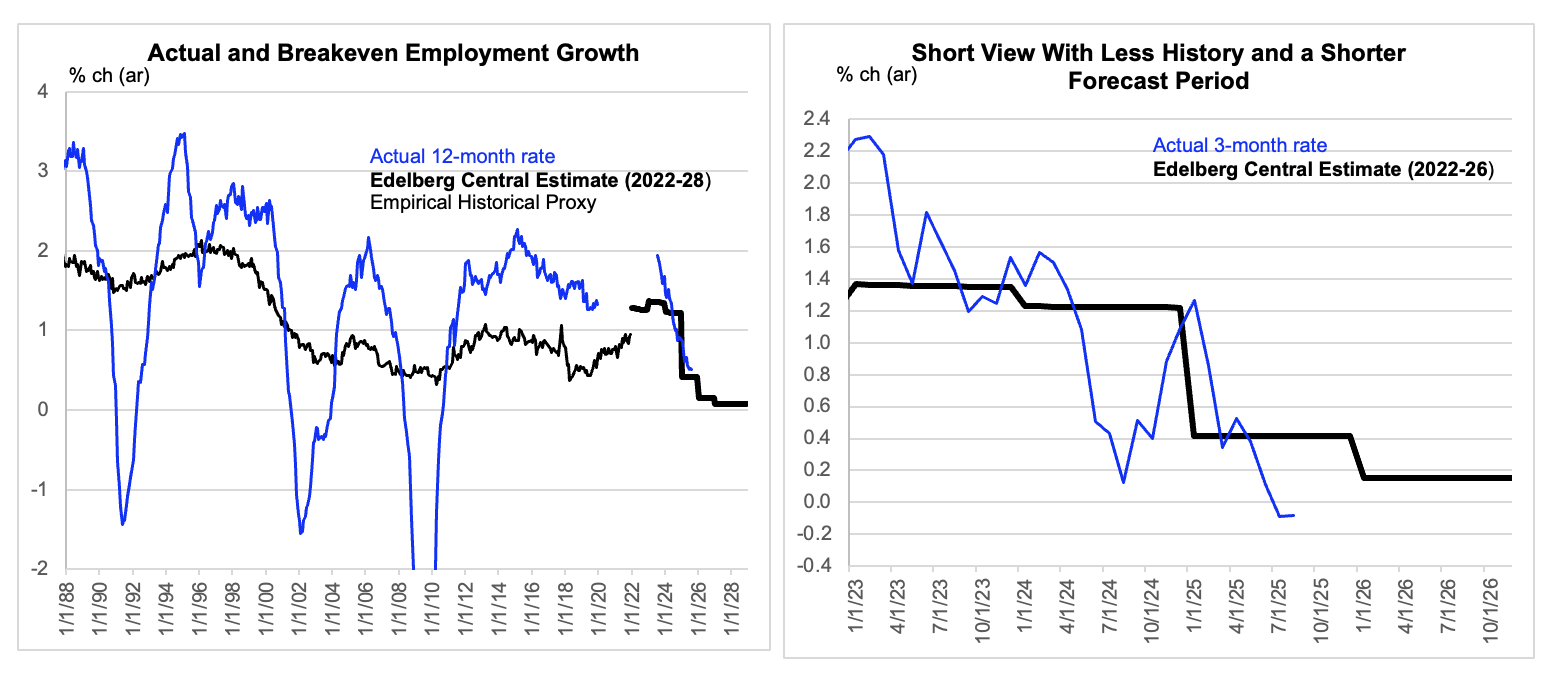
Data are actual to August and include some “corrections” described in the text.
So, yes, recent employment growth has dipped below the breakeven, which would seem to fit with the employment / population ratio trending a bit lower for the past several months. This is not so obvious in the so-called prime age data, which people like to look at because it is less affected by demographic trends, such as the aging of the boomers and older Xers. However, I don’t think it is prudent to just ignore non-prime workers. So, I look at the overall employment / population ratio adjusted for estimated demographic effects, which seems fairer. And if I took that figure at face value, I would claim that employment growth has dropped far below breakeven. So, I am spotting some of the argument to the ageists. 😀[1]
Slowing employment growth and the risks around a further slowing are highly relevant. So, I do not want to present what comes below as a yeah but. Rather, I think it might be helpful to complete the picture here with a brief review of how personal income trends have been tracking. And one motivation for doing this involves those expected downward revisions to employment growth. This year as last, it looks like the downward revision to employment growth signaled by an expert interpretation of the QCEW does not map to a reduction of labor income. This year as last, they seem likely to find a longer workweek or higher average wages to offset to job estimate reductions. At least that is the case for the period through March 2025. And if I were to overlay the effects of my guesstimate that current employment growth is overstated by 40k jobs a month, with no offsets elsewhere in wages or the workweek, that would be worth only 30 bps on labor income growth and less than 20 on total personal income growth.
The chart above pictures various slices of income through July. My bold inference is that personal income growth has been trending at 5% (ar) sequential in recent months. We will see what the August data being released later this week will show. What we do know is that the labor income proxy from the August employment report did not itself imply that the labor income component is about to collapse. But there is room for slippage between the teacup and lip there.
I do not want to lose you with a bunch of mind numbing detail about the various slices. I would just point out that the effective tax rate has been edging up in recent months, which has driven a minor wedge between pre-tax and after-tax income growth. And to the extent this reflects capital gains, it might incline us to look at the slightly stronger pre tax figures. But the stronger point here is that this effect has been small and no big deal either way.
The more important source of noise in pre-tax income was a big spike in social security payments during April, which creates a late spring pothole in total income and core income that we don’t see in wage and salary income. But if we look past that and observe a trend line with a begin and end period well straddling April we see that the trend is that 5%.
We can convert this to real by deflating with our favorite price index. But I think that approach would just add to the noise, because headline inflation is very noisy on a month-to-month basis. Instead, let’s just chop off 2 ¾% for our sense of true inflation in the current environment. That leaves us with 2 ¼% real, or just over 2% if you want to assume the downward revision I mentioned above. Not boom, but not bust either.
The data seem to want to say 5%
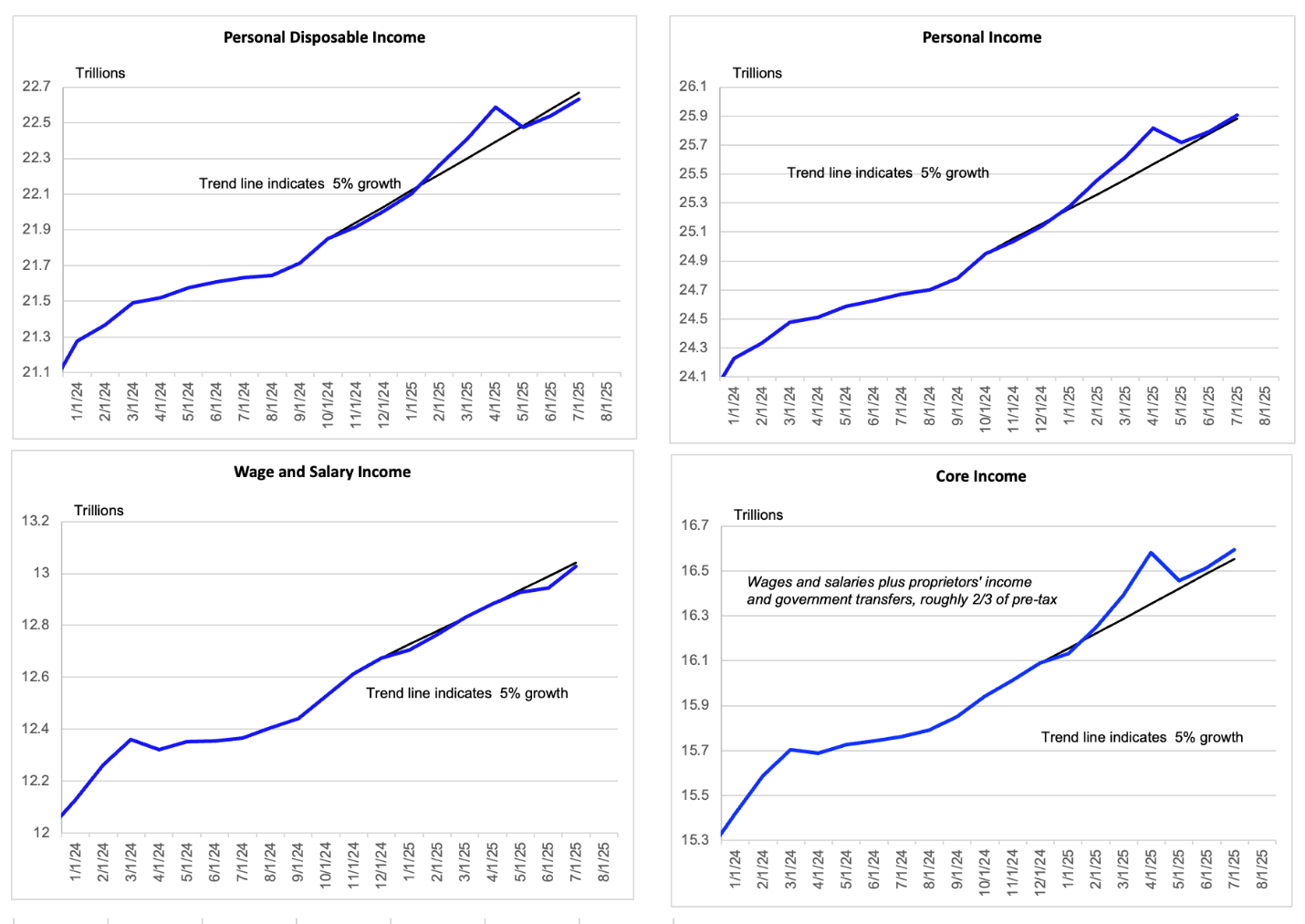
Data are actual to July.
NB: In my view the definition of core income is context dependent. In the current context, I want to include transfers, because unlike post GFC or post-Covid we are not dealing with wild volatility in various forms of government transfers. People do spend their social security checks and public medical insurance payments.
One final thought. I continue to believe that obsessing over the personal saving rate is not a great use of time. As measured, which is unreliably, the ex-post value has been stable at a level that is arguably above what is implied the level of household sector wealth relative to income. I mention this not to insist that we know what the personal saving rate should be. Rather, the point is that we don’t. If we could identify a bubble of some sort then we might say that pressure on it might soon emerge. But pronouncing consumers “wrong” in the choice they make about how much to save does not seem like best practice. I don’t ask you to believe me on much. But we ain’t that smart. Believe me.
Reported saving rate has settled to a slightly lower level post-Covid
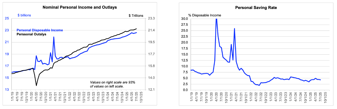
Data are actual to July.
[1] I had earlier been working with a 650k downward revision in the year ending March 2025, but the informed consensus seems to have updated on this point recently.

