

This note follows up on my budget deficit simulations from yesterday to discuss briefly how the rising federal debt / GDP ratio is likely to affect the term premium at, say, the 10-year maturity, and through that channel the slope of the yield curve.
I draw one conclusion and reiterate a point of context. The conclusion is that most of the predictable effect on the term premium now seems to be in the market, although gun to head supply considerations make me more inclined to extrapolate than to expect a correction lower. Don’t think of the steeper curve as being largely about a fiscal premium, although that may be coming at some point.
The context is that the rising debt — and increasing difficulty in absorbing an incremental unit of duration associated with it — meant that we should have generally favored steepeners over the past few years. However, at high frequencies, changes in the slope of the yield curve tend to be driven much more by business cycle and monetary policy considerations. This does not mean that yield curve traders should ignore those influences, obviously. It is just that they are important confounding factors. The effects of the structural steepening influences snuck up on us while we were focused on other issues. And I would claim that they have in some cases been mistaken for fiscal worries.
Before turning to the supply issue, I want to return to my deficit projections – or, more fairly, simulations – from yesterday. Away from r* vs g*, which is really the metric to watch when thinking about sustainability, the key input there was a guess at the primary balance. I assumed a steady 4% of GDP deficit in an effort to extrapolate recent conditions.
But in response to some sobering commentary around the budget bill currently working its way through the house, I figured it might be prudent to sharpen the pencil there a bit. I notice the Penn-Wharton (P-W) Budget model, updated two days ago, has the GOP bill raising the primary deficit relative to current law by 610 billion in 2026, followed by a gradual fade of the incremental effect there. (See Table 1 here.) The Yale Budget Lab seems to provide less detail in their analysis, but I notice that they score the 10-year effect on the debt in the same way that Penn-Wharton does, so I assume they are close on the primary budget for 2026. These analyses are designed to assess the legislative changes, so their scoring emphasized that. But a good proxy of the primary budget balance under current law is the CBO’s estimate from January, where they put the 2026 estimate at $703 billion. Adding the P-W shock to the CBO baseline implied a primary deficit of $1.3 Trillion or 4.1% of estimated 2026 GDP.
Influence on the curve
Ok, so how might this debt supply affect the slope of the yield curve? The first point to make here is that the main channel operating on the curve is conventionally assumed to operate through the supply of default-free duration to be taken down by the private sector. And I see no reason to challenge that framework. The more duration risk to be taken down, the greater the compensation that the market will require for taking it down. And that compensation is basically defined as the term premium, although estimates to estimate it are notoriously fraught. The term premium has nothing to do with default risk, although default risk might creep in at some point, which would be a major problem.
The supply of duration hitting the market is going to continue soaring over the coming years if the apparent preferences of policy makers are acted on. The debt might not rise at the 4 percentage points of GDP per year that I simulate. Concerns about sustainability might generate a market reaction that would prevent that. But until we get actual strains in the market and a fiscal consolidation effort, 4 ppts a year seems like a reasonable number to work with. And it implies a lot of duration.
And there are good reasons to suspect that this duration might be increasingly difficult to take down, even on a per unit (say, 10-year equivalent) basis. And no, the main reason for this is not that the Fed is doing QT. The importance of oscillations between QE and QT over the years has been radically overstated by officialdom, which until recently met a gullible audience among market analysts if not market price setters. The issue rather is duration risk is no longer diversifying within the typical portfolio, which means that the excess return to stuffing portfolios full of it must be higher than when duration risk was diversifying. Moreover, bond yield volatility is higher, both because we have come off the zero bound and because we now have the novel issue of uncertainty around the longer-term inflation outlook. On both grounds, taking down an additional $ trillion of 10-year equivalents is now just more difficult.
Could be fire, ice is gone

Source: Federal Reserve Bank of St. Louis (FRED), FH calculations
Data are weekly and to the close Friday.
Vol and correlation
I am not going to beat the conventional take on interest rate volatility. If you have a Bloomberg, you can take a look at the MOVE index or whichever measure of Swaption vol you would like. I would just point out that it is bp vol that matters here, because price and return vol are proportional with it. And these metrics suggest that volatility tends now to be about twice as high as it was during the aftermath of the GFC. The zero bound on rates caused low vol, a benign stock-bond correlation, and QE. The first two explain why the term premium fell and the Fed saw it in their interest to say it was QE, which folks initially bought, humorously, IMV.
The stock-bond correlation is more interesting and admittedly more ambiguous for a reason I will get to in a moment. I would love to see a derivative measuring the market’s best guess of the correlation over time, and if you know of such a beast, please do feel free to share! But we suspect that the market might even pay a premium to obtain duration risk if if it is sufficiently diversifying and if duration risk (supply times vol) is scarce enough. And even where duration risk is abundant, it is more easily taken down if diversifying.
The chart above shows a moving correlation of one-week price returns in the S&P500 and 10-year Treasury based on par yield curve rates published by the Fed. The observations are weighted so that recent price changes loom larger in the calculation, which has the convenient effect of eliminating base effects when comparisons roll out of the calculation. Before they roll out, their relevance fades, geometrically. Anyhow, the point of the chart is not to encourage you to look at the recent observation. That is my story, and I am sticking with it! Rather, my claim is that there are different correlation regimes associated with different economic regimes. When deficient demand is the worry, as at the zero bound, the correlation will be “ice,” which is benign. And when inflation is the worry and yields have plenty of room to move (adversely), the correlation is “fire.” I am not sure we are in a fire regime. But I propose for your consideration that we are no longer ice, and for reasons that I assume are obvious. More to the point, this matters a hell of a lot more than QE. Still, I can’t help speculating on that recent dip. I wonder if that is recession risk creeping in. If so, it would be non-benign for the term premium curve through a different channel, unless it is temporary.
Quantification? Land shark!
Ok, so is it in the price? To do this “right” we would need a reliable estimate of the term premium, a mapping of the debt path to the path of 10-year equivalents, and model measuring the effects of shifting bond volatility and return correlation. Definitely, I am not going to do this “right,” because I am a big picture guy who tries to identify relevant influences and get the signs on them right, mostly through navel gazing. Some of my competitors are much more advanced in being precisely wrong. See, for example, almost all research published on QE during the 2010s and then quietly dropped recently.
What we can say is that two prominent measures of the term premium a the 10-year maturity have recently rebounded from reasonably decently negative values in the wake of the GFC and pre-Covid shock. The ACM term premium fits my own story best, in the sense that it showed zero reaction to the end of QE or the approach of QT and arguably continued sinking as markets basically just – appropriately – gave up listening to the QT boys crying wolf. But at -125 basis points it was far too low for an environment of surging debt supply, higher rates vol and a shift in correlation towards “ice.” So, it makes sense that it has risen the 200 basis points that takes it comfortably into positive territory.
The Kim-Wright premium is less volatile and fits my story less well. It is driven by comparing yields with consensus guesses of the funds path, while the ACM premium is estimated by comparing various principal components of the yield curve with subsequent excess returns. The two now have roughly the same value, although the K-W is available only to May 9. And they both look similar relative to their own history, no longer depressed but not particularly high either. I would say that the easy call is over but that there is room above. And as usual, the main point of this note is mainly to get at qualitative issues anyway.
For what it is worth
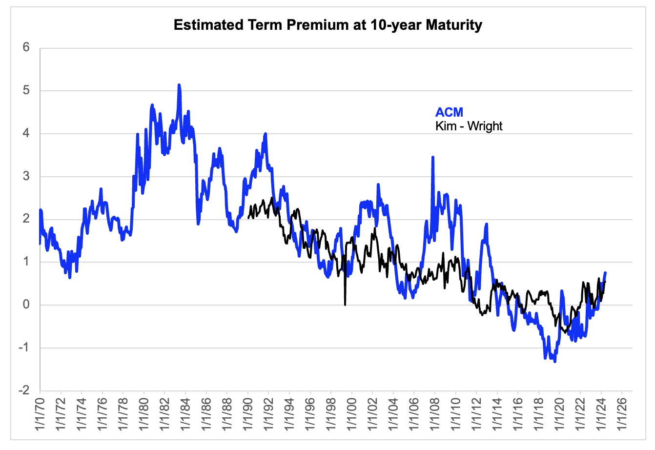
Source: Federal Reserve Bank of New York and St. Louis (FRED)
Data are month-end except for final observations, which are Monday for the ACM and May 9 for K-W.

