

Real PCE grew at an above-potential pace of 3.2% (ar) during the middle two quarters of this year. The data through October, published on Wednesday, suggest that spending moderated during the current quarter. But assuming that financial conditions were to remain where they are, consistent with the Fed cutting as expected, the slowdown would not likely take real PCE growth much below potential – of around 2 ½%.[1]
Consumer spending growth has apparently cooled slightly

Source: BEA, FH calculations and estimate
Data are actual to Q3 and FH estimate to Q4.
From the perspective of risk asset markets, it may be more to the point that the household sector is financially healthy in aggregate and that the odds are against a sudden landslide of labor demand. So, if I am overestimating the consumer, then the implication would more likely be greater Fed ease (unless tariffs intrude) than consumption stumbling into a prolonged period of weakness. The equity market faces some obvious risks, as always, but the prospect of the household sector autonomously folding does not rank among them.
This note documents that the underlying trend of personal income growth is strong enough to support this constructive view of consumer spending. But before turning to that, it might be good to remind ourselves that reasoning from the recent pace of income growth might not be the best way of thinking about the outlook for consumption — because income growth is endogenous to the broader business cycle.
The main reason to be upbeat on the consumer is that household balance sheets are strong, consumer credit growth is moderate, credit availability is not tightening, and there is no reason to expect a rise of the desired saving rate. So, the household sector can probably be relied upon to recycle its income growth into aggregate demand growth – without any need for a nudge from easier financial conditions. And as mentioned, the odds are against the sector suffering a negative income shock from a sudden rightsizing of employment.
That is the argument. But I will not demonstrate its main points here, because I tend to update these stories when the data related to them become available. For example, the release later this month of the US Financial Accounts for the third quarter will allow me to update my measures of the wealth effect, mortgage equity withdrawal, and the related credit impulse within the household sector. For now, I would just point out that wealth effects are probably delivering the strongest or nearly the strongest impetus for the past century. The 4-, 8- and 16-quarter wealth changes (relative to income) all imply as much. We can argue about what spending coefficients to place on those wealth gains. But the idea that wealth gains have been historically rapid is not sensitive to the choice of the rolling windows over which we measure those wealth gains.
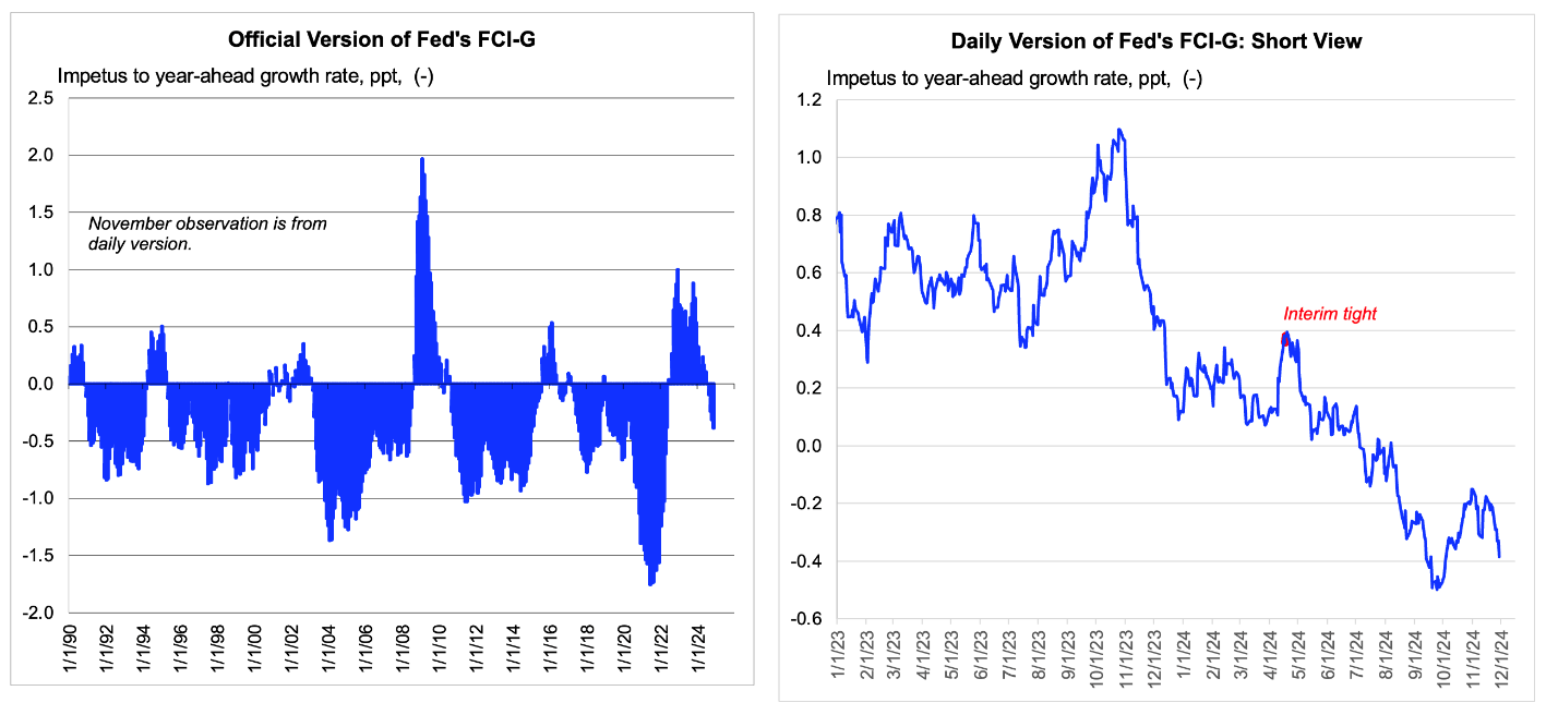
Equities have been the main driver of the recent ease here
Source: Federal Reserve, Bloomberg, Federal Reserve Bank of St. Louis (FRED), FH calculations
The Fed’s official version, which is at monthly frequency, is actual to October. The daily version reflects pricing to the Friday close, and its latest value penciled in as the November reading of the official index.
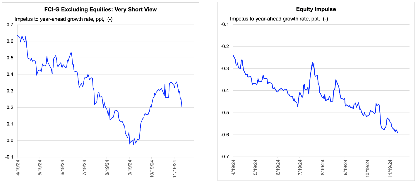
The impetus from the stock market is being reflected in conventional measures of financial conditions. For example, my daily version of the Fed’s financial conditions index, FCI-G, shows an easing of 79 basis points since mid-April, just before the inflation data turned friendly. The equity impulse alone accounts for 35 basis points of this move. And if we shift our focus from the change to the absolute influence of financial conditions, we see that more than all the net impetus to demand growth from financial conditions, as measured by the Fed, can be attributed to the equity market.
In absolute terms, equities explain more than all the net impetus
Source: Bloomberg, Federal Reserve Bank of St. Louis (FRED), FH calculations
Pricing is to the Friday close.
Before leaving this issue of the equity impulse I want to point out a minor quirk in how that impulse is measured. Within the Fed’s model, the impetus from equities is related to (various lags of) the percent change of the relevant equity index. So, a move from, say, 700 to 770 in the S&P500 would generate as large an impetus as a rise from 5000 to 5500, even though the dollar wealth gain associated with the second rise is more than seven times as large as that associated with the first. If the Fed’s way of scaling the impetus is right on average, then it would seemingly systematically understate the impetus when the ratio of equity market capitalization to GDP is very elevated, as currently.[2]
Of course, the influence of the equity market can cut both ways. A 10% decline of equities from here would presumably deliver more than the typical hit to aggregate demand growth. And that may be why some analysts speak of “paper” wealth gains and are hesitant to factor wealth effects into their outlook. But for now, at least, equities are an impetus, and perhaps one that is slightly underestimated.
Discerning “trends” in various slices of the income data
Ok, so with the actual and abstract case for decent PCE growth now expressed, let me turn to the momentum behind real PCE growth being provided by trailing income growth. This approach offers an illusory sense of tangibility, which is a weakness. But it is fair to say that the outlook for real PCE growth will be stronger when trailing income growth is stronger, particularly in the components of income where marginal propensities to spend are higher. For example, income growth concentrated in wages would be more potent than that concentrated in dividends or supplements to private insurance programs.
The income figures in Wednesday’s report were certainly strong during the month of October. Personal income was up 59 basis points during the month and 66 basis points on an after-tax basis. The gain in disposable income was twice the gain in nominal outlays, which is why the personal saving rate recovered more than 30 bps, although from a downward revised level.
There is no reason to expect the effective tax rate to resume its earlier ascent. But nor should be extrapolate the impetus to disposable income growth from last month’s presumably one-off decline. Moreover, there was a lift to income from dividend payments, on which the MPC would be very low, and from a sudden recovery of proprietors’ income in the agricultural sector, which again we cannot extrapolate.
Eyeballing the data in level terms
Source: BEA, FH estimates
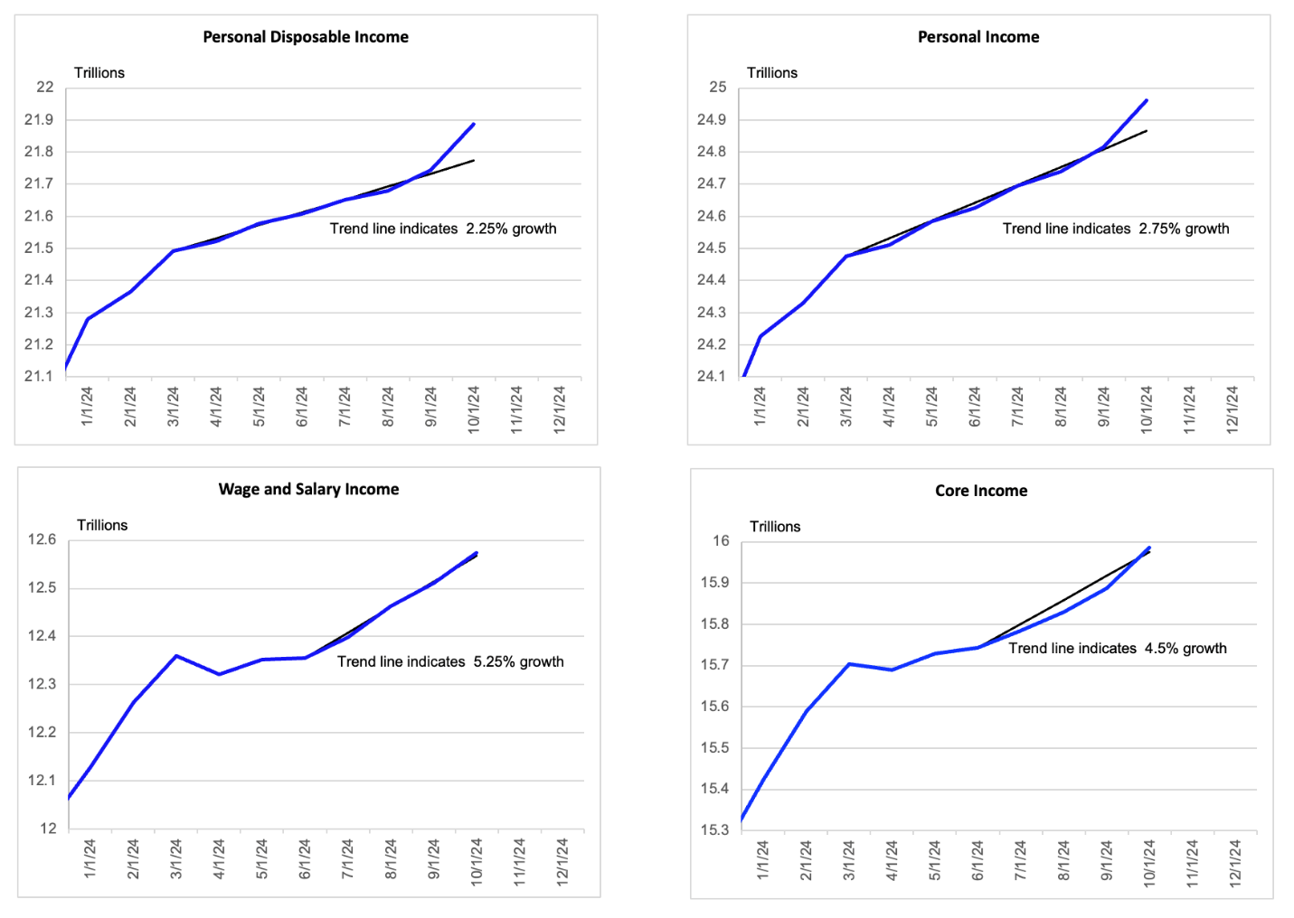
Data are actual to October and the trend lines are subjective, although the most important one seems pretty obvious.
In any case, the strength in broader income growth during October taken in isolation has come in the wake of a prolonged period of weakness. Eyeballing the data during the several months to September, it looks like underlying growth in nominal income was 2 ¼% on an after-tax basis and 2 ¾% on a pretax basis. Those trailing trend lines probably understate the current momentum. But the point is that we ought not make too much of the strength in October, which looks mostly like a catch-up month, rather than evidence of real strength.
However, we can take some comfort in the persistent strength in the 56% of total personal income that is accounted within the BEA’s data as wage and salary income. The trend growth rate there looks to be around 5 ¼%, which is quite closely in line with what is implied by what I call the labor income proxy within the monthly employment report. While the labor income proxy is a direct input into the BEA’s initial estimates of broader wage and salary compensation, there can be gaps when, for example, incentive compensation is (assumed to be) accelerating or decelerating. But that has not been an issue recently.
Incidentally, the consensus is that the labor income proxy will be up at an annualized rate of almost 5% during November, when the data there print on Friday. Some of that will be payback for the storms in October. But keep in mind that those storms did not put a dent in the broader wage and salary compensation figures anyway. So, the strong trend there would just extend by a month.[3]
It is reasonable to broaden our measure of “core” income beyond just wages and salaries to include proprietors’ income and government transfers (net of household payments into those programs), particularly given that the latter have not recently been affected by abrupt changes to social insurance programs, as they were around the Covid shock. (The issue around Covid was not that transfers were irrelevant so much as that
we had no grounds for extrapolating their growth – or even existence.) Discerning the underlying trend in this measure of “core” income is currently a bit tricky, because the recent pattern has been an accelerating one. But in the bottom right panel of the chart above, I draw in a 4 ½% trend line, hoping that is roughly representative.
Weighted by propensities to spend across the various components, we might think of nominal income growth as running at about 4 ¾%. To convert this to real, we would need a measure of underlying inflation that would (incidentally) include the lagging government measures of average rent growth. I apply a 2 ½% (current) trend inflation rate because the market price only, MPO, version of the Core PCE Price Index implies as much. So, the underlying trend of real income growth is perhaps 2 ¼%.
There is room for slippage in this estimate. But the point is that real income growth appears to be middling, neither strikingly strong nor weak. We might say it is strong enough to support a forecast of solid real PCE growth, given the deeper fundamentals discussed above.[4]
[1] It may seem odd to draw an inference for Q4 from the data to October. But given the smoothing of the monthly data involved in the quarterly growth calculation, the data to October largely determine the result, unless they are revised.
[2] FCI-G measures equity prices with the Dow Jones total market index, rather than the S&P500, and I mention the latter only because its index values will be familiar to readers. Separately, I overstate the point about the quirk in measuring percentage changes by simplifying. The true driver here would be the percentage point change of total nominal equity market capitalization as a ratio to GDP. And nominal GDP has doubled since the S&P was last at 700. So, rather than the 10% rise recently being more than 7 times as important, it might be just over 3 ½ times as important. But we can agree that a 10% move of equities should now carry more punch than it did when the market and capitalization were lower.
[3] What the BEA calls (total) labor compensation is the sum and wages and salaries and employer supplements to insurance and retirement funds on behalf of employees. However, I exclude such payments on the grounds that the short-run marginal propensity to consume out of such income is low. The programs matter but the timing of the payments do not.
[4] The 3- and 6-month changes of the Core MPO PCE Price Index Excluding Used MV are running at about 2 ¼%. Excluding non-market prices makes the MPO version less noisy and thus more useful. However, non-market prices have a higher trend inflation rate than market prices, so we do need to correct for the bias created by stripping out non-market prices. Accordingly, this measure seems to imply underlying inflation of around 2 ½%.

