

From a macro perspective, easily the main reason we are interested in the housing sector is that developments there bear heavily on the question of whether the lagged effects of earlier Fed tightening are slated to hit aggregate demand growth. I am on the dovish (i.e., rates hawkish) side of Fed commentary on this issue. Housing is the most interest-sensitive sector in the economy and it is the most important channel through which changes of interest rates (as opposed to equity prices or the dollar) are communicated to demand growth. And housing did its adjustment lower very early in the Fed tightening process, which virtually falsified the idea that the macro effects of funds rate hikes were not yet largely in the economy. Yes, they were! And probably still are.
But there are two caveats here that are worth mentioning. First, the reason we ought not to have expected a big drag from housing over the past several quarters is that housing was already compressed relative to demographic fundamentals. So, even if the rest of the economy were typically or even more than typically sensitive to interest rates, we would not expect housing to weaken further. But it follows logically from this that we cannot infer from the resilience of housing that other rates-sensitive sectors are also resilient or insensitive to Fed tightening. Housing was a special case, just thankfully the most important case.
Second, the housing sector has made pretty decent progress off the cyclical lows, which came as a bonus to my perspective because my call was just, with high conviction, that housing was unlikely to fall much beyond what had been to date the lows. As a result of this, there is now some legitimate downside for housing, although the base case remains that a further rise is more likely than a decline, at prevailing mortgage rates. And the very short run outlook remains solid. The point is, this is a somewhat less obvious call than it was.
It looks like single-family starts are dragging permits higher

Data are actual to February.
With that in mind, let’s run quickly through the recent evolution of the data, starting with this morning’s housing construction report for February, and generally focusing on the underlying trend rather than the beat/miss on the month. Single family starts were up 10% on the month and are now 1% above what had been the high for this episode three months ago. And while permits are meant to lead, on the chart it looks like volatile starts are “dragging” permits higher. The implication is that there is little reason to expect that the starts figures need to correct lower, in the very short term. The more fundamental issue, though, is that activity here is no longer meaningfully below what is implied by demographic trends, although neither is there an overshoot. Trends in the NAHB housing sentiment indicator suggest in turn an ambiguous short run outlook for permits. The relationship there, leaving aside leads and lags, used to be fairly decent, but it was broken by the GFC.
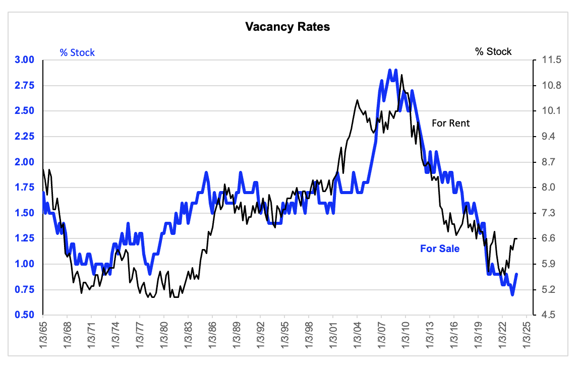
Vacancy rates remain low, most importantly as relevant for single family, but also as relevant for multifamily
Data are to Q4 2023
Separately, the low level of vacancies highlight the lack of an overhang in level terms, particularly on the single family side, which is by far the most important from a macro perspective. This further reinforces the point that significant weakness from single family should not be the base case, even though we can now contemplate some weakness in this sector as plausible. And as an aside, let me pass on a comment made by a client. He is skeptical of the idea that the overhang in multifamily is as relevant for price as most people assume. He comes to this conclusion by adding plausible estimates of new supply implied by the overhang discussed above to the numerator in the vacancy rate (assuming all new supply adds to vacancy), and he finds the vacancy rate does not move much. I have not replicated his work, but it is sort of a cool point. The minor caveat here is that housing analysts tell me that the housing stock figures from which these vacancy rates are derived are loaded with statistical discrepancies.
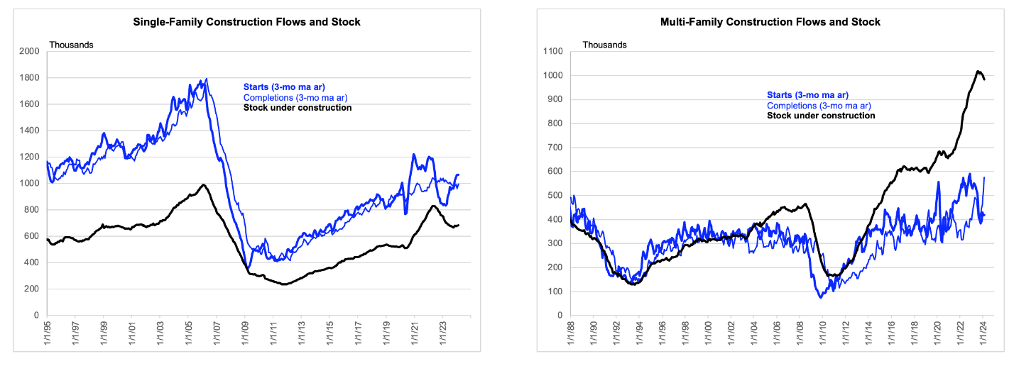
Developments on the multi-family side are quite different and interesting in their own right. I will skip looking at the monthly changes which tend to be pure noise and move immediately to my standard pipeline chart which mostly references three month moving averages. I am discussing here the right panel of the chart below, although the left panel shows the same metrics for single-family just as a reference.
The multifamily overhang now being addressed is depicted in the right panel
Data are actual to February.
The most interesting thing here is that supply is now finally hitting the market with some force, although we will see what that does to pricing. And the pipeline of units under construction is likely to start coming down. The big question is whether starts must fall further from here to clear the backlog and to respect tighter financing. I have a low conviction and a high conviction answer to that question. The low conviction point is that starts probably will fall at least a bit further from here, if only because of financing constraints, delivering a headwind against aggregate demand growth. The higher conviction view is that the big decline of starts is probably already in place. In combination with the relatively low value added from this sector (e.g., less than 1/3 of single-family), this suggests that it is unlikely to be a relevant macro driver.
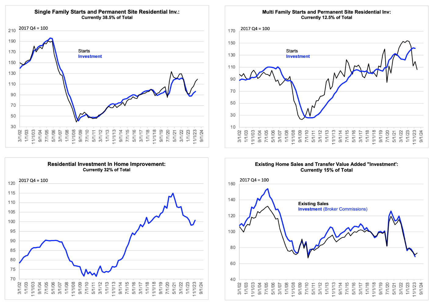
The relative shares are depicted as subtitles in the chart below. The chart shows the levels of real investment (as captured in the GDP accounts through Q4) and then associated higher frequency indicators that might provide a look into Q1 and Q2. Where available, these run to Q1 and are created by extrapolating monthly data from February into March, by assuming UNCH in all cases, and then calculating the quarterly averages. The exception is for existing home sales, which runs to January and requires extrapolating two months. I think the chart speaks for itself, at least in light of the comments above. I would point out only that in percentage terms, Q1 single-family starts are as far above value added in the GDP accounts as of Q4, as multi-family starts are below. The gap is about 25% in each case. But single-family is more than three times as important, as mentioned.
For aggregate demand growth out to Q2 and probably beyond, it looks ok on balance
Real value added data from the GDP release are actual to Q4. Short term leading indicators are actual to Q4 and extrapolated to Q1 as described in the text.
Developments in value added from home resale are interesting. In real terms, there would appear to be limited drag incipient from this source of demand, as I hope is obvious from the chart. But as you are probably aware, a recent settlement with the government has resulted in a breakage of the effective collusion to keep brokerage fees around 6%. The powers that be have decided that $163 billion a year (at the Q4) pace is just too much for repeating the phrase “which is nice” ad nauseum. Stiil, fear not, real growth bulls. This will initially show up in a lower price deflator, rather than in a lower contribution to real GDP. And then when prices have made their move lower, the nominal share of GDP taken by this source will be lower, which will mean its relevance to the real GDP bean count will also be lower. Which is nice. [1]
[1] Pot calls kettle black. The less said about what we do the better.

