

One of the excuses initially offered as a reason to deny the hot January price data is that those data implied a concentrated rise of “acyclical” inflation. This excuse has been applied to consensus estimates of the core PCE deflator (due Thursday), as well as to the CPI and PPI figures themselves. There are some special factors affecting the consensus bean count for the core deflator. For example, portfolio management and strategy fees seem likely to lift the deflator by 7 bps, which should indeed be netted out. But the idea that we should downplay price rises that are “acyclical” struck me as provocative. After all, it is the price pressures that move at a low frequency that most interest the Fed. Why would we strip out, say, commodity prices and yet also strip out acyclical?
So, I have looked into this issue briefly and offer here some initial impressions of this issue. I was a bit off on what acyclical price indexes even are. But the bottom line here is that this framework should arguably make us more concerned about the state of underlying inflation pressures, although for reasons that reflect my out of consensus way of processing the data. If I am right about this, the value of that will be over time, rather than in getting immediate reactions to the updating of these figures.
The first thing to point out about the distinction between cyclical and acyclical inflation is that it might not be what intuition suggests. Cyclical inflation is not meant to be the relatively volatile component nor the component that is most directly linked to a recession / expansion oscillator or even the rate of output growth. No, cyclical inflation is the rate of change of an index whose individual components are most sensitive to the unemployment rate (representing 42% of the core deflator[1]). In other words, if the logic of the Phillips Curve explains the inflation rate, then it is considered a cyclical price component. Otherwise it is acyclical. Obviously, this taxonomy is theory laden, which is probably not a strength, as conventionally interpreted and (contrarily) as I interpret it. And I will return to that below.
Acyclical moves and matters too

Data are actual to December and casually estimated for January.
But first, let’s take a look at the official data updated monthly from the San Francisco Fed. We have official data through December to which I append an estimate for January. I assume that both cyclical and acyclical inflation were up 43 bps on the month, because that is the consensus (false precision) for the core deflator itself. And I don’t want to assume that acyclical inflation led, because rents are part of cyclical inflation, and make up just over 30% of the index there. (Maybe some non-rent cyclical components were relatively weak. I have not looked into it.) Given that I am showing 12-month rates, it does not matter much, particularly as I reject the notion that concentration of inflation in acyclical would be dovish anyway.
A couple fun points arise from the chart above, particularly in light of the history of this distinction. The concept was developed in the late 2010s to preserve the notion that the Phillips Curve even mattered. Cyclical inflation was edging higher at the time, which was the point, and the developers of these indexes suggested that acyclical inflation would eventually catch up, thus rationalizing the Fed tightening program of the late 2010s. In the event, acyclical inflation immediately moved lower, inclining the Fed to ease. Oops.
But it gets better, in the wake of the Covid shock and the fiscal response to it, acyclical inflation led the broader inflation overshoot. It presumably did not pick up the Phillips Curve influence on inflation, but it did pick up the cyclical influence. Because they are not the same thing in this episode. Obviously, that is my own spin, but I have earned the right to it! Cyclical inflation subsequently took off, but it lagged, and the magnitude of the acceleration was no steeper than that for acyclical inflation.
You can probably guess how the consensus interpretation of these data differs from my own. Note that cyclical inflation has been falling particularly steeply in recent months. Within the logic of the conventional interpretation of how the Phillips Curve works, that would fit the view that the labor market is easing (with the unemployment rate pinned to a half decade low). My 2 Stage Disinflation hypothesis rejects that interpretation. But that hypothesis is itself rejected. Indeed, to say it is rejected probably flatters it. Nobody even considers it as a possibility. Nominal wage growth reflects labor market tightness, with no influence of catching up or catching down to inflation arising from outside the labor market. Alrighty then![2]
But what of the basic premise, that the cyclical price components are those that are well described by a Phillips Curve? To a certain extent, this is a trivial question because the components of the cyclical index are chosen based on their historical correlation, which raises the risk of data mining, and makes testing the concept difficult. But unsurprisingly, at first blush, the test is passed. Note from the chart below, the movement of the cyclical core inflation rate do seem to be linked to the Employment Gap, which is my preferred measure of labor market tightness – in all environments, without cherry picking to fit the most recent six months. Incidentally, the chart is truncated to avoid fitting the Covid inflation overshoot because my own sense is that that was necessarily about the labor market, for reasons I have gone over repeatedly, for good or ill.
The purpose for good or ill is to see a Phillips Curve
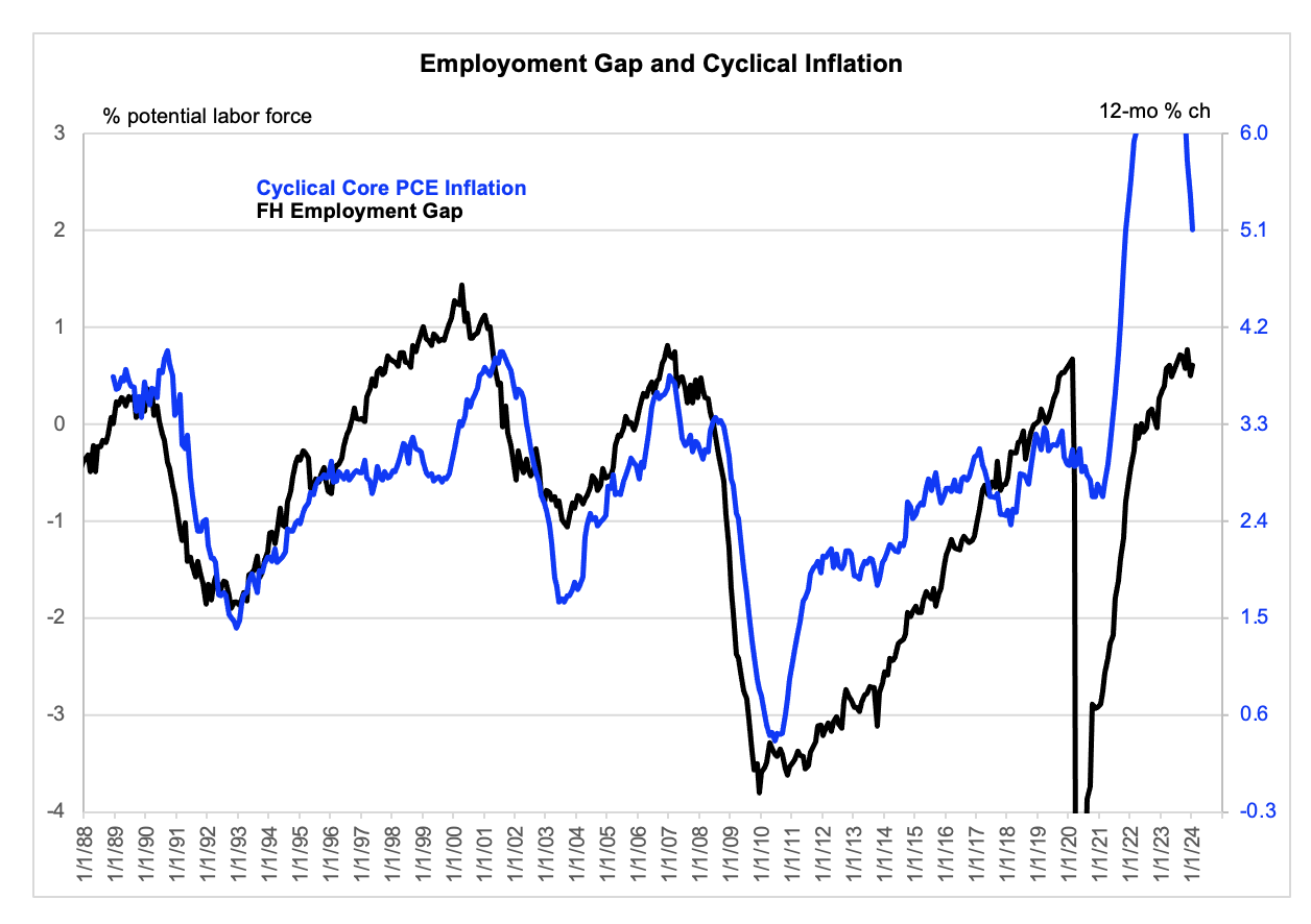
Employment Gap is actual to January. Cyclical inflation is actual to December and casually estimated for January.
And here is why I think this distinction between cyclical and acyclical inflation might actually be turned to a hawkish purpose. Obviously, my handling of the steep decline of cyclical inflation is itself theory laden, and admittedly uncertain. Granted. But let’s focus on the behavior of cyclical inflation during the late 2010s. Note that it was moving higher, unlike broader core inflation. And that’s important — if we accept the basic logic of the cyclical vs acyclical distinction – because it tentatively confirms that the labor market was effectively tight with the measured Employment Gap about where it is now. In contrast, some of the doves say not to worry about the current level of the Employment Gap (or unemployment rate) because it did not cause trouble itself in the late 2010s. Not so, if you believe this concept, which I concede you need not. It is obviously data mined to fit the late 2010s experience, in fairness.
If anything, the chart above may understate this point, subject to the (dubious) logic of the distinction itself. And here is why that is the case. In late 2019, the Cleveland Fed took a deeper dive into the cyclical vs acyclical distinction, basically by looking at the issue at a higher level of granularity. Don’t just look at the cyclicality of medical services, for example, but look at the various type of medical services. What they came up with at the time is shown in the chart below. At the greater level of disaggregation, there was no odd deceleration of cyclical inflation during 2017. Rather, there was a steadier advance. Of course, any comparison between the data I use above and the data presented in the Cleveland Fed study will be a bit off, because we are necessarily using different vintages of data. But I hope you see the point. I just wish the Cleveland Fed updated their data. Perhaps they do internally. I am not sure. But their own inference is that this whole construct reinforces the validity of the Phillips Curve, which would be hawkish in the current context, particularly if you accept my premise that we cannot use trailing nominal wage growth itself as a measure of labor market tightness. (I try to be open minded here and to recognize I may be wrong, but using the second derivative of wages as the measure of slack in the wake of the flow and then ebb a huge price shock is plainly stupid, I mean reductionist.) Repeating for emphasis, my point here is that the Phillips Curve may currently have some validity, which may be obscured by it clearly not having been the driver post the Covid shocks.
Separately, I am not currently pressing a hawkish rates view here. So, please treat this as background that might become more relevant in the event of another repricing or some other bit of news.
Cleveland being a bit more granular than San Francisco
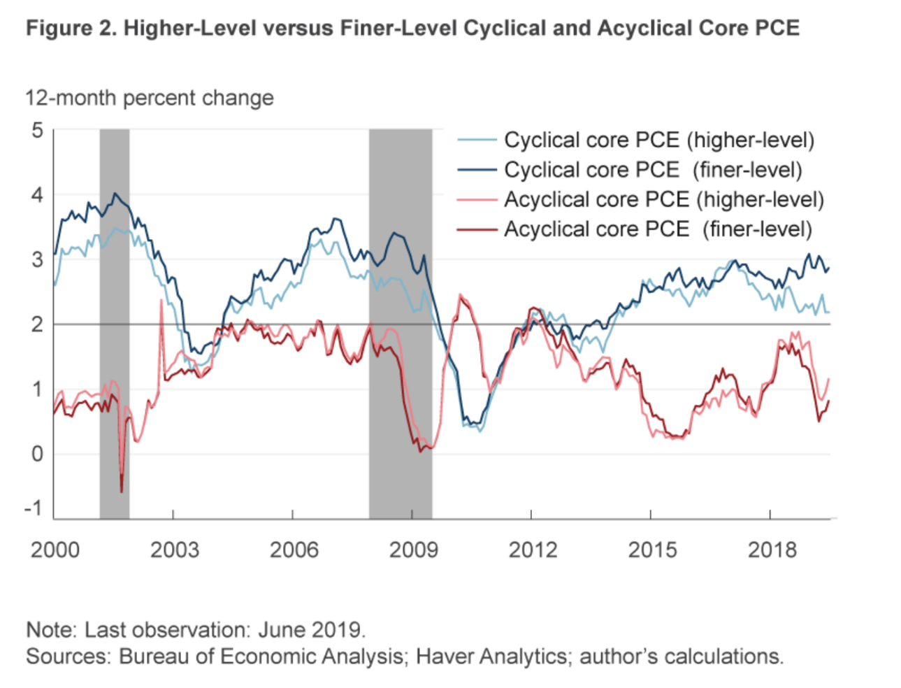
Note: these data have since been revised, which makes it difficult to compare with my own chart.
[1] That was the share when the index was developed. It may have changed slightly since then, but I do not have access to a measure of the shares in real time.
[2] Snark aside, I think a relevant consideration here is that catch-up effects were not evident in the wage data prior to the Covid shock. See, for example, this paper by Bernanke and Blanchard, which was published after the Covid shock but used, as its in-sample estimation period, a sample ending in 2019. They then simulated it through the Covid shock, unfortunately. in my view. I am not alone in this view. The idea that wages catch up and catch down to the flow and ebb of a price shock is now more widely accepted. It is just that when thinking about the labor market, many people do not incorporate that point into their interpretation of changes of nominal wage growth. So, they think slowing nominal wage growth recently must mean the labor market has eased. It is possible the labor market has eased, but what a hellishly silly lens.

