

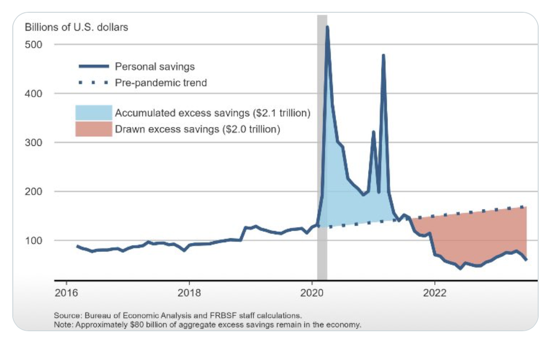
A note on the San Francisco Fed blog a couple weeks ago estimated that “excess savings” had dropped below $200 billion and would probably fall to zero by the end of the third quarter. An economist at the SF Fed figured August was probably the right month, to be specific. Imagine the commitment to this idea required to pin it to the month.
But then this morning, the Federal Reserve’s Financial Accounts for the United States reported that household sector net wealth had risen $5.5 trillion during the second quarter alone, taking it to the highest ratio to GDP in the history of the data prior to the peak of the Covid bull market[1]. The Financial Accounts are by far the more relevant. Households have assets and liabilities of varying degrees of safety and liquidity. And the difference between the total stock of assets and total liabilities (debt) is net worth. No one measure within this constellation holds the key to prospective consumer spending, obviously, but there is relevant information here.
It is possible to calculate the presumed thing
Source: X, as linked below.
In contrast, there is no such thing as “excess savings.” We can take the integral between a poorly measured curve and an arbitrary curve over some arbitrary period and call that “excess savings,” as for example in the figure above. But the measure does not actually correspond to anything found in nature. I am not sure how people got sucked into that concept. It has social delusion aspects that remind me a bit of the mania over QE. (Everybody talking about it convinces everybody it must be something. What do banks offer on “excess” savings accounts these days? Sorry.) But anyhow, people are not — on average at least — about to go broke. Nor is it obvious that the saving rate is ridiculously out of line with where it might be. We ought not claim to know where the saving rate should be. Rather, I would simply not reason from my opinion of it.

Source: Federal Reserve, CBO, BEA, FH calculations
Data are generally actual to Q2, although the July personal saving rate (relative to GDP) is pencilled in for Q3. “Excess savings” are as I measure them, ruefully, not as SF Fed does. The role of excess savings is slightly exaggerated in the top left panel so that you may see it. It has to do with each bar having an “outline” of non-zero width.
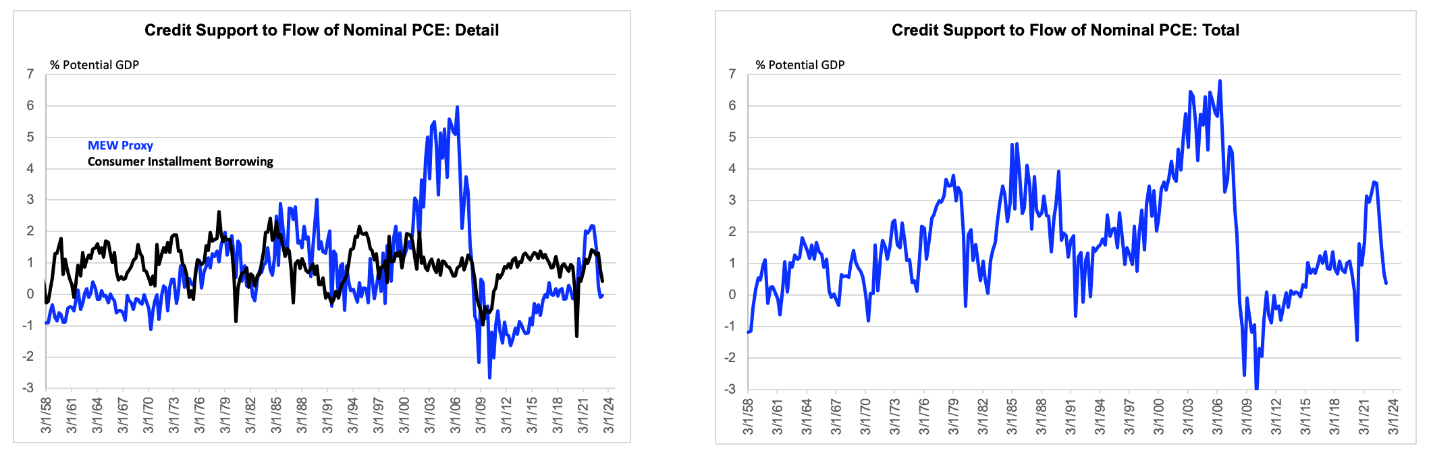
Self indulgent mockery of macro silliness aside, the more interesting news in the Financial Accounts might have been the data on how much support to the flow of consumer spending has recently been delivered by household sector borrowing. During the third quarter, mortgage borrowing ran at about $350 billion (ar) for the second quarter in a row. This is down from the $1 trillion during the first two quarters of last year. And it is slightly below even the reduced flow of residential investment, which means that Bill McBride’s (pretty good) proxy of Mortgage Equity Withdrawal (MEW) was marginally negative for the second quarter in a row. Meanwhile, consumer instalment borrowing got cut roughly in half to $114 billion (ar). So, total support to PCE from household sector borrowing has slipped to about $100 billion, down from $900 billion four quarters ago.
Source: Federal Reserve, CBO, FH calculations
Data are actual to Q2.
What some people call the credit impulse is meant to be the swing of such borrowing over some fixed period, say, four or eight quarters. I used to show that but have recently come to realize that the choice of window can arbitrarily affect our sense of things, perhaps by a lot. For example, the 4-quarter impulse might have a different sign from the 8-quarter impulse. But if you look at the right panel of the chart above, you can see the flow of borrowing is fairly low and has recently tended to fall, implying that we should probably think of the credit impulse as recently quite negative.
Let me conclude with a wild speculation and then a more serious point. Some of the retail sales trackers heading into next week’s release look fairly soft. If the retail trade report were to come in weaker than even the somewhat muted consensus, then I would not be shocked if some analysts were to claim, ah ha, excess savings gone! And others might point out more seriously, that in the very short run, a reduced flow of borrowing might imply a slight reduction of household sector liquidity (i.e., cash building) that might be a weak signal for spending over a very short horizon. But high net worth and a compressed reliance on debt to finance the current flow of spending would seem to be constructive, in isolation, over the medium term.
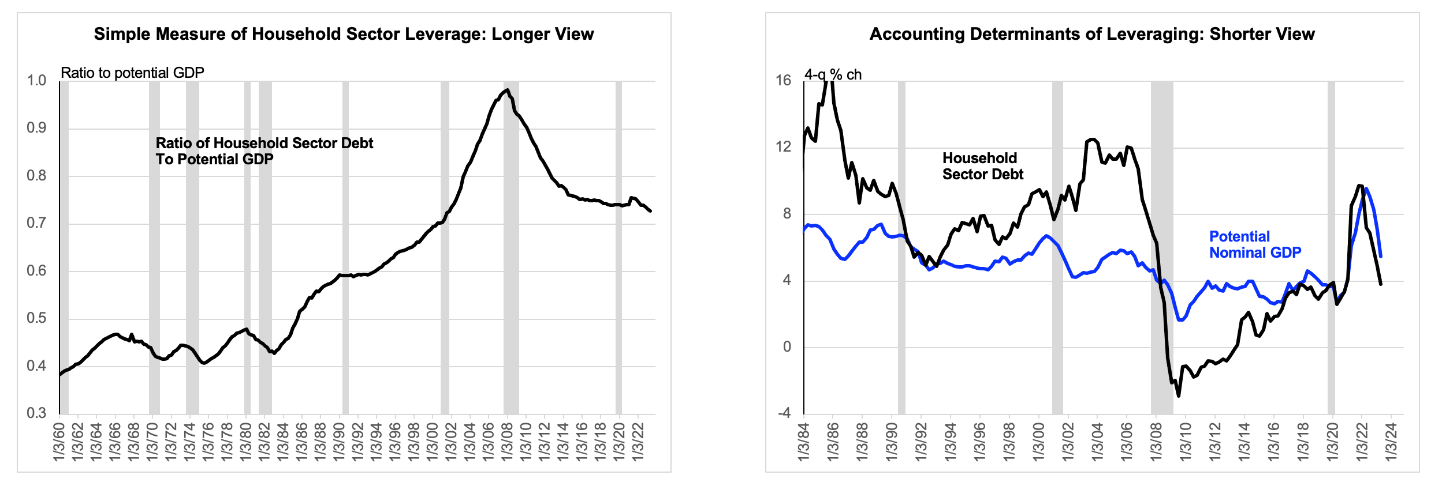
Separately, it is somewhat interesting that household sector deleveraging appears to have resumed. With the recent repricing of borrowing rates, I doubt this trend can long continue. As the economist J.W. Mason has long emphasized, household sector debt income ratios are much more a function of household r vs g than they are of keeping up with the Jones’s effects. See, for example, here. But for now, deleveraging probably slightly reinforces the points raised above. In fairness to the economy bears, the relative importance of distributional concerns is probably rising here. Some consumers have probably gotten a bit over their skis.
Source: Federal Reserve, CBO, FH calculations
Data are actual to Q2.
[1] Based on available information on the market prices of equities, real estate and bonds, it looks like household sector net worth might be tracking roughly flat in nominal terms so far here in the third quarter.

