

I am not competent to assess the econometrics behind the Fed’s new Financial Conditions Impulse on Growth index (FCI-G). But I am immediately a huge fan of its logical coherence and will be inclined to follow it more closely than competing measures of financial conditions. If I could attempt to bring one unit of my own value to the popular discussion it would be to insist adamantly on the following point. The index is presented as an impetus. So, if we want to understand how monetary policy is acting on prospective growth, via financial conditions, we look at the last print only. It would probably be double counting the impetus to look to the higher derivatives, such as the recent swing of the index. It is already measured as a swing. An opposing view might be that the economy might be addicted to, say, a steady drip of stimulus. But I don’t think that is the most helpful interpretation.
The derivation of the FCI-G is itself just an accounting exercise, as the weights assigned to each of the seven (mostly) financial variables in the index come from the Fed’s main econometric model, FRBUS. That model estimates the influences of current and lagged values of financial variables on the level of future economic activity. Accordingly, differences in the weights assigned to each lag of the variables can be interpreted as an impetus on growth from changes in those variables. Rather than go into the gory detail of how that works (which, to be honest, I have not fully internalized), let’s just take a look at a picture that will communicate the intuition here. (Keep in mind that the index is worked up on quarterly data, although eventually converted to monthly.)

Source: Federal Reserve as linked above
Let’s focus on the mortgage rate. The effect of the most recent annual swing of the mortgage rate is more than three times as important as the annual swing recorded a year ago. That is B4-B0 (.21743) is more than three times as large as B8-B4 (0.06243). Related, the general influence of the mortgage yield is much larger than the influence of either the BBB corporate yield or the fed funds rate, which has a duration of zero but presumably has a signaling effect to the real economy that extends beyond its influence on financial asset prices. The signs of the weights on contemporaneous and lagged values of the 10-year Treasury have a counterintuitive sign, because the income effects of higher Treasury yields are actually positive, while the substitution effects are picked up via other financial asset prices. But the scale of the effect there is quite small.
When interpreting the coefficients on the variables generally, note that swings in all interest rates are calculated in percentage points. For equities, housing and the dollar the measure is roughly percent changes. (Log differences multiplied by 100.) I bet the size of the coefficients will generally seem small to you. They do to me. But that is perhaps a nice correction of unreliable intuition.
There are two major advantages to this approach. First, the coefficients in the index are taken directly from the main econometric model. So, this shows us one lens at least through which Fed researchers are seeing the central case influence of innovations in Fed policy, via financial conditions. Of course, the Fed researchers are aware that not all changes of financial asset prices can be viewed as shocks. Some changes are endogenous to the economy itself. For example, if increases of mortgage rates and corporate bond yields are just equal to the rise of r*, then they might have little systematic effect on demand growth. But the premise here is that asset price changes can be treated as mostly exogenous, on the grounds that the endogenous component is typically slow to evolve. And the index is presented to reflect that consideration, by emphasizing changes rather than levels.
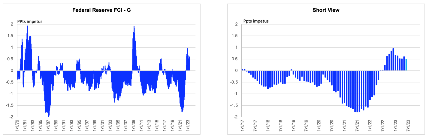
Second and closely related, we don’t need to eyeball how changes in the level of the index might relate to growth, because the index is presented as an impetus. The Fed has published data through May, but I crudely estimate a value for June based on a recognition that equity prices have moved higher and respect for the fact that the index does not tend to gap. (The standard deviation of the monthly change is only 16 bps.)[1]
Anyhow, the estimated June value is 50 bps. What does this mean? This is where my attempt at a value added comes in. The very straightforward interpretation of the 50 bps figure is that recent changes of financial variables imparts a headwind impeding growth of 50 bps relative to what we might take the underlying trend of aggregate demand growth to be if there were no monetary policy forces acting to restrain or stoke demand. Ok, then what is that counterfactual growth rate? It is some combination of the economy’s potential growth rate and the self-reinforcing influence of the cycle. There is unavoidable ambiguity here, but at least we know conceptually what we are looking at, which distinguishes this index from its competitors.
Given how the index is designed, I think it is probably a bit more helpful to present it as a bar, rather than, line chart. The reason is that a bar chart forces us to pay very close attention to the zero line, which influences the height (or depth) of the bars. The current bar is not that high. It is 50 bps full stop. A line chart might encourage us to think it is 225 bps higher than it was, but, as mentioned, I don’t think that would be a helpful interpretation. In contrast, two years ago, the Fed was putting in a lot of aggregate demand impetus, even as fiscal policy was doing the same thing.
One final point, for now, as an aside. Note that the FCI-G has an average value of far below zero. Things have rallied over time, which could be interpreted as fitting the secular stagnation thesis: that the economy is forever dependent on stimulus. Or at least that might be a reasonable description of history, which moves on, in fairness.
Let’s show it as a bar chart to highlight the relevance of the value zero
Source: Federal Reserve as linked above
Data are actual to May and FH “estimate” to June
[1] I may eventually try to replicate the index and then simulate its value to real time. But for now, I just go with the fact that it tends not to gap and has more likely declined than risen this past month. Also, this is not the final word on the index, even from me. It is just my initial impression.

