

I have noticed that people are puzzling needlessly over one aspect of Friday’s jobs report while oddly not puzzling over another. So, I would like to return to the jobs report in an effort to get folks to be puzzled over what strikes me as the right thing!
The point that folks puzzle over (seemingly) needlessly is the divergence in employment growth as measured in the establishment survey and employment growth as measured in the household survey. The puzzling usually starts with the question of how the unemployment rate can rise if headline employment growth, as measured in the establishment survey was up 339k?
The first part of the answer to this is that the unemployment rate is calculated with data from the household survey, rather than the establishment survey, which I am pretty sure is widely known and not really the source of the confusion here. But just for completeness, the household survey samples the share of the population that is employed, and then that share is multiplied by the estimate of the current population to obtain a measure of total employment. Last month, that was down 310k.
So, is there a big contradiction between what is suggested by the establishment and household surveys? There always is to some extent, but it does not seem as though it was particularly so this month. The BLS computes a “research” series, in which the household survey data are recast to overlap with how employment is defined in the establishment survey. During May the research series rose 394k, pretty much in line with the 339k rise of headline employment last month. Moreover, the trends in these two measures are also in line. So, it roughly lines up month to month as well as on a trend basis. There is little particularly unique to this month to see here.

One reason people may have difficulty with this issue is that it is hard to identify which definitional issues were the source of the difference between the standard and research measure of employment growth in any given month. The reason is summarized in this note from the BLS. Specifically, the individual adjustments are presented only on a not seasonally adjusted basis, and it is only at the end of the adjustments that the seasonal adjustment is applied. I think this issue may be more broadly appreciated if people could do the line by line accounting on an SA basis, which would make it more tangible. But that aside, there is not much new to see here.
What I suspect might have happened last month, although I do not have the data to provide it, is that multiple job holding went up, which would tend to make the research series stronger than the standard measure of household employment. If so, then that would be consistent with the drop of the average workweek in the establishment survey and the associated weakness in the index of aggregate weekly hours, which I highlighted on Friday as an element of weakness. It is not that the report was uniformly strong, so much as not the extreme head scratcher it is sometimes characterized as.
Somewhat related, people are inclined to pay more than the usual amount of attention to the household survey these days on the – legitimate to me – grounds that the birth / death model may result in an overstatement of job growth within the establishment survey if the economy is at a turning point, downward. But there are three points to keep in mind here regarding that:
- The relevant measure from the household survey would be the research series, at least if our interest is in getting the job count right. As I mentioned, the average workweek is also related to the turning point idea, because employers cut hours before letting people go. But that is a separate technical issue.
- The ADP measure of employment – and it is now finally a legitimate alternative measure – provides a relevant cross check, as it relies on direct measures of payroll services data. And it too was stronger than expected.
- Most importantly, an employee at the BLS had a great tweet storm on Friday explaining that the birth / death model is probably not a major issue right now, although he accepts the point that there might be some tendency to miss at turning points. That is definitely worth a read.
To repeat, my point is not that the BLS data are precise or that there are no cross currents in Friday’s job release. As mentioned, the seemingly falling workweek is a bit of a red flag for the future. It is just that the data this month were not particularly confusing. Rather, the inconsistencies that people see would seem to be overstated – in the popular discussion.
People seem a bit nihilist on mix-shift in the wage data
Ok, so that’s what I would discourage you from being puzzled about. Now let’s move on to a reiteration and extension of what people should be more skeptical of. As I mentioned on Friday, the 33 bps rise of the headline average hourly earnings (AHE) series would seem to have understated wage inflation during May. The reason I say this is that my mix-shift-controlled measure of wages, which accounts for sectoral mix-shift as well as “rank” mix shift (between production-and-nonsupervisory and management jobs) and related cross terms, was up 42 bps. That is not a huge deal. The distortion in April was larger and in the opposite direction. But it does seem as though underlying wage growth may have bottomed and at a slightly higher pace than is widely perceived – just as the lagging ECI implies, incidentally.
That’s an old story from Friday. But I want to underscore it by highlighting the most tangible part of what is going on here. I suspect that people might not trust an effort to control for mix-shift associated with sector, rank and the cross terms there. There is way too much going on there, it is sort of abstract, and the possibility of a calculation error is large.
So, let me boil it down to a simpler and more tangible point to get your attention. The index of aggregate hours worked fell about 10 bps for the overall private sector, while rising 25 bps within the production and nonsupervisory (PNS) component. This means that there was a huge shift on the month from what we might call “management” jobs, which pay higher, to PNS jobs. Surely, we can see the case for controlling for that, which is a simple and intuitive task. And when we do, we see a wage gain of 47 basis points.
In the chart below, then, I now show four measures of AHE growth: the headline series, a series controlled for sector mix-shift, a series controlled for “rank” mix shift, and my more complicated series that controls for both as well as the cross terms. The third item in the list is the new one, which I provide for context and to get your attention. It is the final item on the list that I would highlight as the most relevant. And that is why it is shown as the most prominent line in the chart.
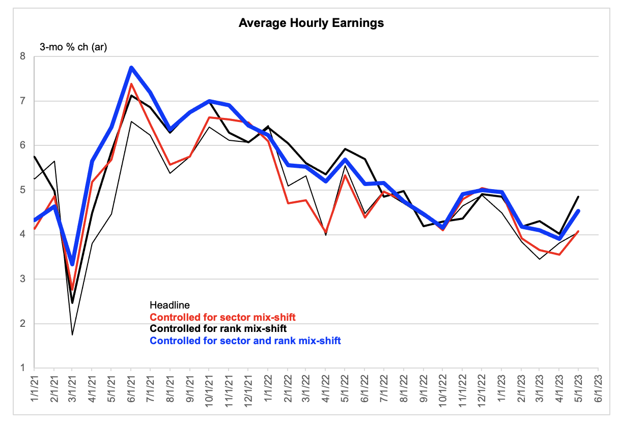
Data are actual to May.
I may put this technical issue in a broader context in a follow-up note. For now, I can say that it fits neatly into an idea that seems correctly to have gained some currency recently. Skip is probably a better word than pause to describe what is teed up for June. Raising the dots but not the rate may be fun to watch.

