

Bloomberg has a story going over the possible implications for equities of the huge stock of “cash on the sidelines” (HERE). In this note, I would like to offer some thoughts on how we might think about the cash on the sidelines, without getting on the wrong side of accounting identities, which is a mistake that very often plagues this sort of analysis.
The Bloomberg story alludes – seemingly inevitably — to the cash “flowing” into the equity market at some point. That, of course, is impossible as a matter of logic. Net flows in every asset class are equal to net issuance, although there is no explaining this to journalists or even to the many strategists who weigh in on “flows.”[2] However, that impossibility does not mean that there is nothing to say here, if you will forgive my use of the triple negative. In fact, I love this issue because it circles me back to my take on the “excess savings stock,” which I will get to below, but without my usual whining.
Money does not actually flow from money markets or deposits to equities because an accounting identity forbids that – or relatedly because holders of assets cannot retire the liabilities of agents who issue liabilities. Please pause to internalize that. It is dispositive. Instead, there is a portfolio balance effect, which moves prices. Specifically, if the average investor holds a lot of low-risk assets relative to high-risk assets, then the average investor may seek to reallocate to higher risk. This is impossible in aggregate, as mentioned, but the desire moves asset prices until the portfolio balance force is exhausted. For example, if the allocation to equities looks 10 percentage points too low to most, then equity prices might rise until equities take up 10 percentage points more in the typical allocation. I am simplifying to make a point. The point is that the pressure is relieved by price, not by actual net flow. This is very standard, and yet seemingly ignored by most flow analysis, as mentioned.

Allocation data are actual to 2022 Q4 and estimated to today. Return deviation is actual to April and estimated to today.
About a decade ago, a blogger who goes by the pseudonym Jesse Livermore and published at Philosophical Economics produced a piece that treated this issue in a way that is very much to my own taste. He argued that the average allocation to equities (at prevailing prices) is The Single Greatest Predictor of Stock Market Returns. The title of the piece is partly in jest because allocation correlates with (relative) valuation, which may be the real driver here, and because of the risk of data mining.
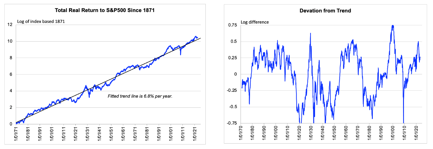
But that aside, his analysis respects accounting identities, which is necessary — even if not sufficient – for being coherent. Jesse did a service to us all by programming his calculation of the average allocation into the St. Louis Fed’s FRED database. As a result, the calculated allocation is readily available to the last print of the quarterly Financial Accounts, which currently means 2022 Q4. However, I estimate the figures in the chart above to Q2 (i.e., today) based on current market prices. I show on the same chart the deviation of the total return to equities from its historical trend line to demonstrate the role of valuation. And in the chart immediately below I show a longer history of that total return deviation for context and to make obvious what I am doing here.
Allocation data are actual to 2022 Q4 and estimated to today. Return deviation is actual to April and estimated to today.
The main chart makes a relevant point. There is plenty of cash on the sidelines, but the typical allocation to equities is actually pretty far above its historical average. Based on Jesse’s initial work, which to repeat was partly tongue in cheek, this suggests that the 10-year real return to equities from current pricing might be 2% a year for the next ten years. You can see that by reading the current allocation in the main chart above against the main chart in Jesse’s own piece linked above. So yes, there is a lot of cash on the sidelines. And yes, that is constructive on portfolio balance grounds. But, no, there will be no net flow. And no, it is hard to argue that the portfolio balance effect is not already in the price. This is not to say that equities cannot beat 2% a year. It is to say that a logically coherent treatment of this issue does not itself predict a high return.
That is the main point of this note. But let me conclude with how this relates to excess savings. As you know, I think the excess savings stock is a really dumb way to think about the macro effects of fiscal deficits that extend beyond the period of the high deficit itself. However, there are effects. It is just that the consensus across real time commentary misunderstands how those effects work, even though my own take is actually much closer to conventional from a theoretical perspective.
What had been the conventional take, at least prior to everybody seeming to get confused after the Trump-Biden fiscal expansion, runs as follows. When the stock of default-free government debt rises relative to GDP or relative to the stock of risky assets, there are insurance or portfolio balance effects that put upward pressure on risk tolerance (including as described above) and thus upward pressure on r* and downward pressure on the equilibrium equity risk premium.
One way to distill that argument down to common parlance is to say that historical deficits are the source of the cash on the sidelines. Or put alternatively, what I call risk-free assets, they call cash on the sidelines. It is just that my conception of “cash” is about risk characteristics and ignores maturity, although QE during the fiscal expansion did ensure that the risk-free asset supply was in deposits. From a macro perspective, a key practical point here is that the upward pressure on r* and relative price of risk assets lasts for as long as the debt / GDP ratio (roughly) remains elevated, which means indefinitely. The effect does not get burnt off as the excess savings get “spent,” which is close to a meaningless concept. (It would be totally meaningless in a closed economy.)
This all hangs together very nicely if we will only stick with inside the box thinking (which works!)[3] and not ignore accounting identities. The thing is, it looks like it might already be in the price.
[2] As often with analysts or actual investors, they may be on to something but just express it very poorly. When people refer to “flows,” they often mean across market participants with relatively weak or relatively strong hands. For example, if the weak hands accumulate, if there have been net flows into weak hands, then that can be negative and vice versa. But net flows sum to net issuance – or to zero if you want to include net issuance as a flow.
[3] I have made this point before, but I think the GFC so discredited conventional thinking that thinking inside the box has been the new outside the box. I may be wrong, but I am certainly not joking. Just going with the extremely obvious stuff from text books seems to have worked for over a decade now. For example, nobody believed maturity management mattered much until the Fed felt the need to pretend otherwise to find a role for QE. But I am wandering off topic there.

