Super Bowl Trivia + 12 Super Charts
These 12 Super Charts will be an appetizer to tonight’s game. After all, nobody wants to be looking at charts during the game…we’ve all got to pay attention to our box pools.
But to warm you up and get you in the proper mindset we’re presenting the following Super Bowl trivia question. We’ll buy lunch to the first person with the correct response to our question. Here goes:
Name the only player in Super Bowl history to be named MVP from the losing team?
Here are our 12 charts.
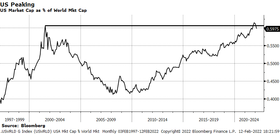
US Market Cap as % of World Market Cap – From 2010 – 2021 this ratio rose, in favor of the US, 10 of 12 years. So far, in 2022 it is down -2 ½% from its 2021 peak. In the only two years from 2010 – 2021 that it fell was in 2012 losing -1.3% and 2017 when it gave back -3%. We’re expecting it to work lower which fits with our “tech bear market / cycle peak” theme.
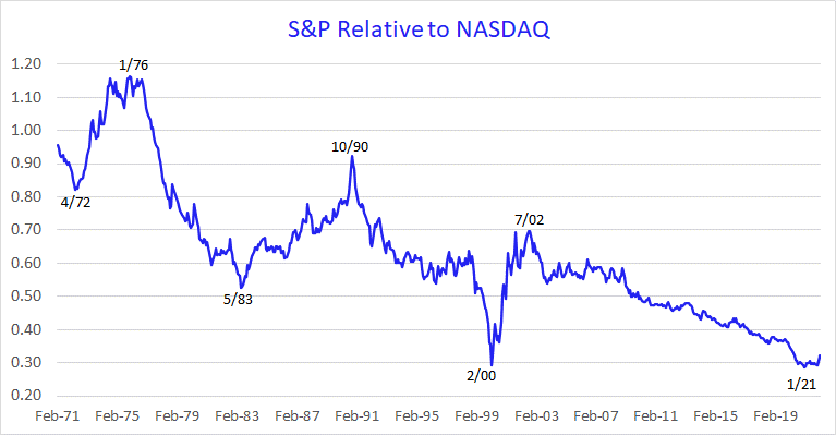
S&P Relative to NASDAQ – The turn, in favor of the S&P, is in its infancy.
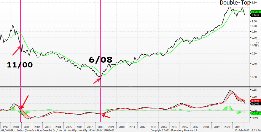
Growth Relative to Non-Growth – We want to continue to sell Growth Relative to Non-Growth. Monthly momentum (bottom panel) not oversold. Oversold may not be a panacea, however. The last major down cycle lasted a long time.
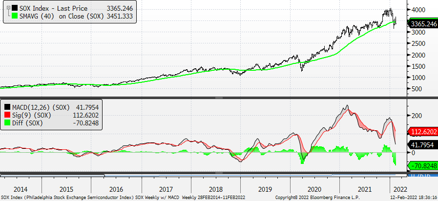
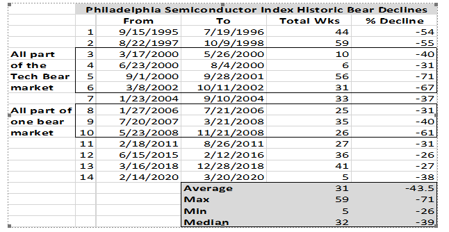
Philadelphia Semiconductor Index – Late 2021 / early 2022 high was unconfirmed by the Weekly MACD at bottom and now the Weekly MACD is at its lowest level since June 2020. Price, in the top panel, is rolling and will no longer be immune from tech’s weakness. As the table below shows, the historical median bear market for the SOX is -39%.
Source: 22V Research
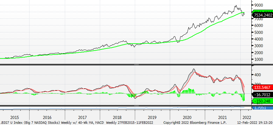
Big 7 – While market internals had been deteriorating for an entire year, AAPL + AMZN + FB + GOOGL + MSFT + NVDA + TSLA insulated the S&P and NASDAQ as they won, nearly, to the exclusion of everything else. It’s just the opposite now as they’re now dragging down the S&P and NASDAQ. The great powerlifter, Ed Coan, was once asked about the injuries he sustained over a career of setting 71 powerlifting records. He said, “My greatest strength has now become my biggest weakness.” The same is true for the S&P and NASDAQ as it pertains to the Big 7.
Beyond the obvious and immediate implications for portfolios is the fact that there are not seven stocks anywhere in the world more widely held than this septet. You know where your portfolios stand, but here’s how these stocks are distributed via ETFs: AAPL 155, AMZN 142, FB 138, GOOGL 118, MSFT 175, NVDA 153, and TSLA 134. The combined market value of these stocks in the 1,105 ETFs is $1.034T.
In the chart below please notice that while the Index didn’t peak until November 2021 its Weekly MACD carved out its own peak in September 2020 which means that while price continued to advance it was carrying a negative momentum divergence of 14 months! We believe our Index makes a new reaction low, beneath its January 2020 trough, and weakens further to the 6000 level.
And, as it pertains to FB – We find it remarkable that FB lost ¼ of a trillion dollars in market cap in a single day while market participants shrugged it off as if to say, “The bad news is behind it.” If any stock embodies the extreme nature of investor complacency it is this one. It would be extremely hard for us to believe that a stock can lose $250 billion dollars in one day and that we are left with a healthy market and that somehow, miraculously, FB won’t decline again. We don’t think we have a healthy market and we do think FB will decline again importantly. Oh, one more thing, FB is a canary.
Big 7 – Weekly w/ 40-Week Moving Average and Weekly MACD
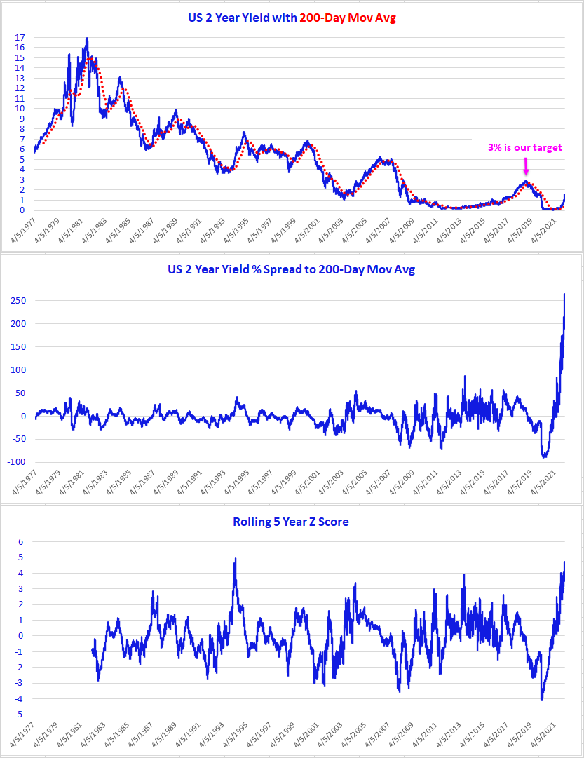
US 2 Year Treasury Yield – Not only has the Fed lost control of inflation expectations (“Fool me once, shame on you; fool me twice, shame on me; fool me all the time, shame on the Fed”), but there is no way to conclude anything less about the yield curve when you check the following charts for the 2 Year Yield. History is not going to be kind to this group at the Fed.
Top Panel – Daily; US 2 Year Yield from 1977 – to date. Our target remains @ 3%.
Middle Panel – US 2 Year Yield % Spread to 200-Day Moving Average was recently @ 264%. It’s not GameStop like, but for the Treasury market this price action is ahistorical.
Bottom Panel – Rolling 5 Year Z Score (thanks Kevin Brocks!) nearly touched 5 Standard Deviations.
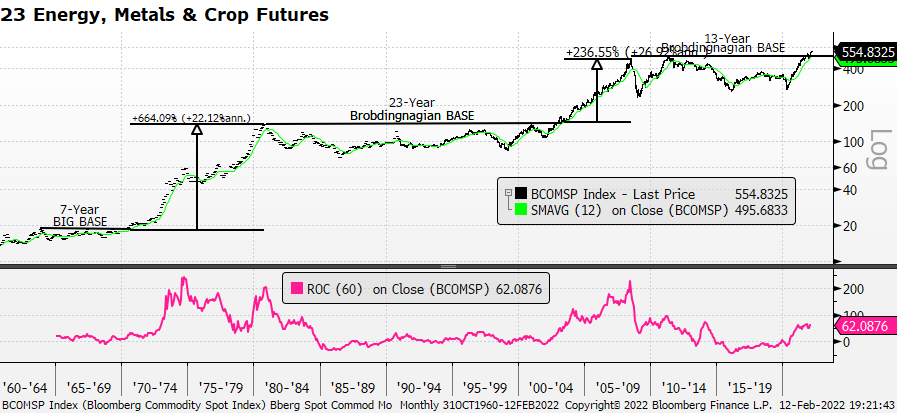
Commodity Spot Index – Brobdingnagian BASES speak for themselves.
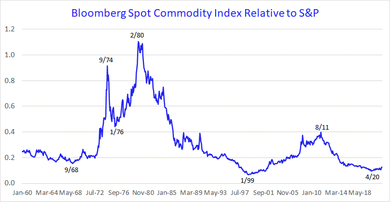
Spot Commodity Index Relative to S&P – The turn is in its infancy.
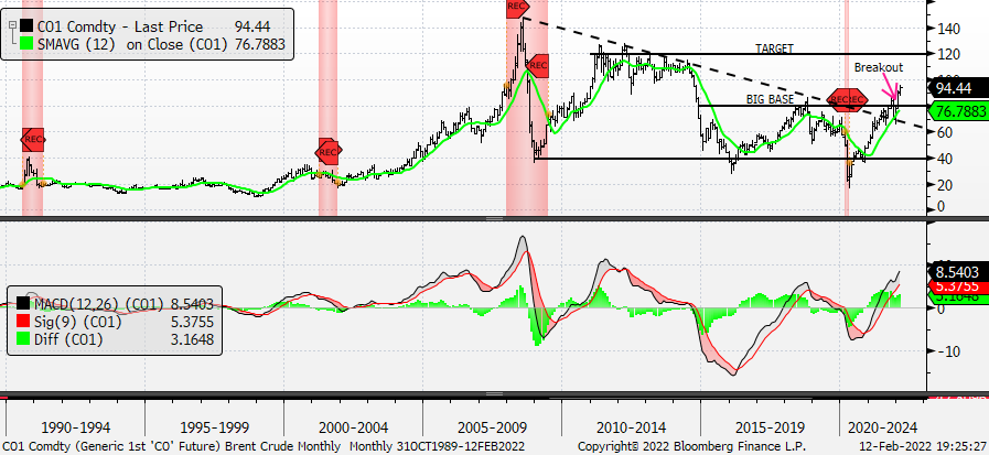
Brent Crude – Target $120
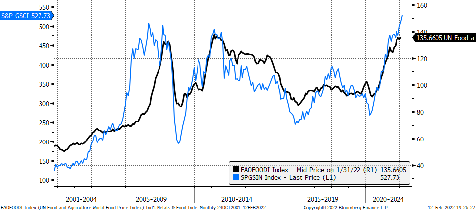
Industrial Metals (L, +30% y/y) w/ United Nations Food Price Index (R, +20% y/y)
Gold – We continue to believe it will make a new all-time high. The current environment makes the following quotes, which we’ve used before, even more apropos. The first is an old English proverb (aren’t all English proverbs old?) –
“When we have gold, we are in fear, when we have none, we are in danger.” The second comes from King Ferdinand who said in 1511, “Get gold, humanely, if possible, but at all hazards – get gold.”
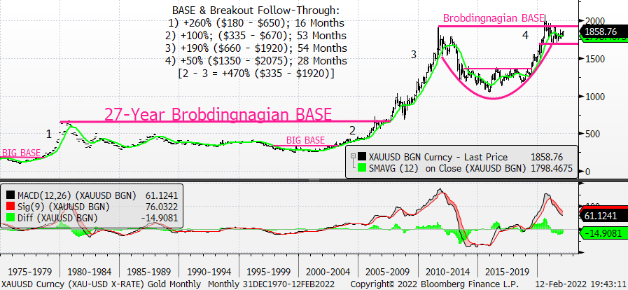
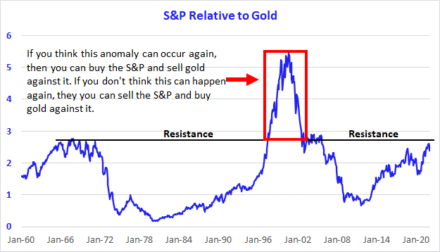
S&P Relative to Gold – It’s clear to us, we’re selling S&P’s and buying gold.