Our entire repository of COVID charts is HERE.
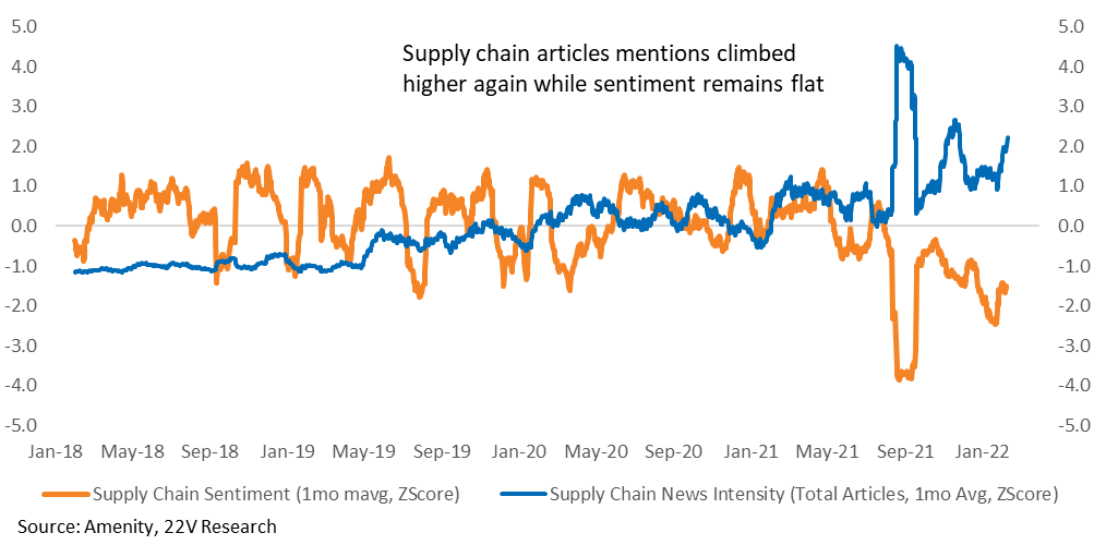
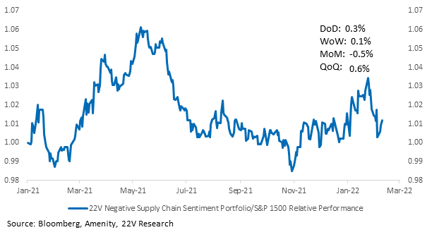
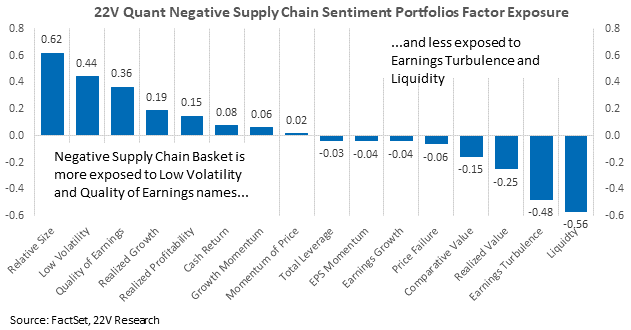
The number of mentions of supply chains in the news is spiking higher. Simultaneously, the recovery of supply chain sentiment has stalled. We built a portfolio of companies whose management teams have been the most negative about their supply chains to benefit from an improvement in supply chain sentiment, which we expect as the Omicron wave eventually fades in important supply chain countries. Recently, the portfolio has underperformed as case growth has accelerated in China and some Southeast Asian countries and supply chain intensity in the news has ratcheted up. The portfolio’s factor exposure is well positioned for tightening financial conditions, which provides another important tailwind. The constituents are listed at the end of the report.
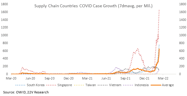
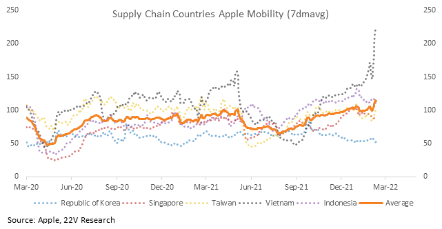
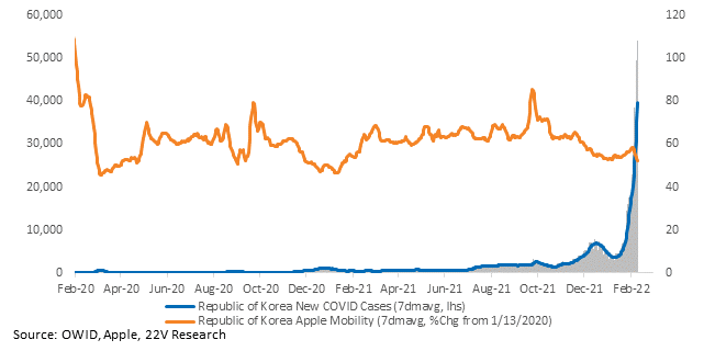
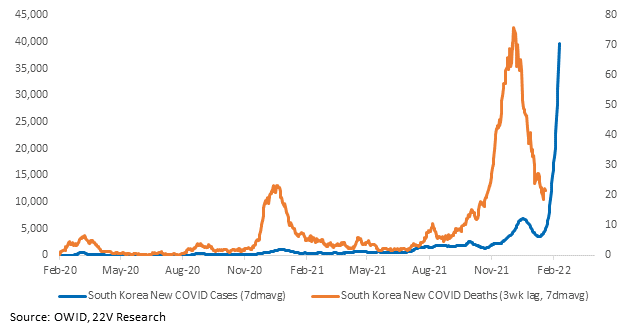
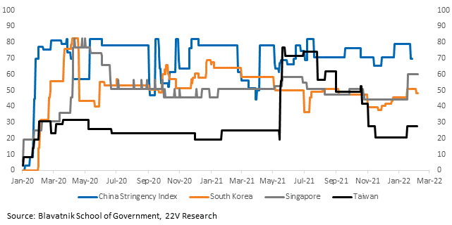
Case growth is accelerating in South Korea, Singapore, and Indonesia following the Lunar New Year. South Korea’s curve is particularly poor, but Omicron is less severe and South Korea’s vaccination rate is very high. Deaths are so low (check out the right hand axis of the fourth chart) that the country has put out guidance for self-treatment. Mobility, though, is declining. We don’t have a good read on what restrictions will be put in place as an Omicron wave takes hold, so we will continue to monitor Oxford’s stringency indices and Apple mobility data to gauge the possible disruption to supply chains.
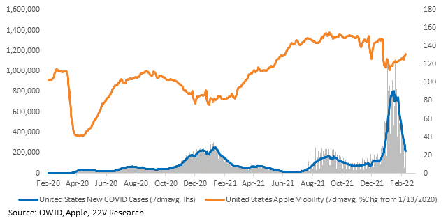
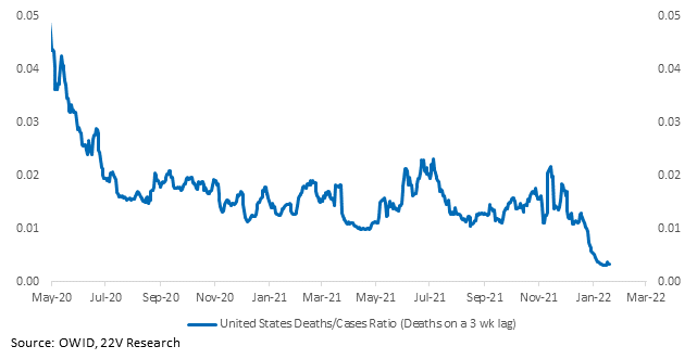
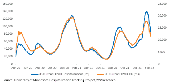
The US is in good shape. Case growth is down in almost every state and mobility is up. Severity stayed low. Hospitalizations and patients in the ICU are declining.
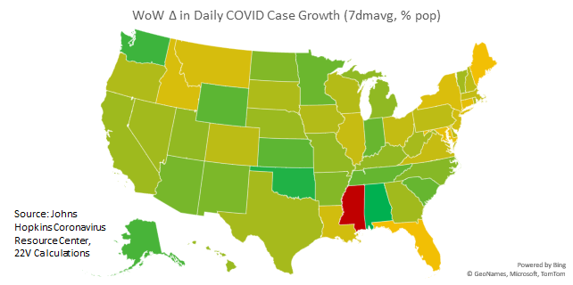
Charts for every state and country we have data for are HERE.
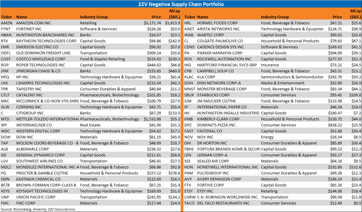
Constituents of our Negative Supply Chain Sentiment