Today’s title will not make the metaphorical tie-in between the 2002 movie of the same name and our subject matter. Rather, we thought about the “catch me if you can” line while checking daily, weekly, and monthly charts for the 2-Year US Treasury Yield and the chart for the Fed Funds rate. And with both data series on the same chart (below), we thought the 2-Year US Treasury Yield looked like Usain Bolt and the Fed Funds rate looked like a bunch of chubby 6th graders.
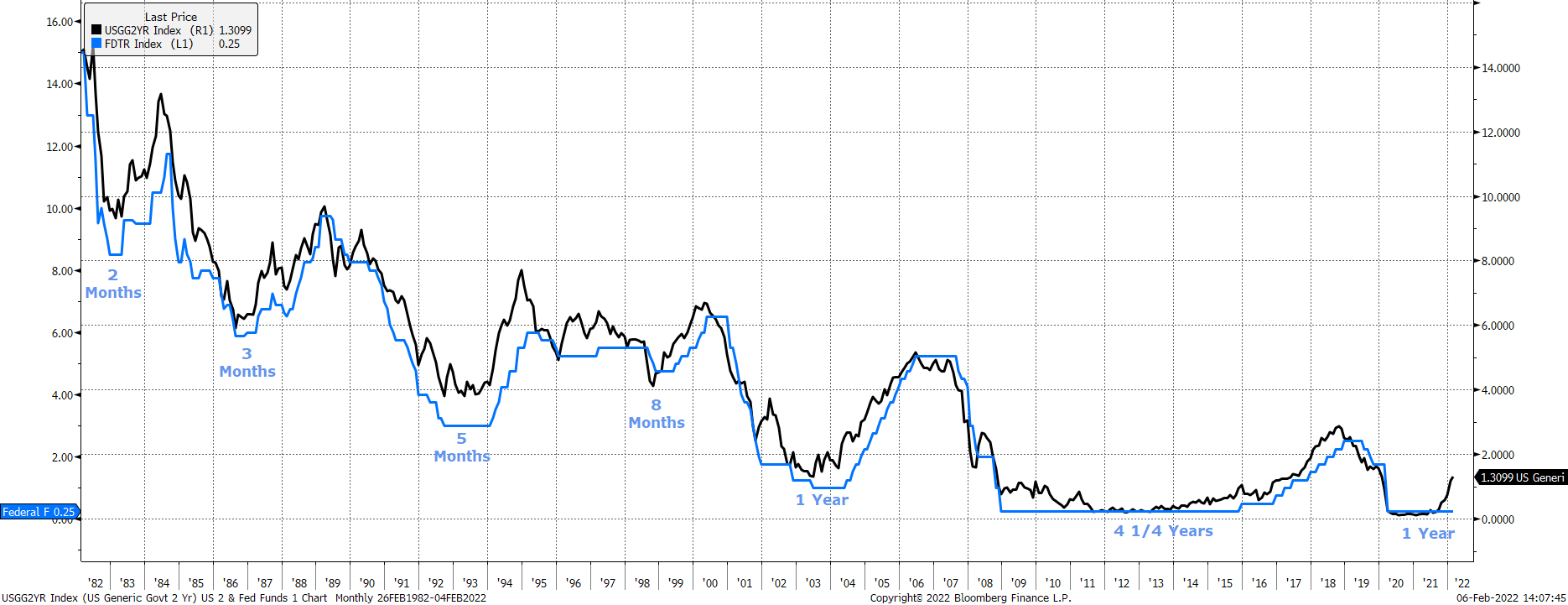
The chart below shows the 2-Year US Treasury Yield (black) and the Fed Funds Rate (blue) with data back to the early 1980s. We found the current 1-year disconnect between the 2-Year US T Yield rising and the Fed Funds rate being raised is, except for the post GFC-period when it took the Fed more than four years to raise the Fed Funds rate, equal to the prior longest disconnect when it was thought that the Fed was also “behind the curve.” Here’s what we mean:
Time between the 2-Year Yield rising and the Fed Funds Rate being raised:
Early 80s: 2 Months Mid-80s: 3 Months
Early 90s: 5 Months Late 90s: 9 Months
Early 00s: 1 Year Post GFC: 4 ¼ years
Early 2021: 1 Year (so far)
The length of time between the 2-Year Yield rising and the Fed Funds rate being raised has consistently lengthened over the last four decades. It went from 2-months to 3-months to 5-months to 9-months to 1-year (let’s forget the Post GFC period for a minute) to the current 1-Year and counting…So, to be sure, we shouldn’t necessarily be alarmed that the Fed is “behind the curve” because it is, in varying degrees, always behind the curve. Too, we shouldn’t necessarily be surprised if the Fed, as has been true to date, continues to dissemble with respect to raising rates because, you know, they are loathe to raise rates.
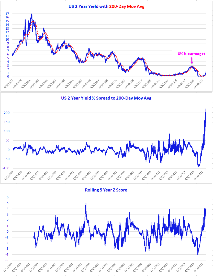
Starker than this, however, is that the 2-Year Treasury Yield is 221% above its 200-day moving average (middle chart below). Truth be told, the % Spread between the 2-Year Yield and its 200-Day Moving Average is note GameStop like – at its closing high on Jan 27, 2021, GME was 2,671% above its 200-Day Moving Average and at its intra-day high on Jan 28, 2021, GME was 3,483% above its 200-Day Moving Average – but it’s otherworldly for Treasury debt. And, with an able assist from Kevin Brocks in our Strategy Team we find the current Rolling 5 Year Z Score has a +4 standard deviation reading.
It’s a veritable Treasury outlier, but it’s instructive nonetheless to use the action in the 2-Year Yield as a primer on how items that are overbought can (a) stay overbought and (b) get more overbought. For example, at the end of September 2021 the 2-Year Yield was 62% above its 200-Day Moving Average, then 153% at the end of October, 141% at the end of November, 150% at the end of December 2021, 214% at the end of January 2022 and now it 221% above its 200-Day Moving Average. Did the yield models catch that?
Source: 22V Research
We continue to look for the 2-Year Yield to get to 3%, but we’d prefer being long the 10-Year Yield / short the 10-Year Treasury Note price right here because it is only starting to break out. Our target for the 10-Year Yield is also 3%.
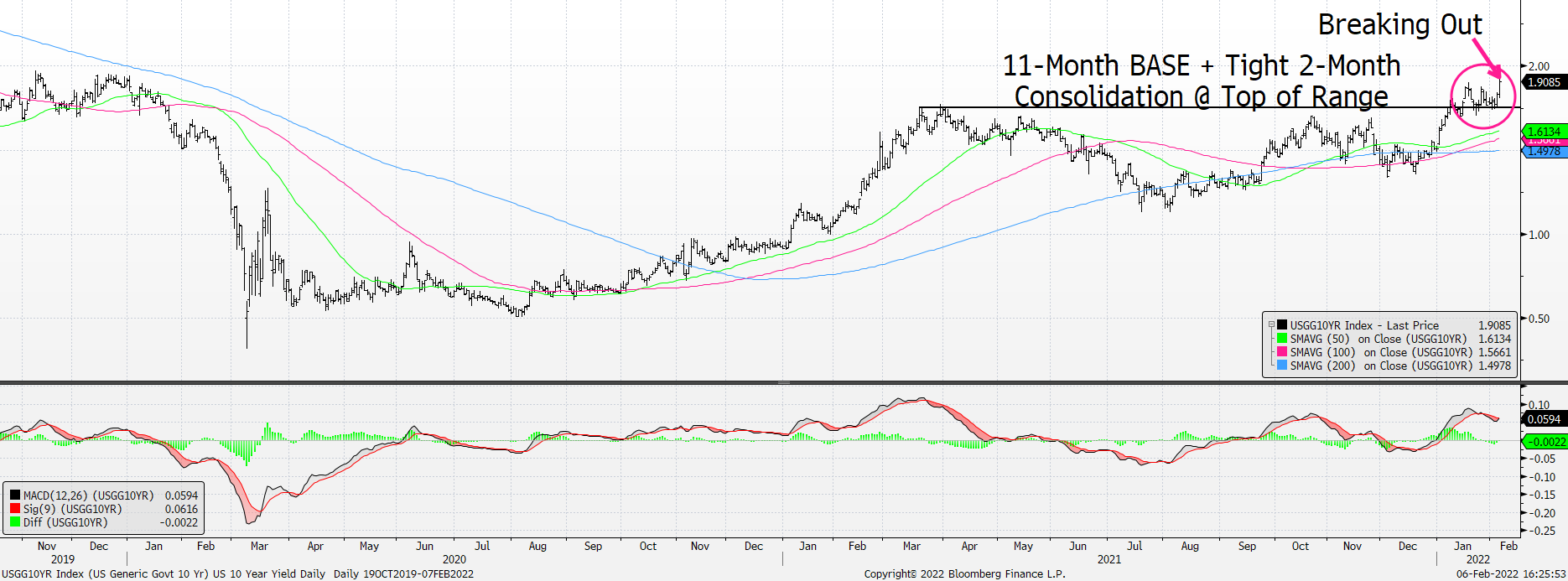
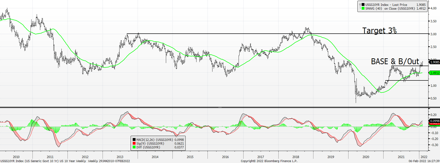
We’re also looking for Euro Yields to work higher. What with the amount of Negative Yielding Debt falling fast it can only mean that Euro rates will work higher.
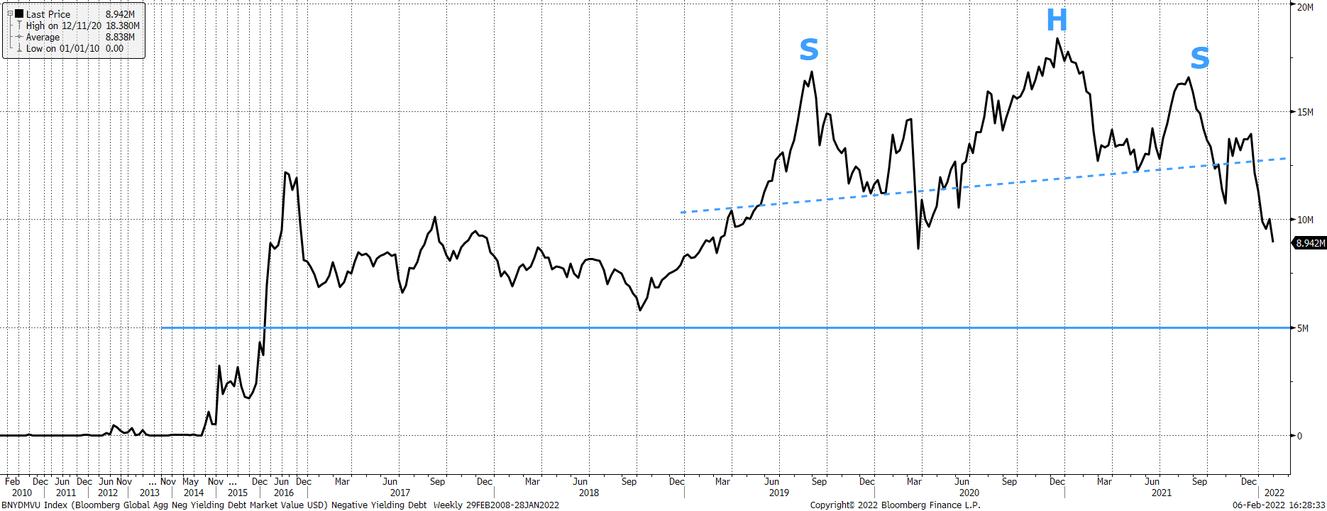
There’s a Brobdingnagian BASE & Breakout for the 2-Year Bund Yield.
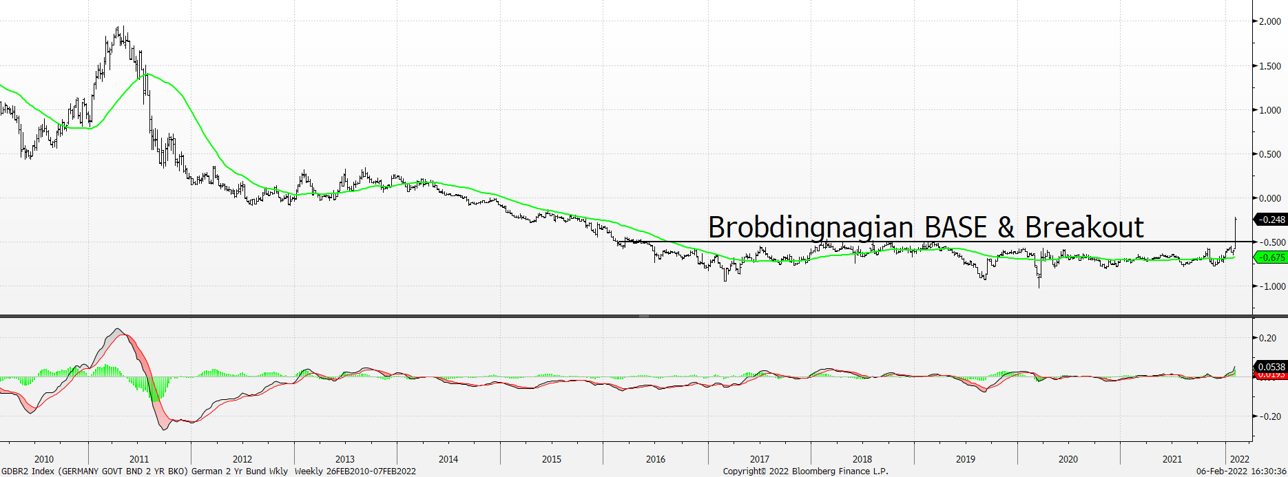
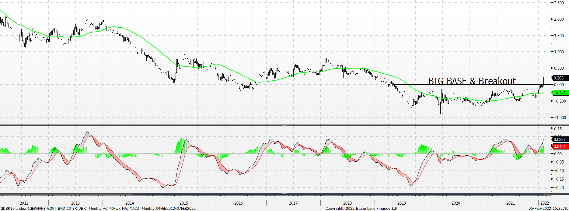
And a BIG BASE & Breakout for the 10-Year Bund Yield, too.
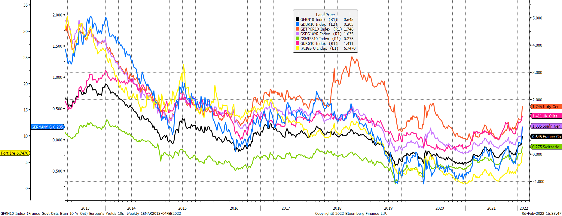
Yield trends are almost always homogeneous, and this time is no different with French, German, Italian, Spanish, Swiss, UK and PIIGS Yields moving sharply higher.
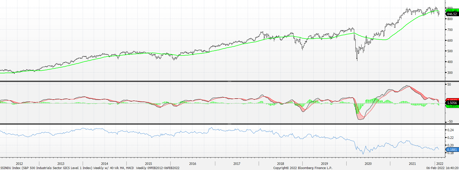
We’re trying to stay consistent with our yield commentary (higher) and with our market commentary (lower), too. Market weakness is now infecting the Industrials Sector as its Technical Score has weakened to 1 with 63% of the stocks in the Sector having weak to bearish scores. The S&P Industrials (top panel) is now below its cresting 40-Week Moving Average, its weekly MACD (middle panel) is thisclose to negative territory, and relative to the S&P 500 (bottom panel) it is close to testing its 2020 lows.
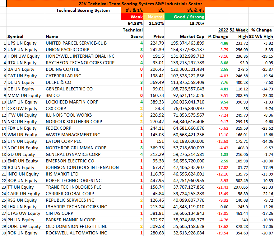
We’re only showing the Technical Scores for the top 30 market cap stocks in the sector, and you’ll see quickly that the scores are overwhelmingly weak.
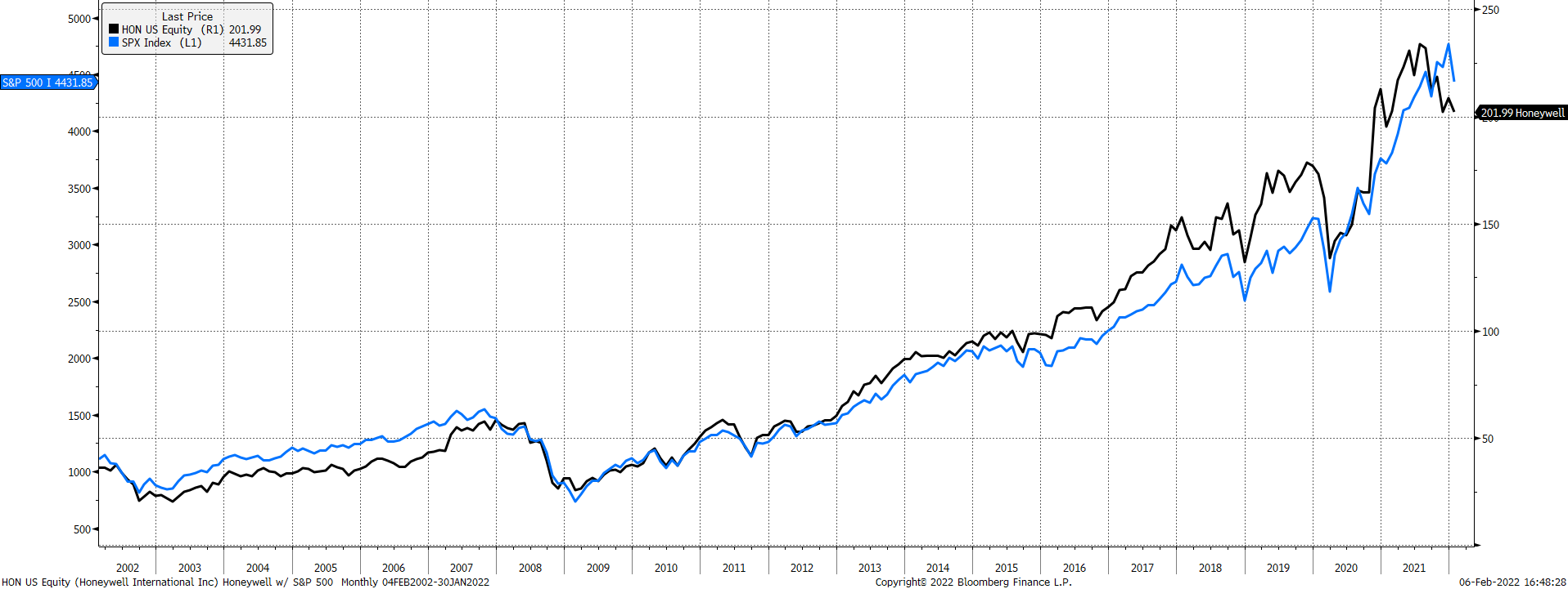
Most troubling to us is that Honeywell’s deterioration is likely a precursor for more weakness in the S&P 500. In a prior era when the S&P was more of an economic indicator, and less of a tech index, we often used Honeywell (HON) as a bellwether for the S&P. We still find HON to be helpful and right here it is weaker than the S&P and is below its downward-sloping 50, 100, and 200-day moving averages. Key near-term support for HON was at 200 and it broke beneath that level last week in a damaging way. Its monthly chart below, along with that for the S&P, looks like an important top.
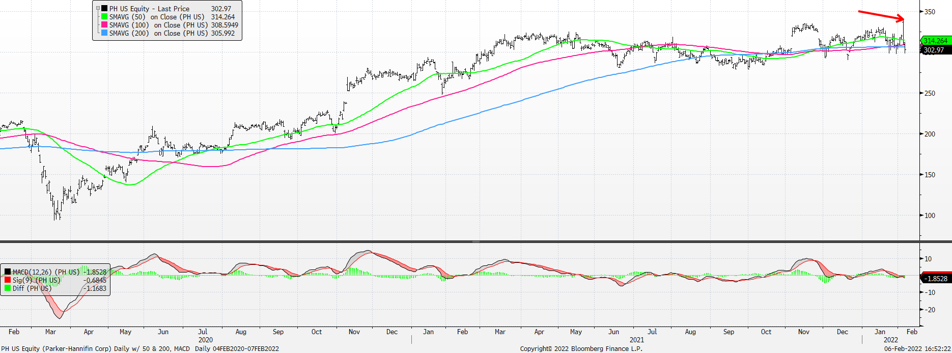
The chart here is for Parker-Hannifin and its Technical Score is 2 (Neutral). However, we noticed that it didn’t trade well last Thursday as it gapped up at the open – touched its intra-day high of 340 on good fundamental news – and then proceeded to decline throughout the day to close at 311.56 for an intra-day move lower of 8.4%. Fake breakouts – and this was an intra-day fake breakout failure – always make us nervous and this one is no exception. We think PH is worth shorting here with a target of 250.
Here are some charts we reviewed from last Friday’s 22V Webinar.