
Our entire repository of COVID charts is HERE.
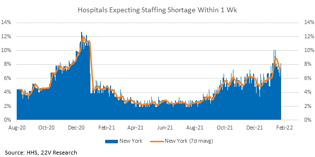
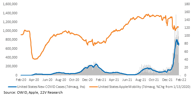
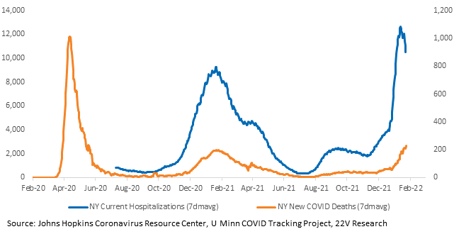
Case growth in the US has rolled over. Labor shortages are following the improvement. The percentage of hospitals in the US reporting imminent, critical staffing shortages finally decreased and the trajectory, based on early-hit states (NY), looks good. All of NYC’s subways are running again. Labor shortages in other fields, like retail, are still acute, but there are signs of incoming relief from the industries first affected.

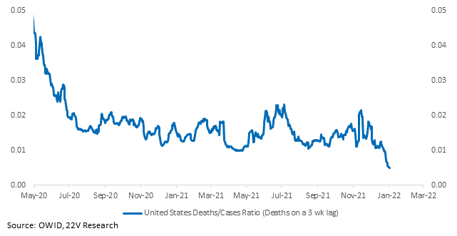
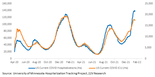
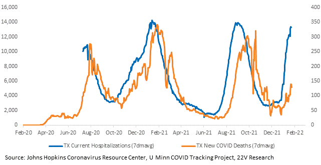
Hospitalizations may have peaked. And the ratio of deaths to new cases is confirming early estimates of low severity. Near-term economic data
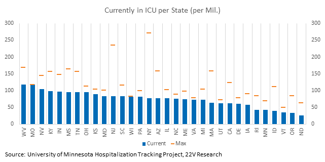
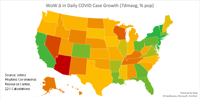
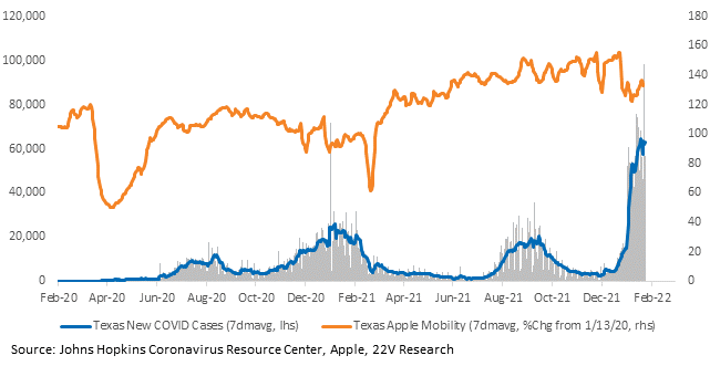
Case growth is better across the most populous and economically significant states (California, New York, and Florida). The rate of growth in Texas, which still has higher case growth than a week ago, is decelerating. In general, things are improving.
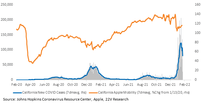
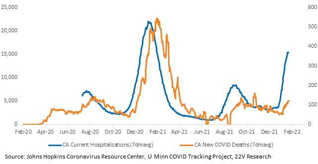
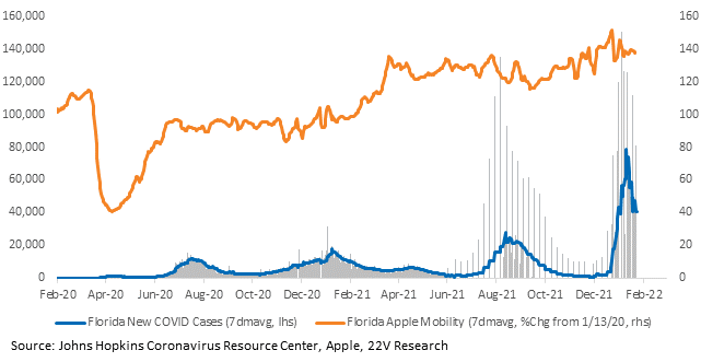
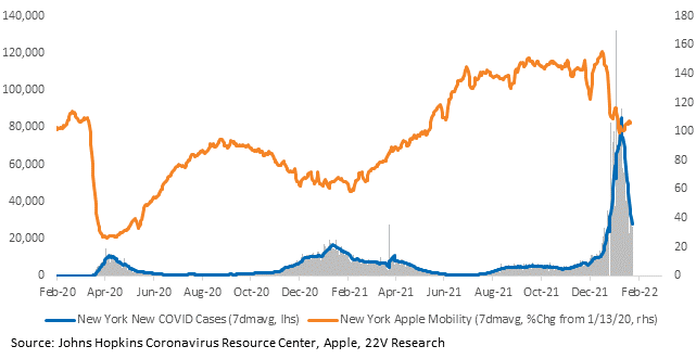
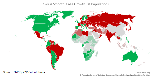
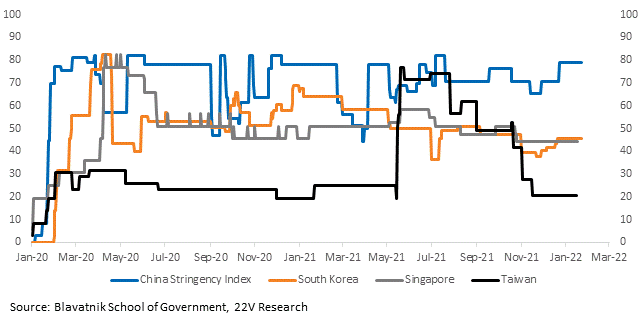
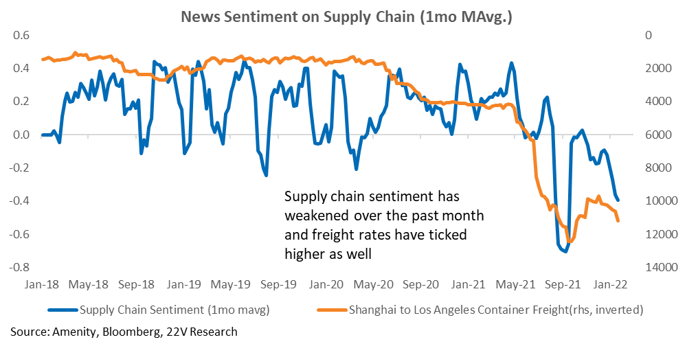
And a brief global update – COVID trends are deteriorating in important supply chain countries. As we have been saying, the primary risk Omicron poses is widespread disruptions to supply chains that delay goods deflation at an inopportune time. Keep an eye on Oxford’s stringency indices to gauge restrictions, which are still easy (for now). Supply chain sentiment, calculated using the Amenity natural language processing tool, deteriorated again last week.
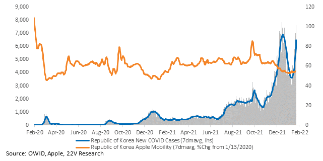
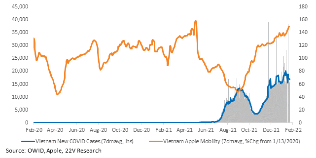
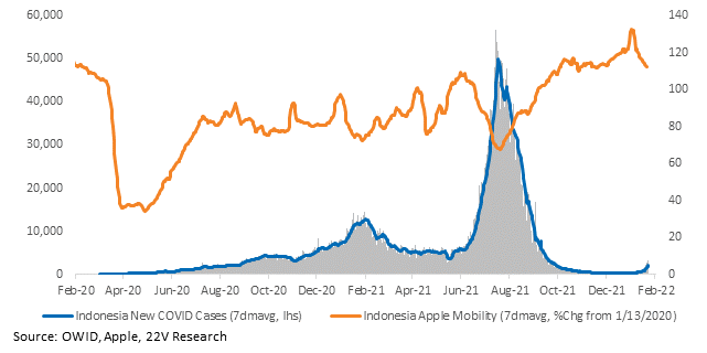
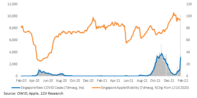
Charts for every state and country we have data for are HERE.

