
Our entire repository of COVID charts is HERE.
Severity data indicates the worst-case scenarios are off the table. The primary risk is supply chain disruptions. Headlines are beginning to pop up about case growth in Asia (and not just China). Hong Kong is enacting travel restrictions, curfews, and closing venues after finding its first COVID case from local community transmission in 3 months. The positivity rate in Singapore is increasing. And China is committed to its zero-COVID policy; state-run media is publishing articles about COVID found on imported fruit while supermarkets are shut down.
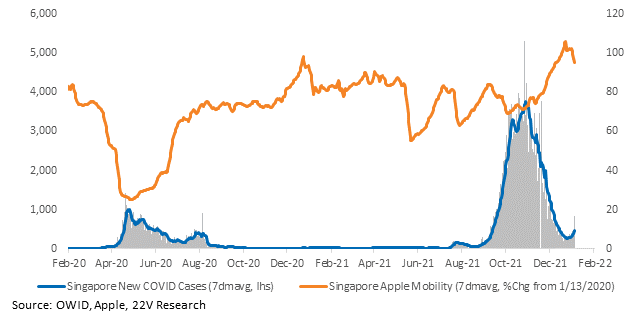
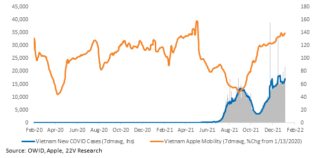
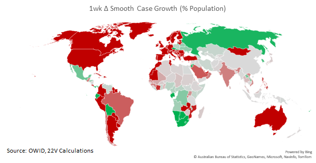
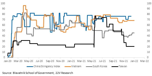
We are monitoring Oxford’s stringency indices to track the level of restrictions. Unfortunately, China’s score has still not been updated.
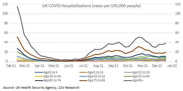
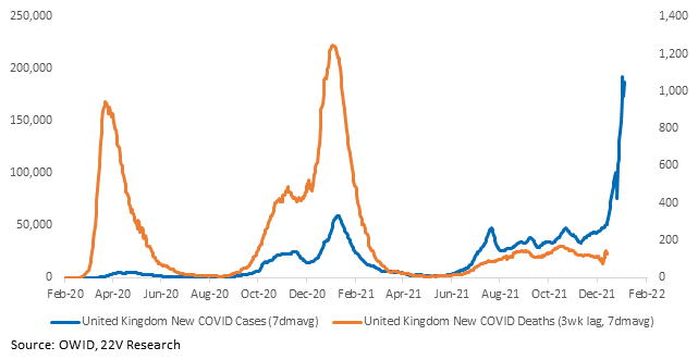
We don’t have UK or London case and death demographic data past 12/31, but we do have updated hospitalization data (though still on a lag). For the week ending December 19, overall hospitalization rates remained below the Delta rates and well below the pre-vaccine rates. To be fair, hospitalizations did not start accelerating until the week after December 19. But the early data is encouraging. Patients currently in the hospital with COVID (for which we have data through 1/4) has increased, but the number of patients on ventilators has diverged from hospitalizations. That is a good sign for deaths, which in turn is a good sign for activity and policy.

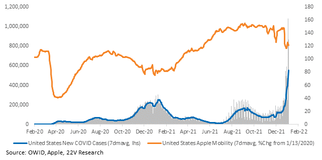
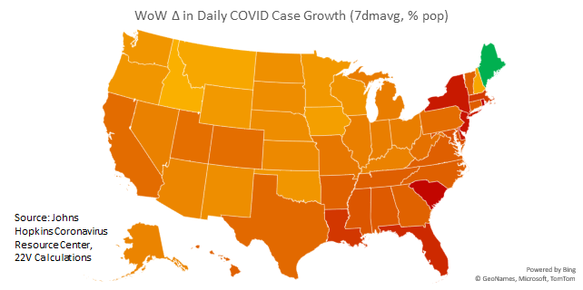
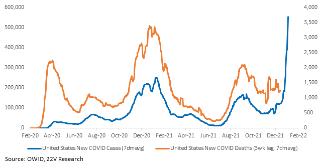
Case growth in the US is increasing rapidly. Cases are higher everywhere, but worst in the Northeast and Southeast. The CDC has estimated 95% of cases in the week ending 1/1 were Omicron. With case growth so high, it’s good 95% of the cases are a less severe strain. U.S. death data does not yet reflect the Omicron wave given its typical lag, but the data starting this week will.
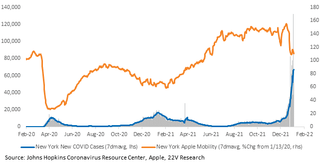
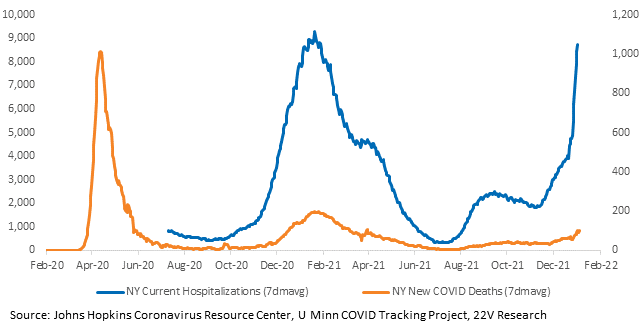
Cases and hospitalizations in New York are spiking. Deaths are increasing as well but, as the second chart demonstrates, this is nothing like early 2020.
Charts for every state and country we have data for are HERE.

