Source: Google Images
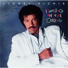
We’ve used the mid-80s hit “Dancing on the Ceiling” as an analogy for the NASDAQ / S&P relationship so often that we’re paying residuals to Lionel Richie. It continues to be apt.
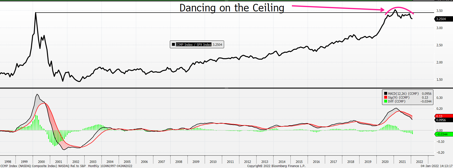
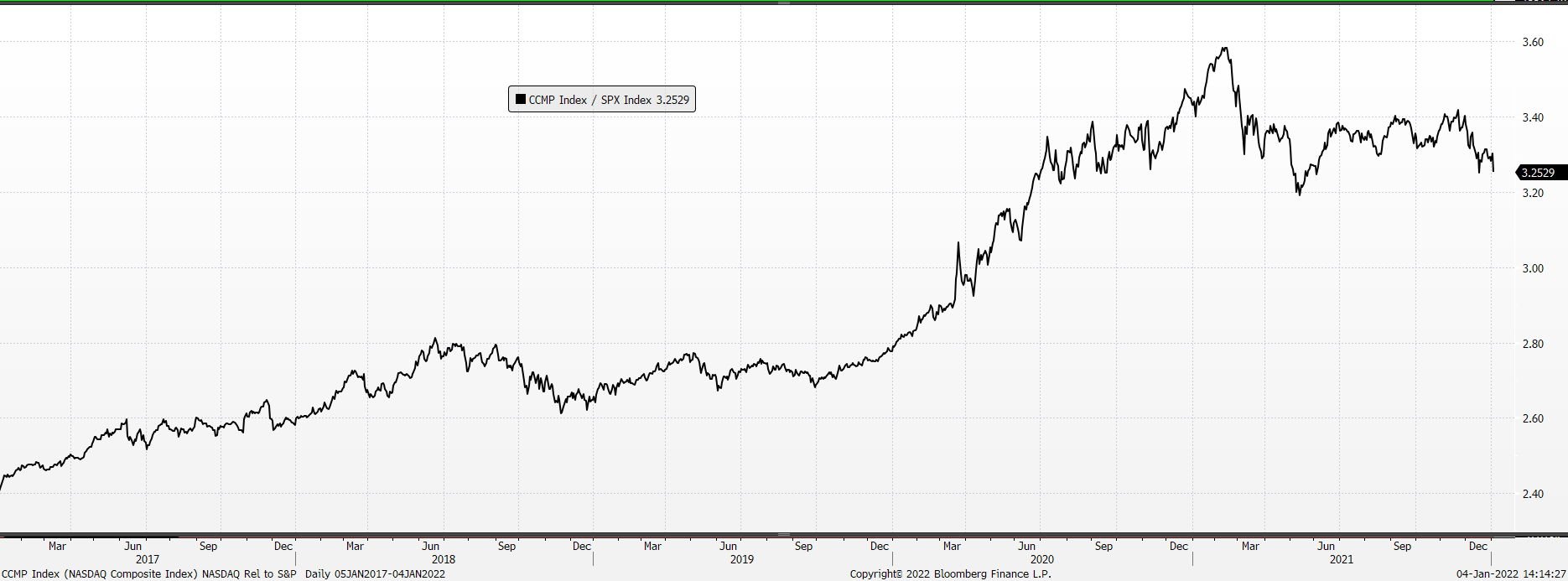
The NASDAQ / S&P Relative Ratio peaked in Feb ’21 and has been distributing, cresting, rolling, and topping since. We continue to think it works lower with NASDAQ underperforming relative to the S&P. Near-term and intermediate-term momentum indicators for this relationship are oversold, but a long-term version (shown below) is not close to an oversold reading. Moreover, it’s hard not to make the unmissable comparison between the current set-up and the one from the late 1990s – early 2000s: this ratio made a minor new all-time high, in early 2021, above its 2000 peak, but the corresponding monthly momentum indicator did not confirm the new high – for a negative divergence. The second chart shows the relationship using a daily chart and, to be sure, it’s been a back-and-forth battle between NASDAQ leadership and S&P leadership. But we think the message in both charts is the same – NASDAQ is in an underperformance cycle.
NASDAQ’s outperformance had been aided and abetted, in no small part, by what had been a low interest rate regime. It should come as no surprise – except to the most ardent of tech supporters – that as rates are rising NASDAQ is under relative pressure though many tech stocks were and continue to be under extreme absolute pressure, too. For example, if you look inside the iShares Expanded Tech-Software Sector ETF (IGV) you will get the sense, like we do, that if you’re looking for Tech shorts this was, and continues to be, a good starting point.