Charts Are the Language of Wall Street
Many years ago, Paul Tudor Jones said, “Price turns and then the narrative follows.” Suffice it to say that he’s proven right at every turn.
We thought about his quote when reviewing our charts and the one here seemed to fit today neatly with Jones’ direction. The premise is not new – higher yields likely mean the economy is (a) strong, (b) opening further, (c) COVID is, for the most part, in the rear-view mirror, (d) the Fed is buying less than $80 billion in Treasuries monthly, and (e) cyclical stocks – both consumer cyclicals and industrial cyclicals – would be likely beneficiaries.
Black line = US 10 Year Treasury Yield
Blue line = Marriott Vacations Worldwide
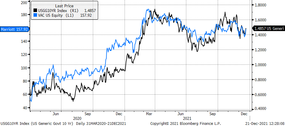 Suffice it to say that a move for one of these, without a similar move for the other, will likely be dismissed. However, a move for one that is confirmed by a similar move for the other will have more meaning / provide us with useful information regarding all the things we are trying to figure out.
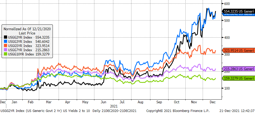
Until then and as the chart below shows, the US 2s and 3s will remain like Secretariat to the rest of the field in the 1973 Belmont Stakes. Our Technical Scoring System has the following Scores for US Treasuries and Marriott Vacations Worldwide shown in the chart above:
US 2s – Technical Score = 4
US 3s – Technical Score = 4
US 5s – Technical Score = 4
US 7s – Technical Score = 3
US 10s – Technical Score = 3
Marriott Vacations Worldwide = 2