
Our entire repository of COVID charts is HERE.
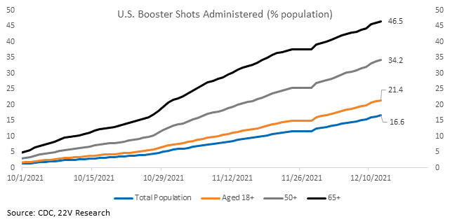
First, a study released today found Pfizer’s COVID therapeutic, Paxlovid, helps reduce hospitalizations by 70%. Pfizer believes it will be effective against Omicron. Therapeutics will help a lot. Researchers found two doses of AstraZeneca and Pfizer vaccines were not as effective or ineffective neutralizing Omicron. However, there is currently no evidence of increased potential to cause severe disease. And a small study of vaccine efficacy in the UK found a booster dose provides ~70-75% protection against symptomatic infection. Boosters are important; rollout in the U.S. is progressing. 47% of those 65+ have received a booster.
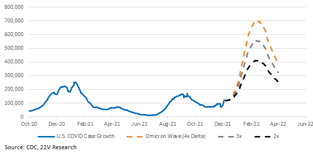
Second, we have seen a lot of conflicting data about transmissibility and severity. None of the data is particularly clear. There is value in illustrating how much estimates of hospitalizations change based on changes in assumptions. First, what if the omicron wave infects 2x, 3x, or 4x the number of people as the delta wave? Daily case growth could change by as much as 300k cases a day. And if Omicron has the same rate of hospital admissions per cases Delta, then peak hospitalizations range from 250k at 2x Delta transmissibility to 450k at 4x.
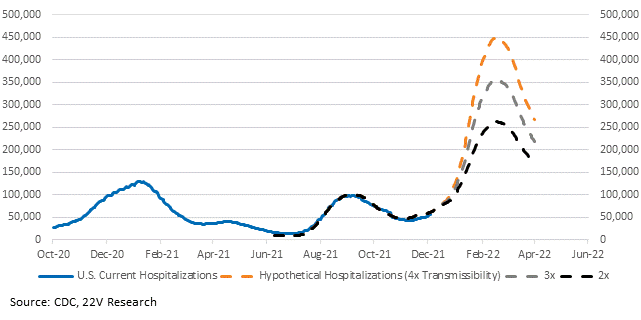
Let’s hold the size of the wave steady at 4x, given the initial indication from a study in Japan was for 4x transmissibility. What if the omicron wave has a hospital admittance rate that is as bad as Delta, 0.7x as bad, 0.5x as bad, or 0.2x as bad? Peak hospitalizations range from 150k at 0.2x Delta severity to 450k at Delta severity.

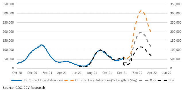
Let’s hold the number of people infected and the hospital admittance rate steady. We’ll use 0.7x because a Discovery Health study found hospitalization risk for the general adult population was 29% less than Delta. Now what happens to hospitalizations if the length of stay is the same as Delta, 0.7x, or 0.5x? Peak hospitalizations range from 120k to 310k. There’s a level shift because the number of admissions drops once omicron takes over and the length of stay declines, meaning briefly fewer people are being admitted with omicron than are being discharged with Delta. We can make adjustments for this by estimating how quickly Omicron becomes dominant, but we don’t have good data on that yet.
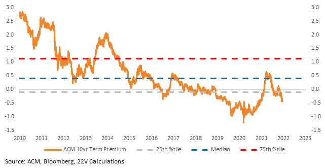
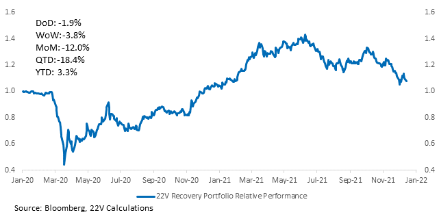
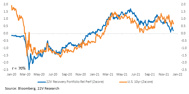
All of the above is to say there is a large range of hospitalizations in the US based on different estimates of Omicron transmissibility, hospital admission rate, and hospital length of stay. We do not have reliable data for any of the three pieces. And so, the 10yr term premium has fallen and our Recovery portfolio is underperforming. We think Omicron is having a large impact on 10yr yields.
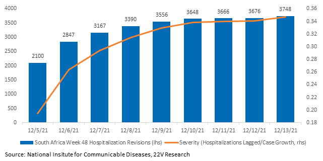
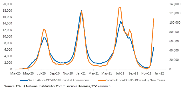
South Africa’s data is opaque. A week ago, South Africa hospitalization data looked like Omicron was significantly less severe than Delta. But weeks-old admissions have been revised up significantly (check out the chart below, which tracks how hospitalizations two weeks ago have been revised +80% higher). Case growth is not revised in the same fashion. So, estimates of severity are increasing. The net result is investors are extrapolating worse hospitalizations elsewhere. The practical implication is not to place too much emphasis on last week’s hospitalization numbers yet – they probably won’t be close to their final tally until late this week.
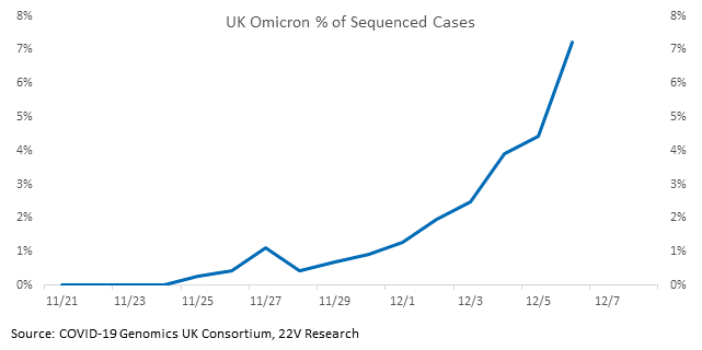
The UK is a better comparison than South Africa. It collects better data and has a more similar standard of living. It’s not as far along, so it won’t yet make the headlines that South Africa will. But, the incidence of Omicron is accelerating and case growth is increasing. So, the data that it produces over the coming weeks will be more valuable.
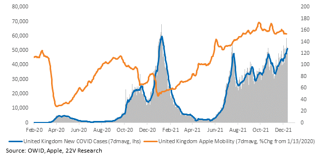
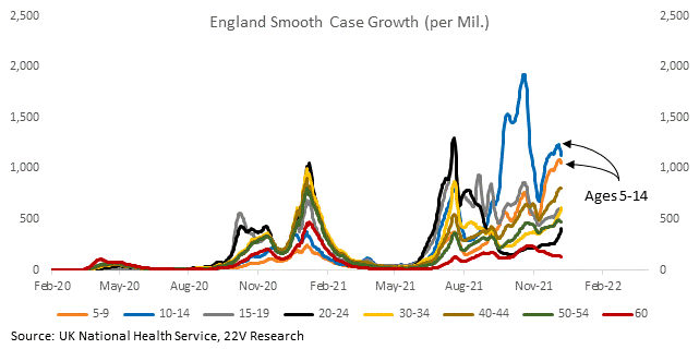
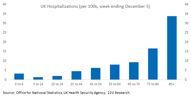
Case growth rates in the UK are highest in children and hospitalization rates are the lowest. Tracking severity is important; tracking severity in children is even more important. We will be monitoring this data as Omicron case growth increases. We will have a better idea of what the US is facing after we assess data from the UK.
Charts for all the states and countries we have data for are HERE.

