Wall of Voodoo
I dial it in and tune the station
They talk about the US inflation
I understand just a little
No comprende–it’s a riddle
It’s always odd to us how you can hear little snippets in songs of different eras and shake your head knowingly because the same snippet could fit neatly into the current era. For example, the early ‘80s band Wall of Voodoo had a hit with “Mexican Radio”, which is an homage for songs that were broadcast out of high-wattage unregulated AM Mexican radio stations. We thought about the song / the above lyrics because it struck us oddly that the band said in 1982 the same thing about inflation – “it’s a riddle” – that Janet Yellen told us when she was the Federal Reserve Chair. And it’s so odd because we’re certain that not one of the band’s members are PhD economists! Yet, during her helm from 2014 – 2018 when CPI YOY averaged a mere 1.5%, she said low inflation was a “mystery.” We’d say inflation is still a mystery to the Fed.
Even stranger than the Wall of Voodoo / Ms. Yellen coincidence is the fact that many are now apoplectic about inflation even though commodity prices have been hinting at higher inflation readings since the Bloomberg Commodity Spot Index broke out of a 6-year BASE in October 2020. The index is now 45% higher, has kept pace with both the S&P and NASDAQ, and is at new all-time highs. Commodities, and not bonds, have been the release valve for inflation.
Stranger still is that we’re now being told, by some, that “At Times Like These, Inflation Isn’t All Bad” or “What Scaremongering About Inflation Gets Wrong.” More than that, Americans are now being urged to abandon their own collective raison d’etre – to conspicuously consume – for this…“Americans Need to Learn to Live More Like Europeans.” Truth be told, we’re not fans of conspicuous consumption but we’ve thought for a long time that the Fed was keeping rates low to pull consumption forward continuously – i.e., if you’re not making anything in your savings account you might as well spend it. Heck, Americans are now scolded by news anchors who claim they can afford more expensive groceries.
We’ll extend an open invitation to any of the pro-inflation folk to join us at the corner of 4th Avenue and 3rd Street in Mount Vernon, NY so they can tell the good residents of that neighborhood why higher prices are in their best interests. Have we all forgotten the lessons of Milton Friedman? Thank goodness, however, that price action helps to sift through the mind-numbing narratives.
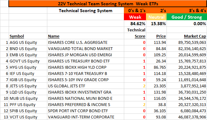
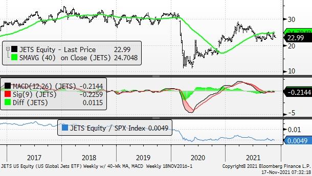
For example, price action is very telling – but negatively so – for the following list of 12 bond proxy ETFs and one equity ETF. Our Technical Scoring provides the snapshot.
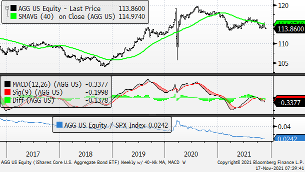
AGG – Weekly chart with 40-Week MA, Weekly MACD, and Relative to the S&P
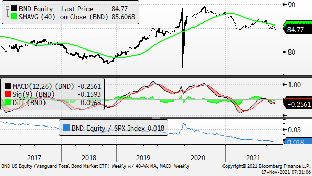
BND – Weekly chart with 40-Week MA, Weekly MACD, and Relative to the S&P
JETS – Weekly chart with 40-Week MA, Weekly MACD, and Relative to the S&P
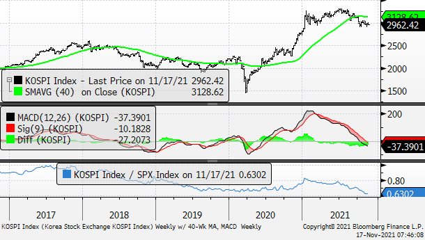
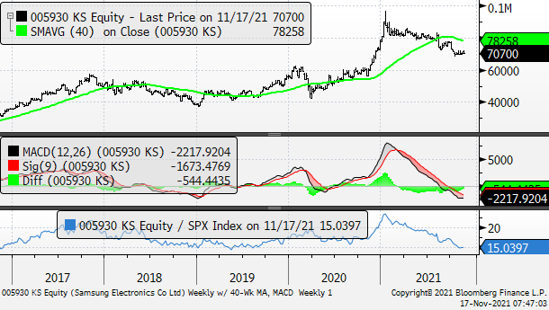
It’s also curious to us why the KOSPI of Korea, and Samsung (005930 KS) which is 20% of the market cap weight of the index, is sitting out biggest cap Tech’s bacchanalia?
KOSPI – Weekly chart with 40-Week MA, Weekly MACD, and Relative to the S&P
Samsung – Weekly chart with 40-Week MA, Weekly MACD, and Relative to the S&P
For example, the US$ Spot Index continues to work higher after completing its BASE / inverted H&S pattern. The DXY is now at its highest level since July 2020. The “top of its range” is at the 103 level. Before getting to the $ charts below we thought it’d be a good idea to go over the following…
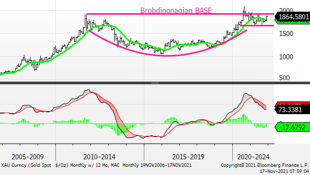
We’ve gotten a lot of questions recently as to how we can like gold while the US$ is rallying. It’s true that gold’s best historical upcycles have occurred when the US$ was weakening so it might be a bit strange that the metal has perked up. But, for some time we’ve thought that it’s better to trade what you see rather than trying to fit the item to some predetermined narrative. Trust us, we’re not minimizing in any way market history; rather, we’re constantly reminded of something we’re going to attribute to George Soros. We believe it was Mr. Soros who said that the “moves that make the least sense tend to be the most robust.” We think gold makes a new all-time high.
Gold – Monthly Chart w/ 12-Month MA and Monthly MACD
DXY – Daily chart with 200-Day MA
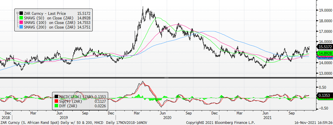
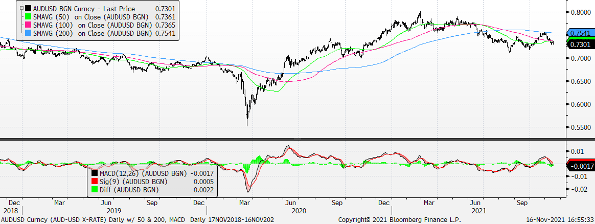
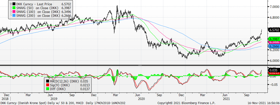
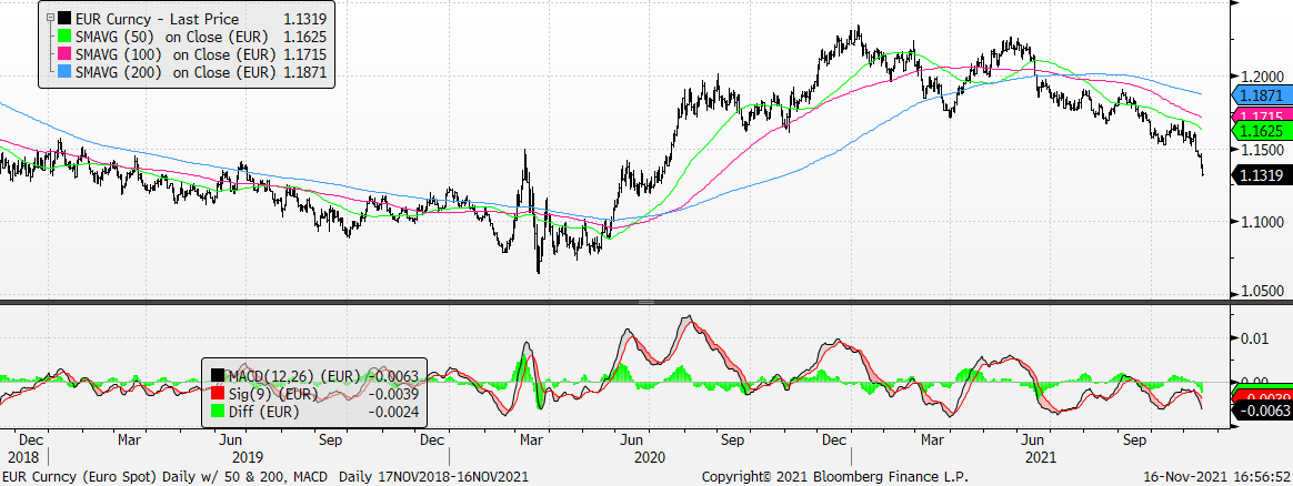
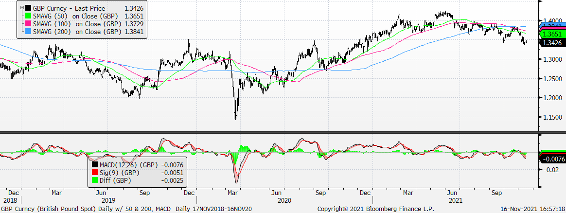
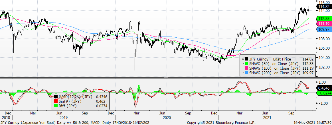
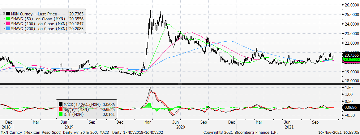
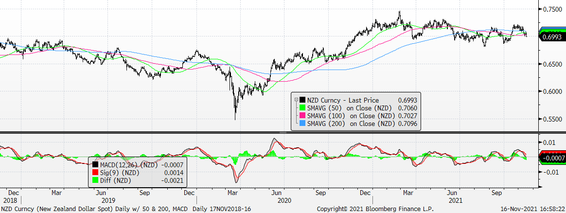
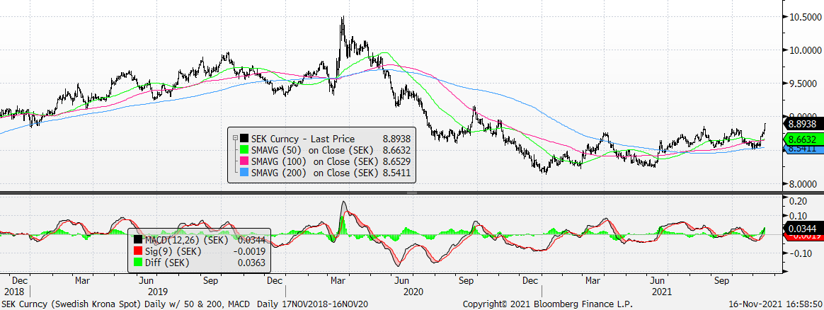
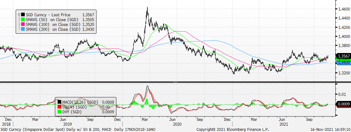
The US$ is strong vs. AUD, DKK, EUR, GBP, JPY, MXN, NZD, SEK, SGD, and ZAR.
AUDUSD
USDDKK
EURUSD
GBPUSD
USDJPY
USDMXN
NZDUSD
USDSEK
USDSGD
USDZAR